This project explores a world where the NBA establishes a permanent presence in the European market. I selected London, Paris, and Athens as the inaugural cities, tasking myself with building "market-ready" brands for each.
Brief: Create distinct brand identities for three NBA expansion teams in Europe. Visual identities must not collide with any of the current 30 NBA franchises and each new team must have an identity that resonates with the culture of its host city.
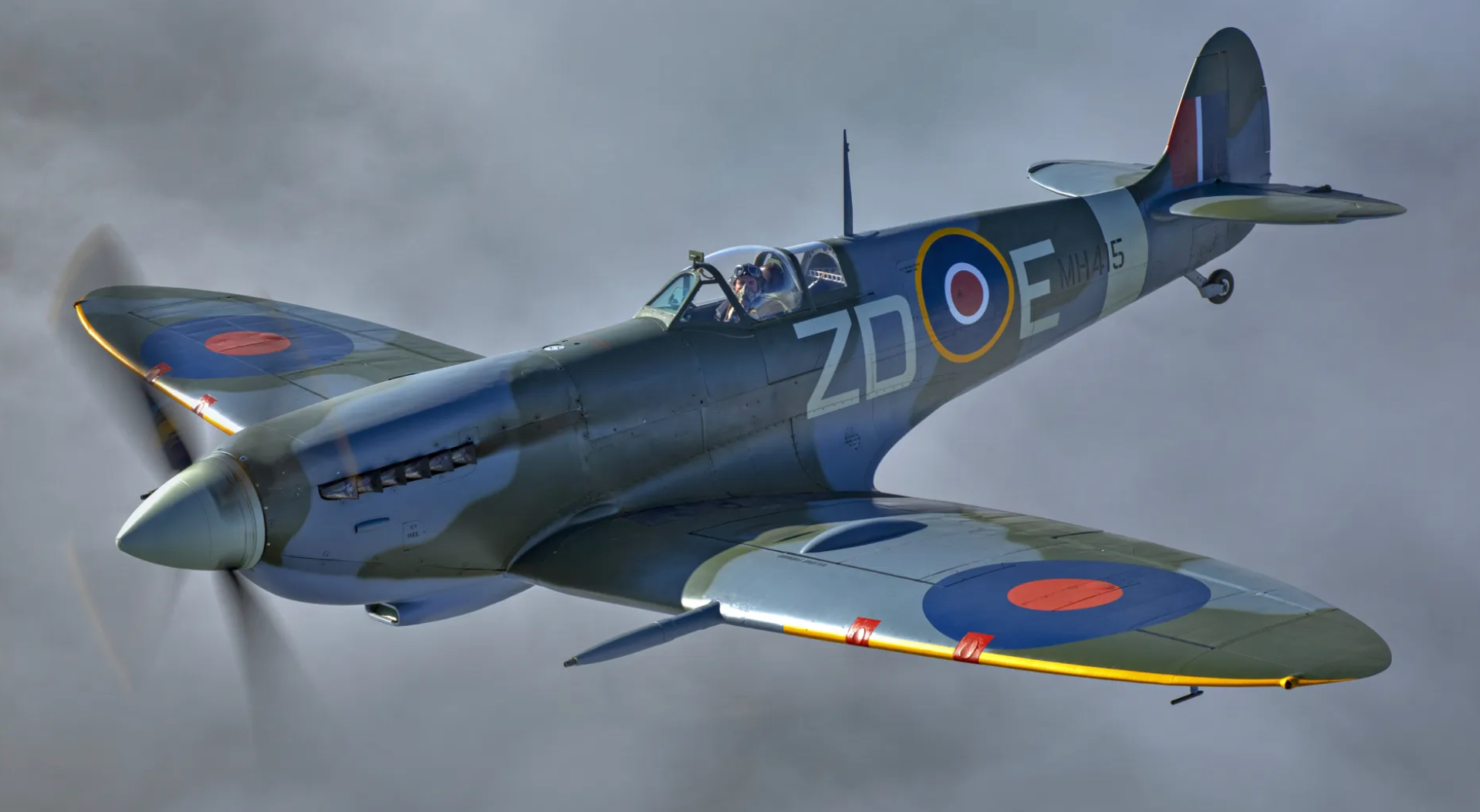
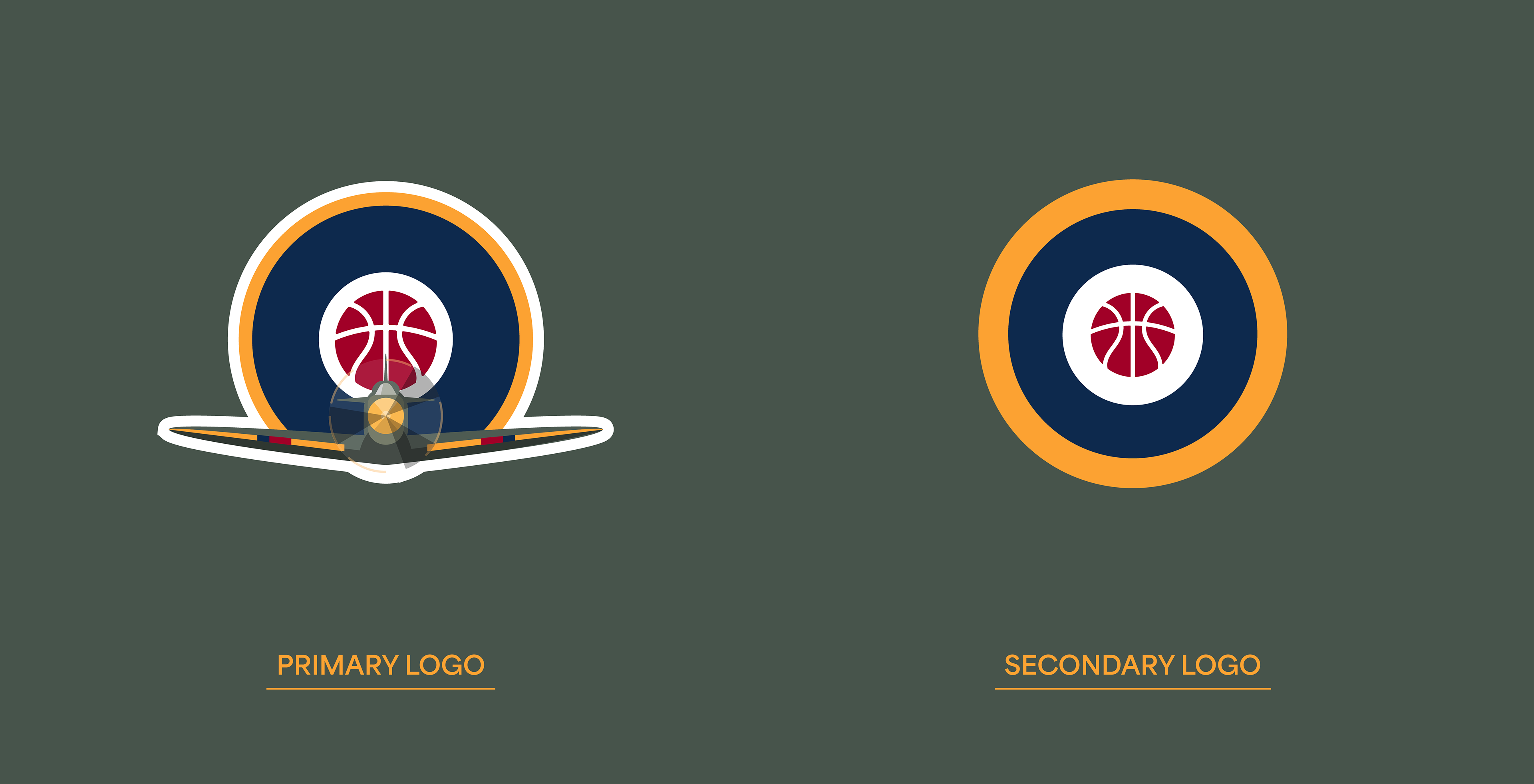
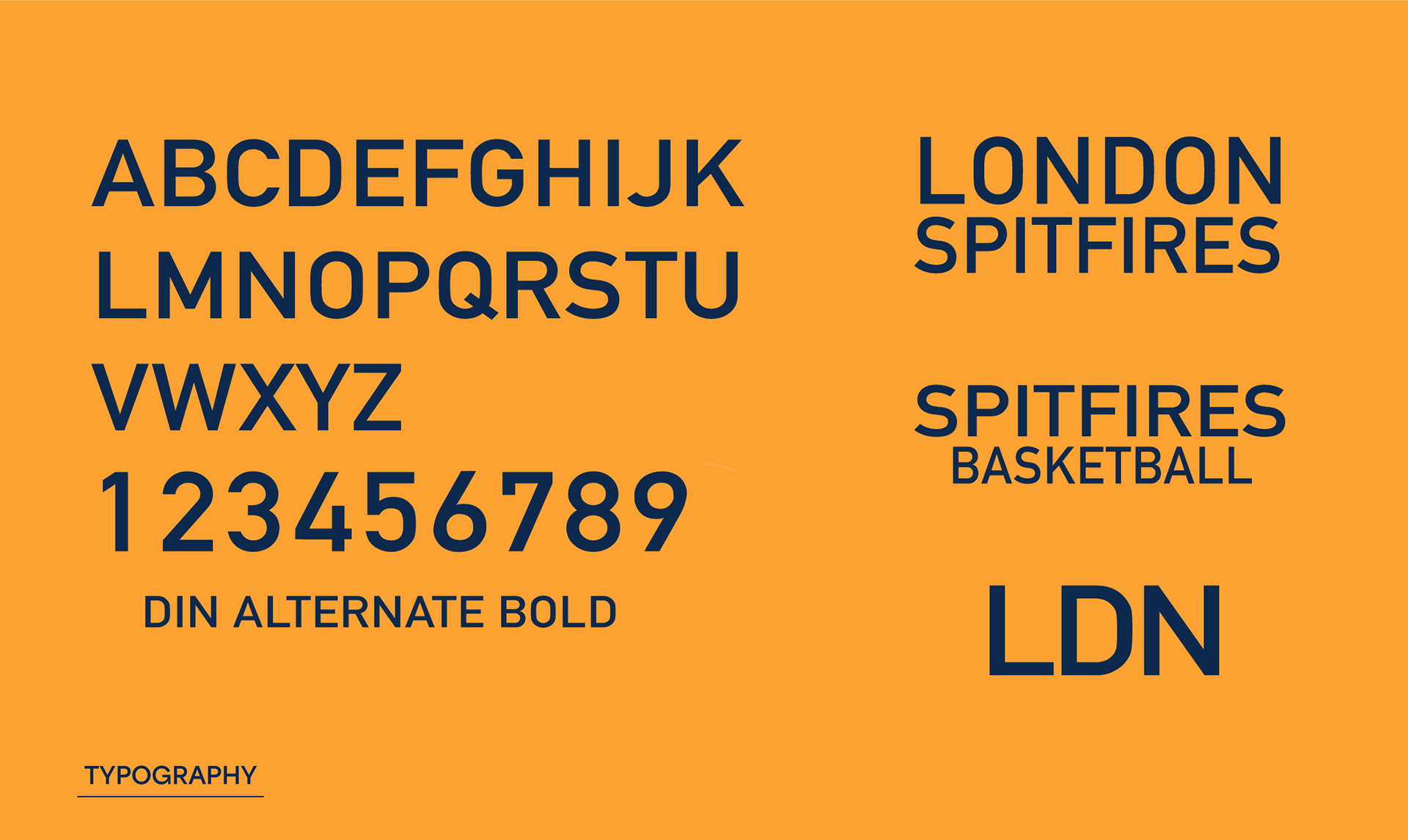
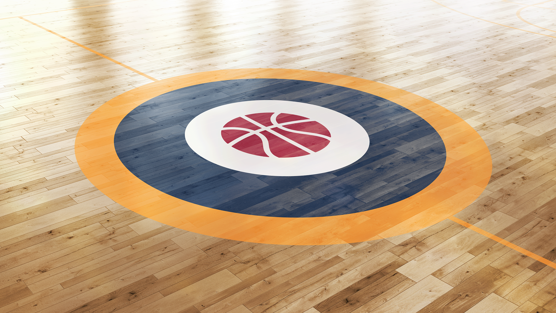
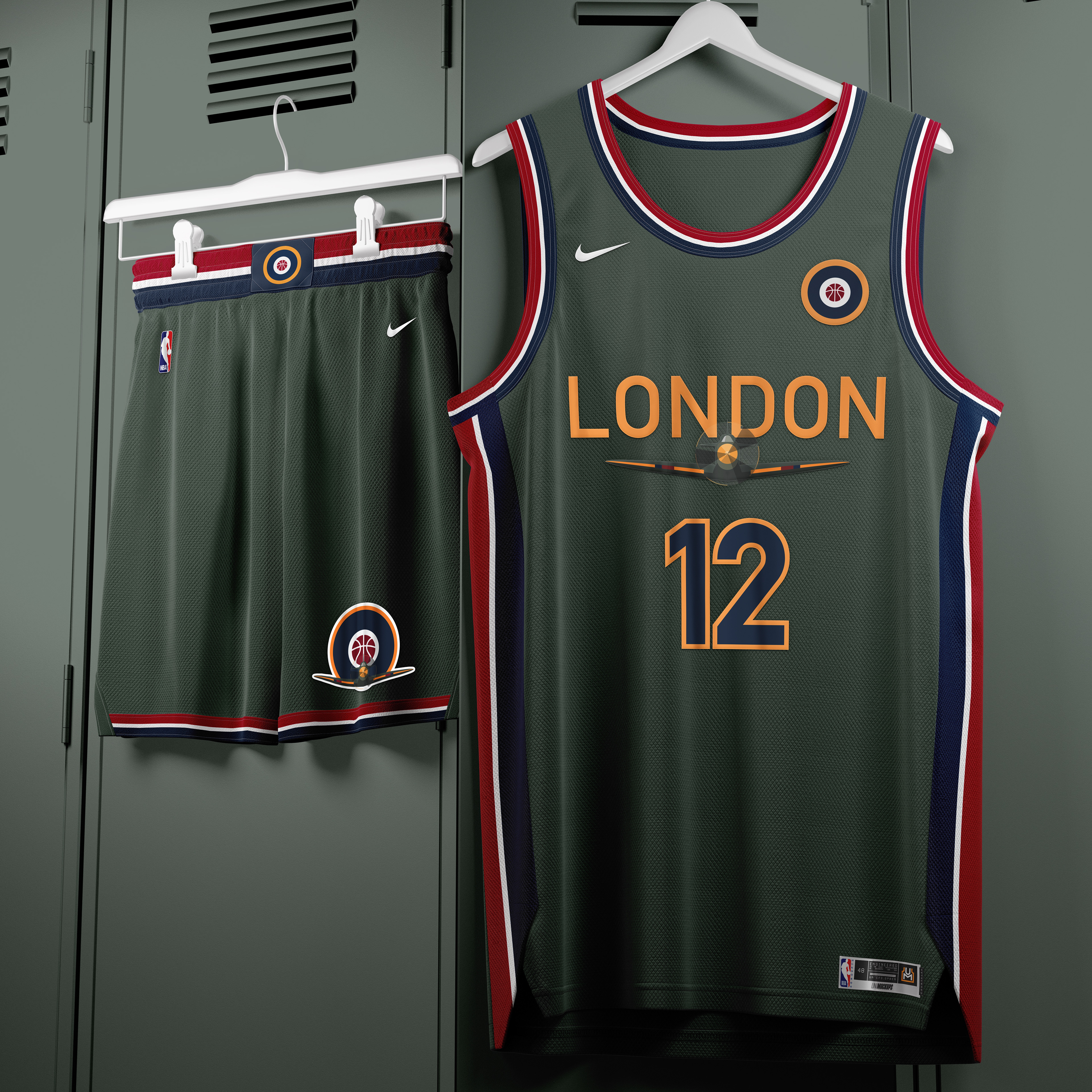
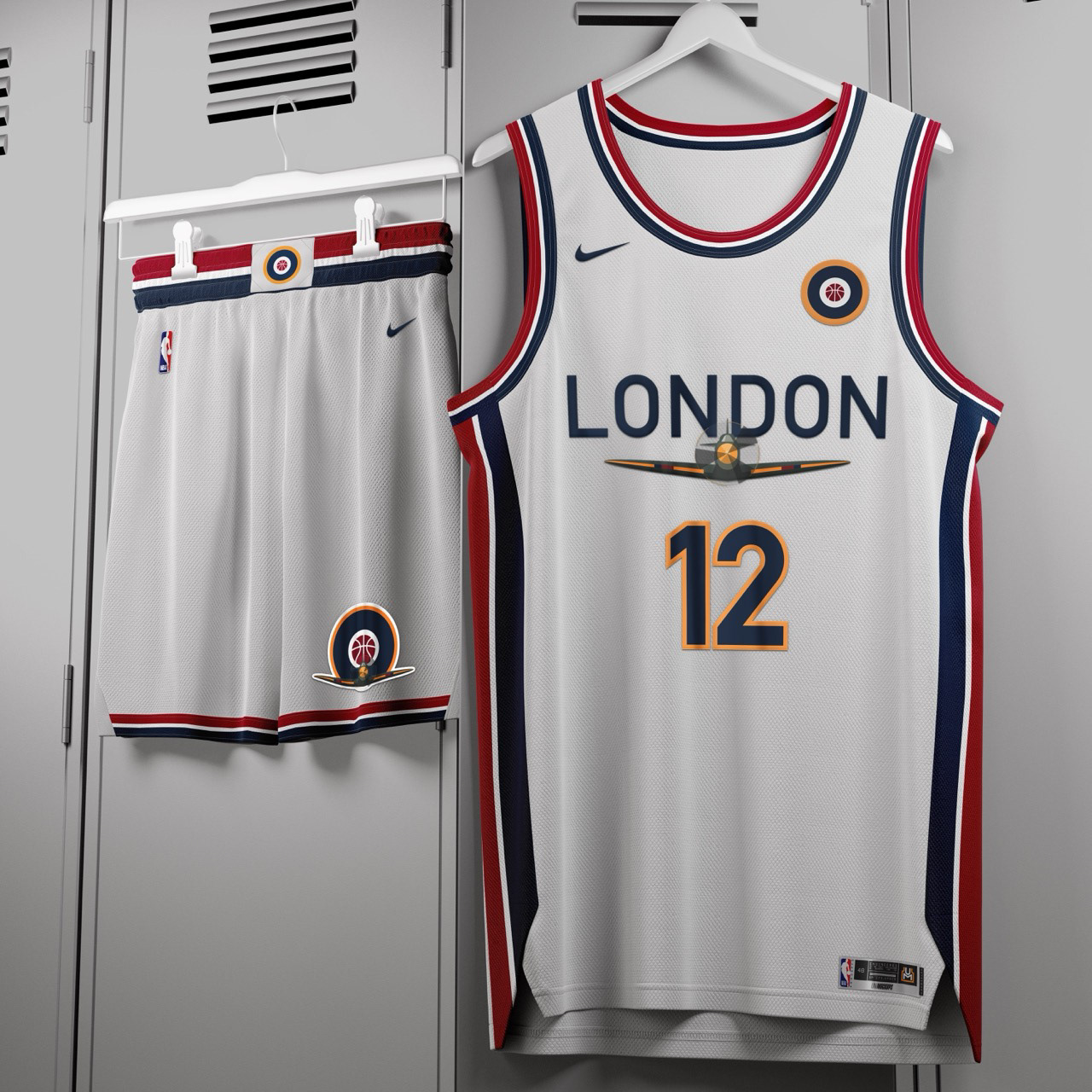
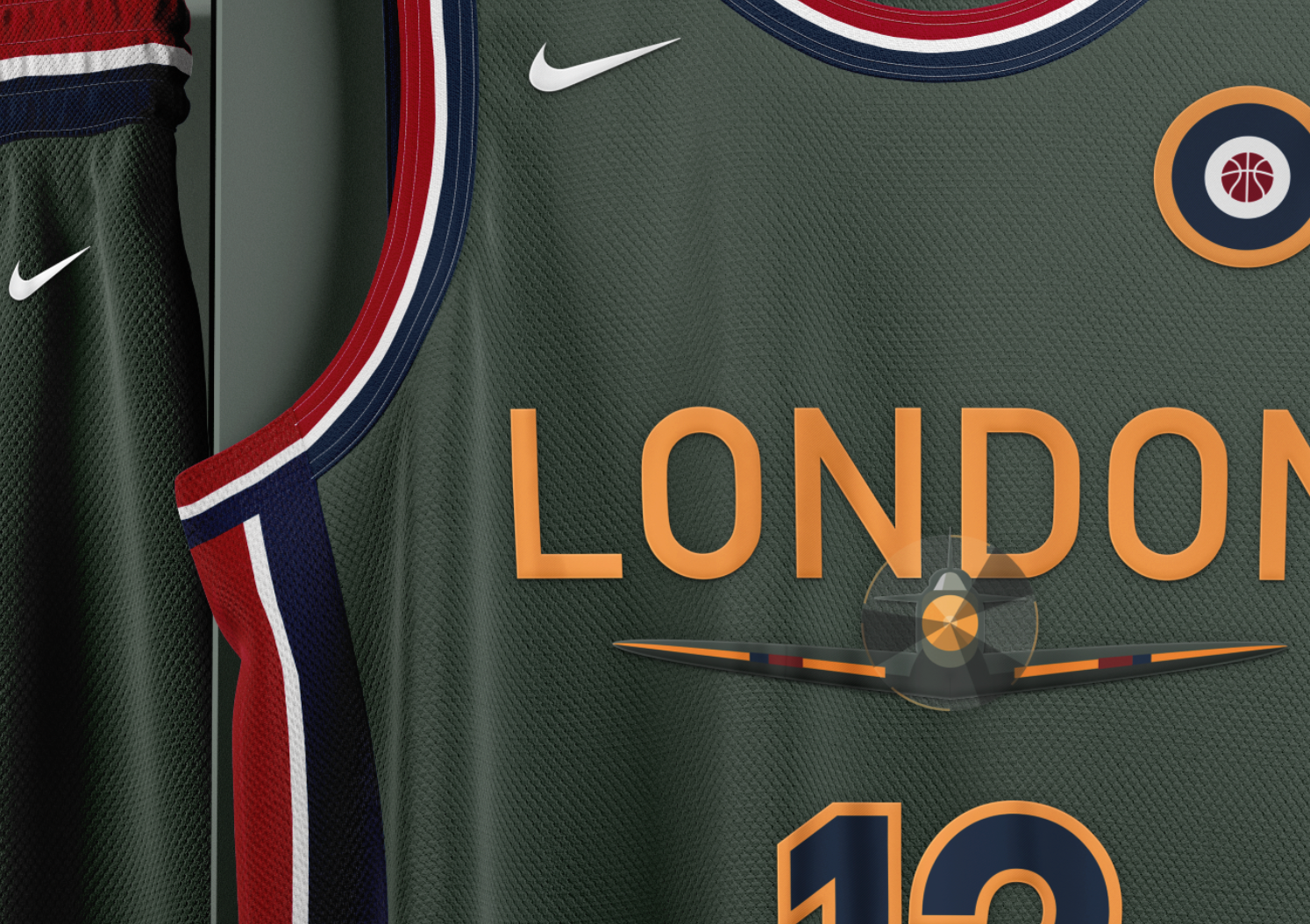
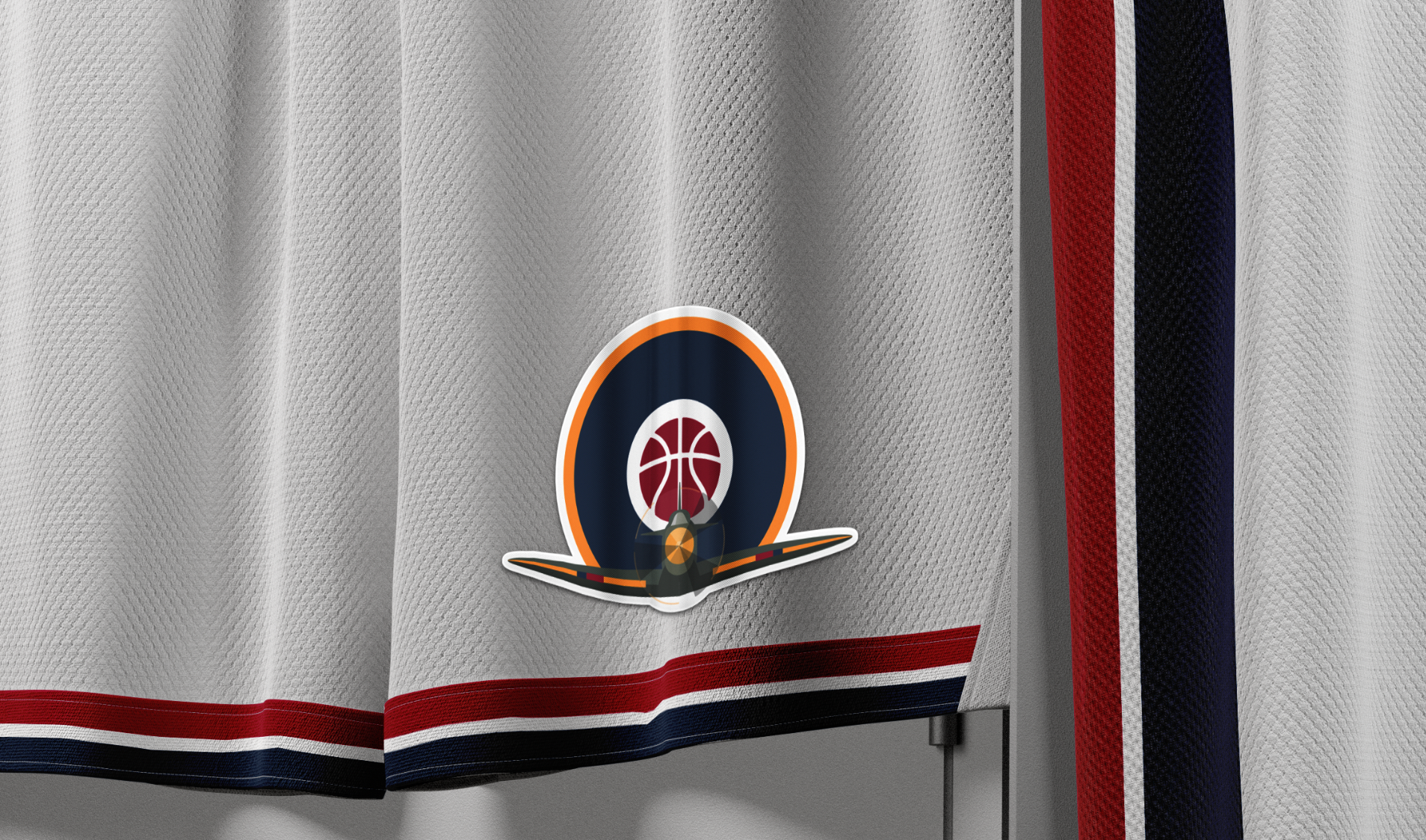
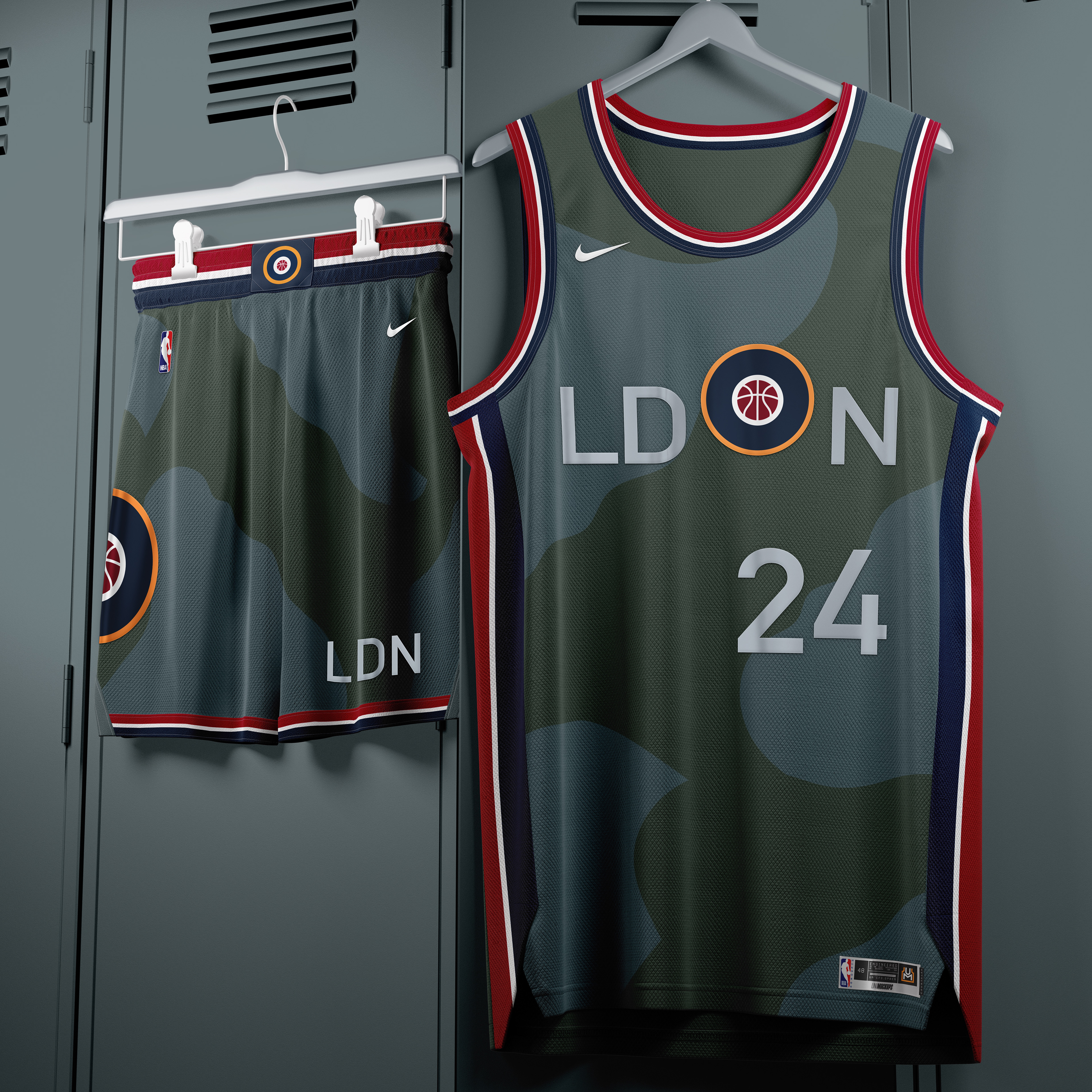
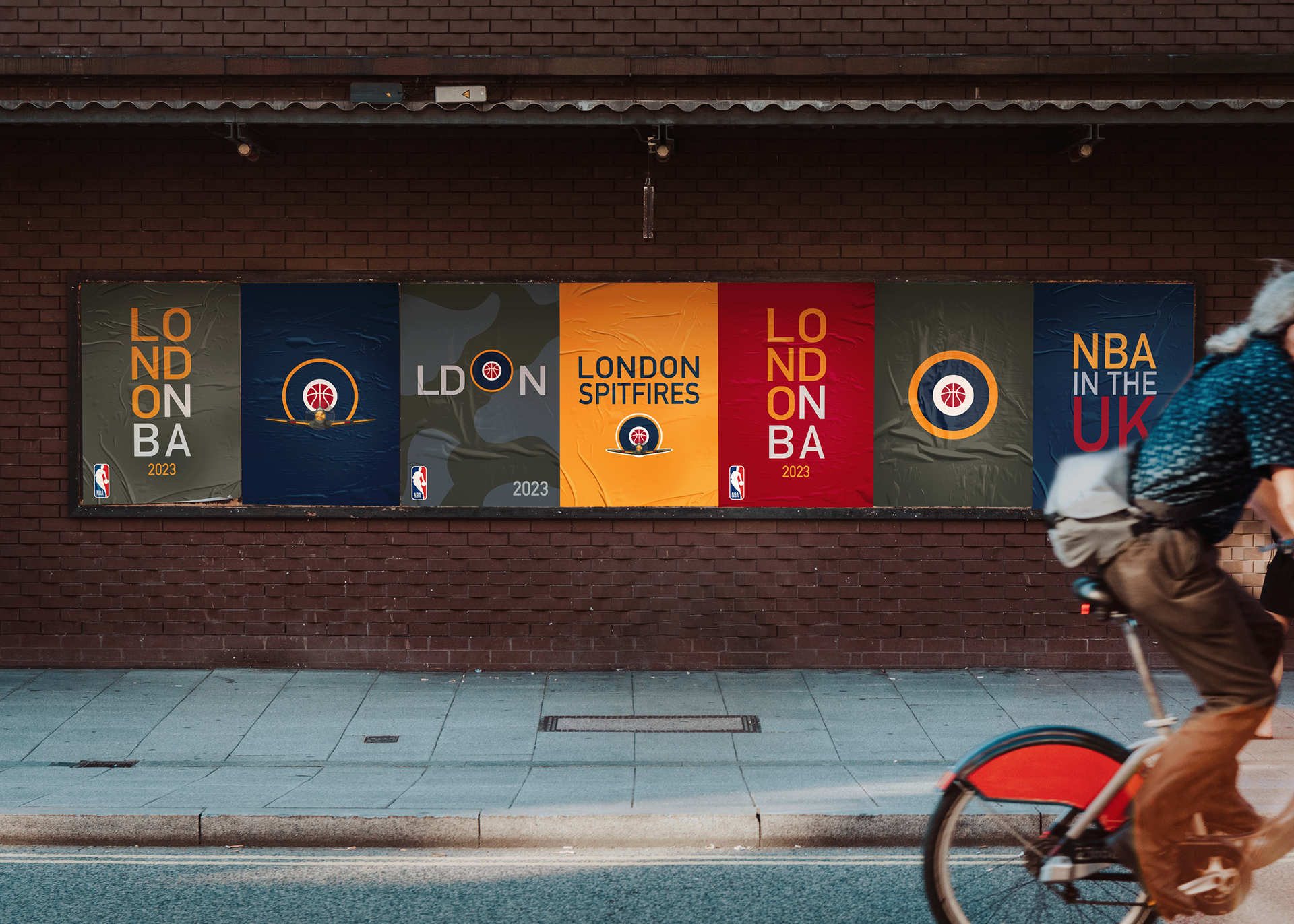
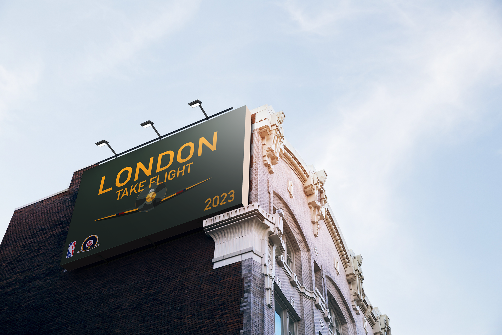
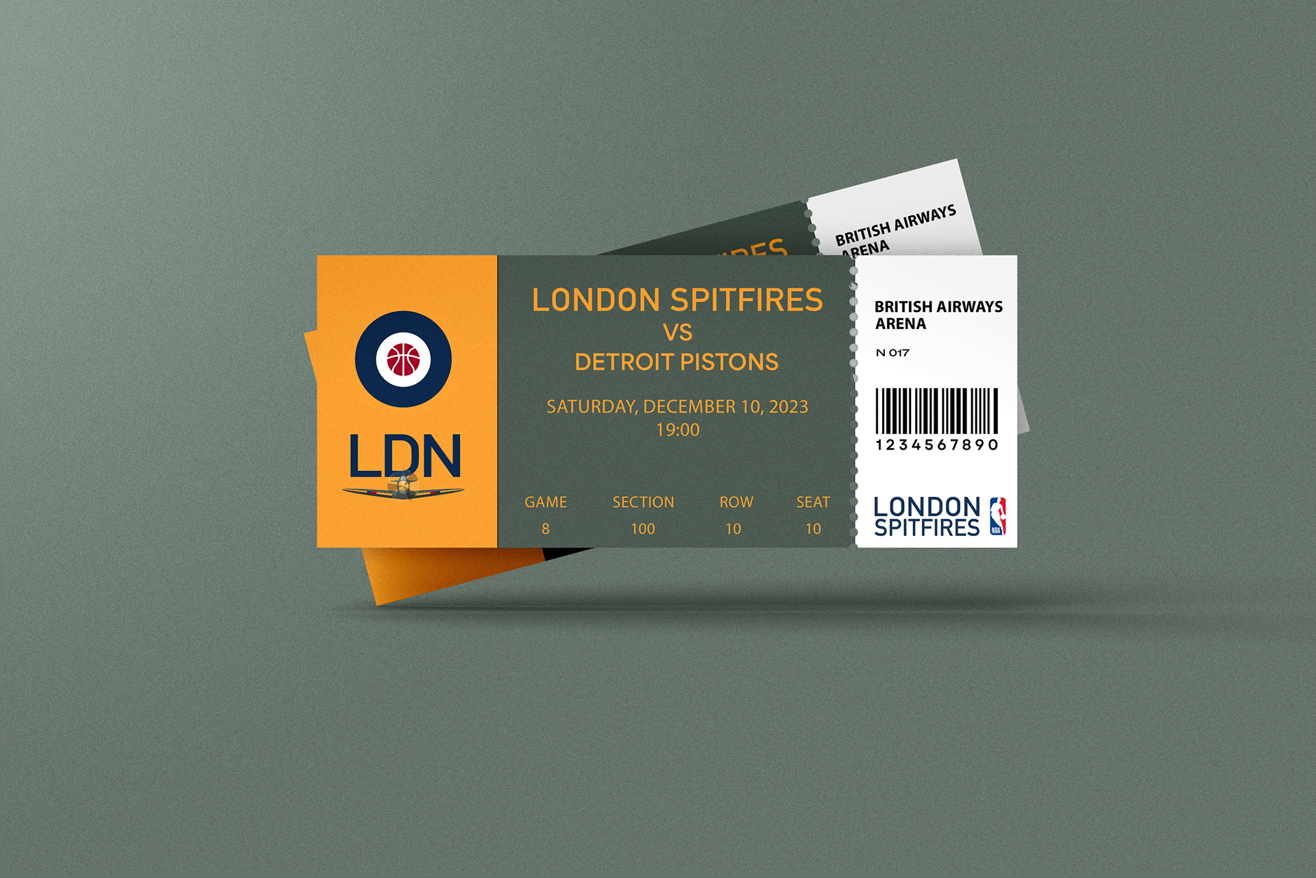
LONDON SPITFIRES
Vision: The objective for the London franchise was to establish a brand identity that bypasses traditional tropes of monarchy or knighthood in favor of a more visceral, resilient British icon. The Supermarine Spitfire serves as the ideal symbol for a modern London team representing bravery and courage that will honor the city’s resilience and its legendary achievements during the Battle of Britain and throughout WWII.
Highlights and Logic:
• The Roundel: The primary mark centers on the iconic RAF roundel, reimagined as a modular brand asset. This architecture allows for maximum utility; the roundel functions as a high-impact standalone secondary but it also integrates with the front facing spitfire to create an iconic and memorable primary brand mark.
• Color Palette: Utilizing an Olive primary alongside the traditional RAF roundel colors creates a sophisticated palette. This tactical color combination immediately disrupts the league's standard color conventions, offering a premium and versatile foundation for high-concept uniform rotations that all feel on brand.
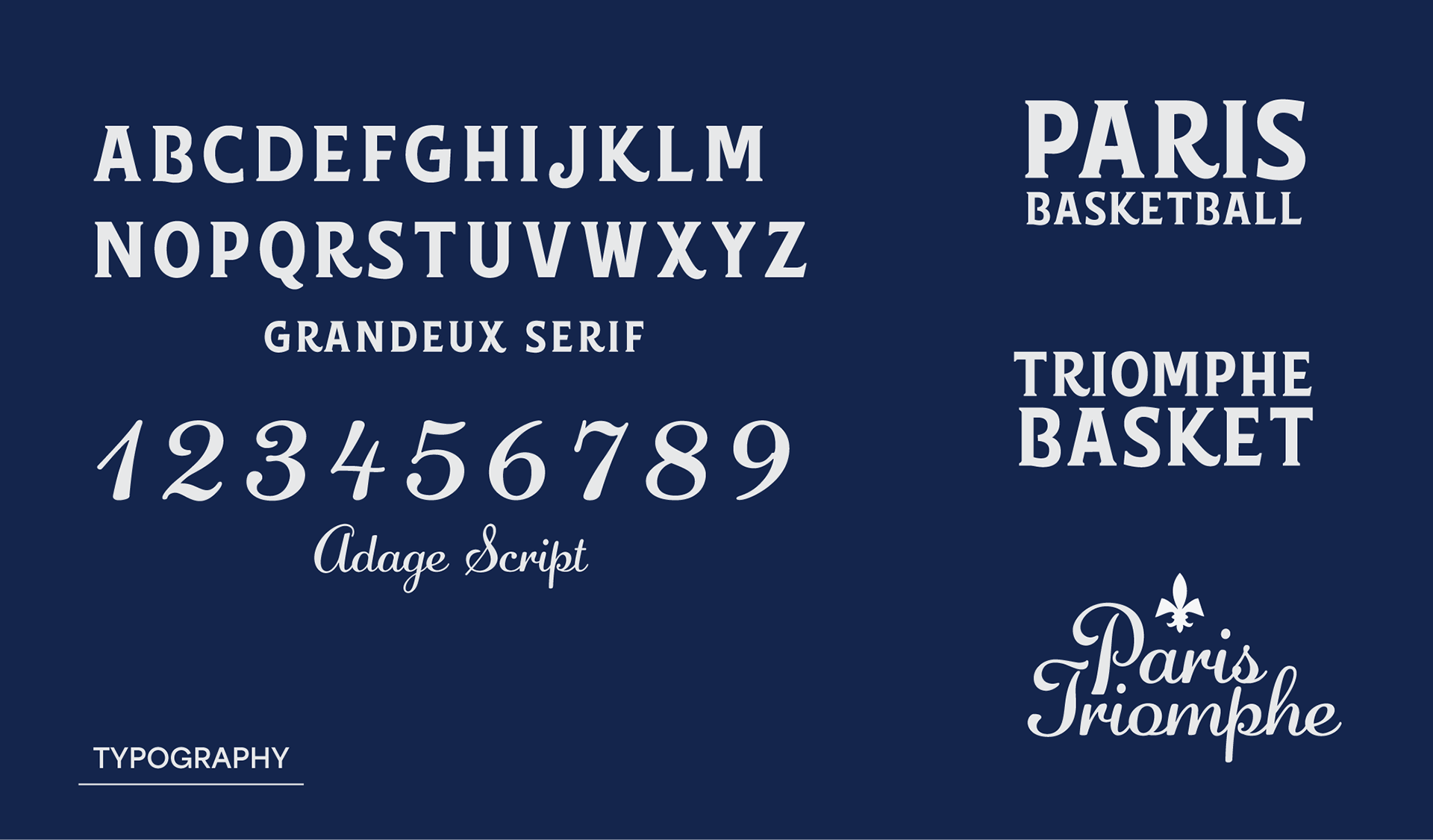
• Typography: I selected DIN Alternate for the typographic system to lean into the brand’s industrial and administrative roots. Its clean, functional structure mirrors the technical specs found in mid-century military documentation. The result is a high-visibility typeface that provides a sharp, modernist contrast against the high-energy environment of a professional basketball arena


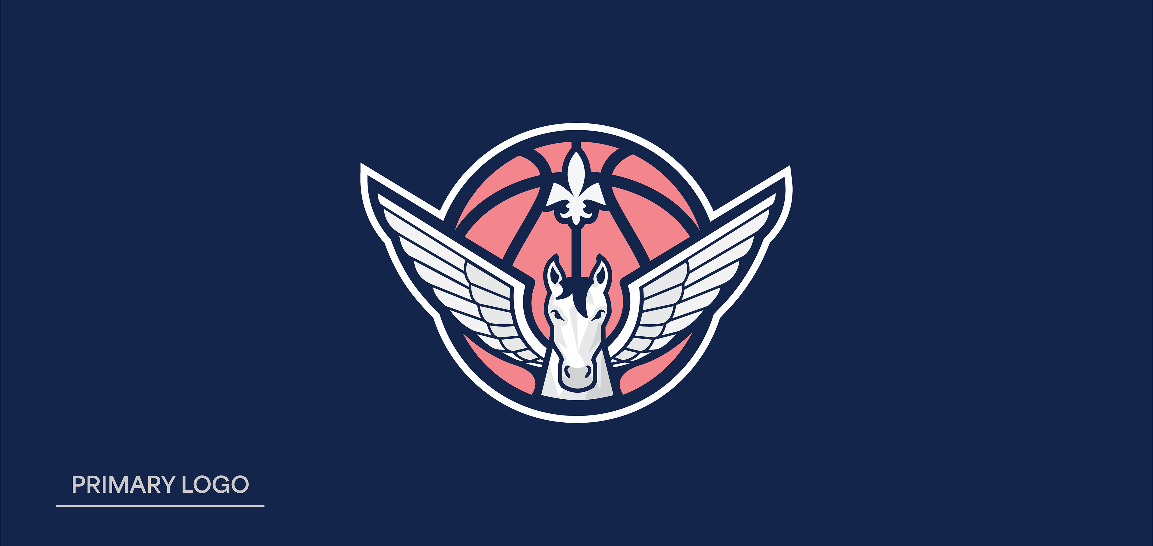
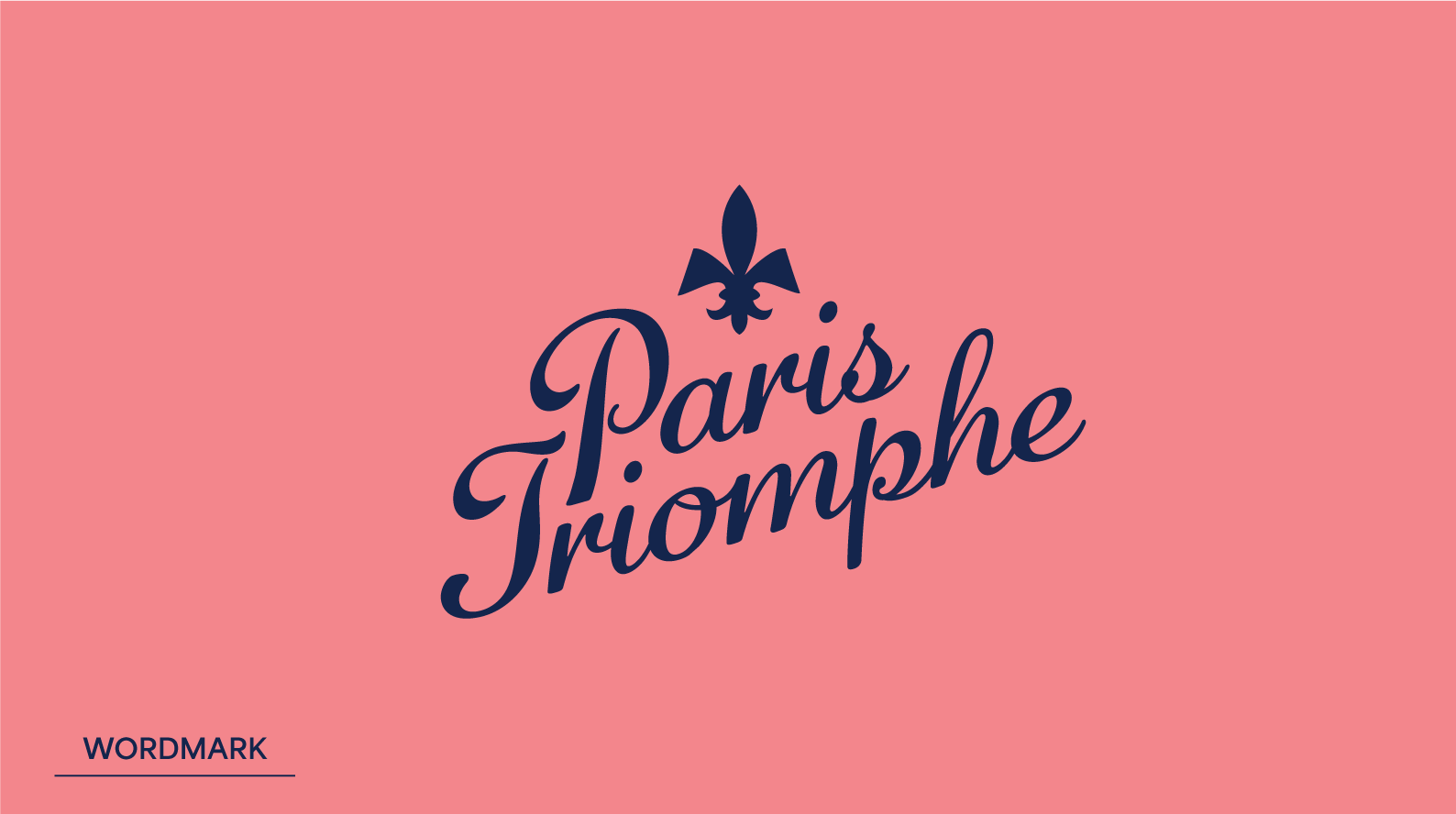
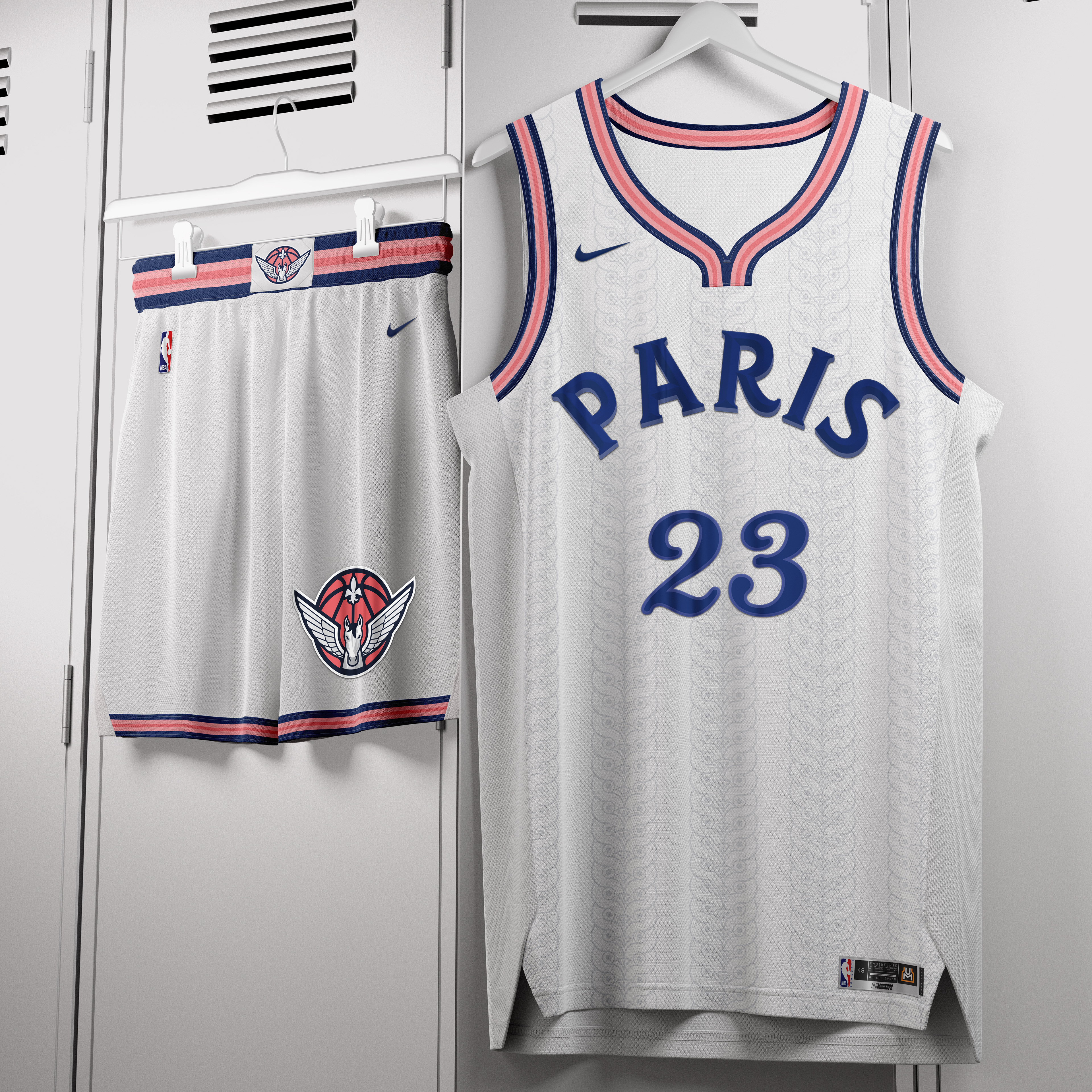
PARIS TRIOMPHE
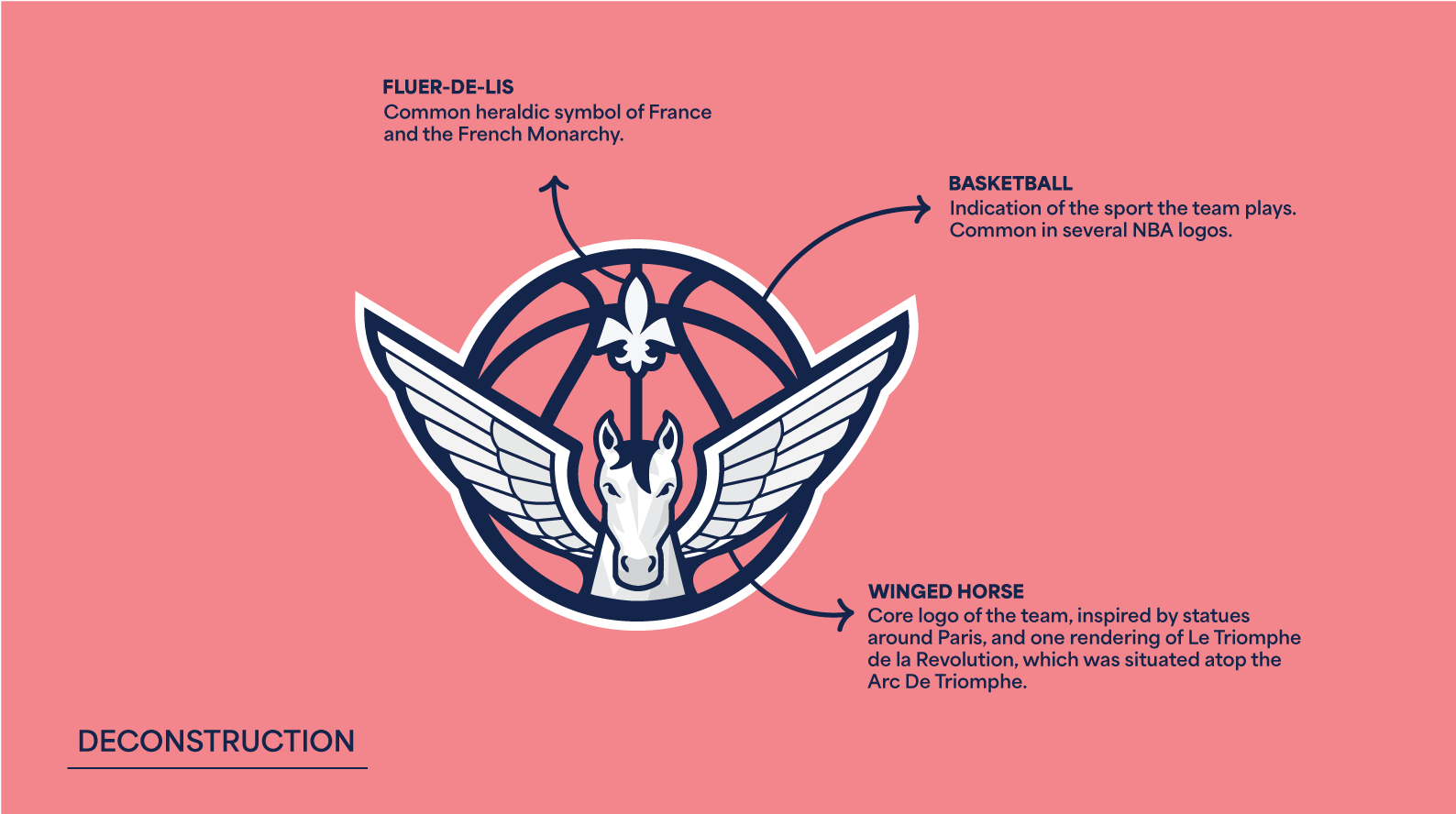
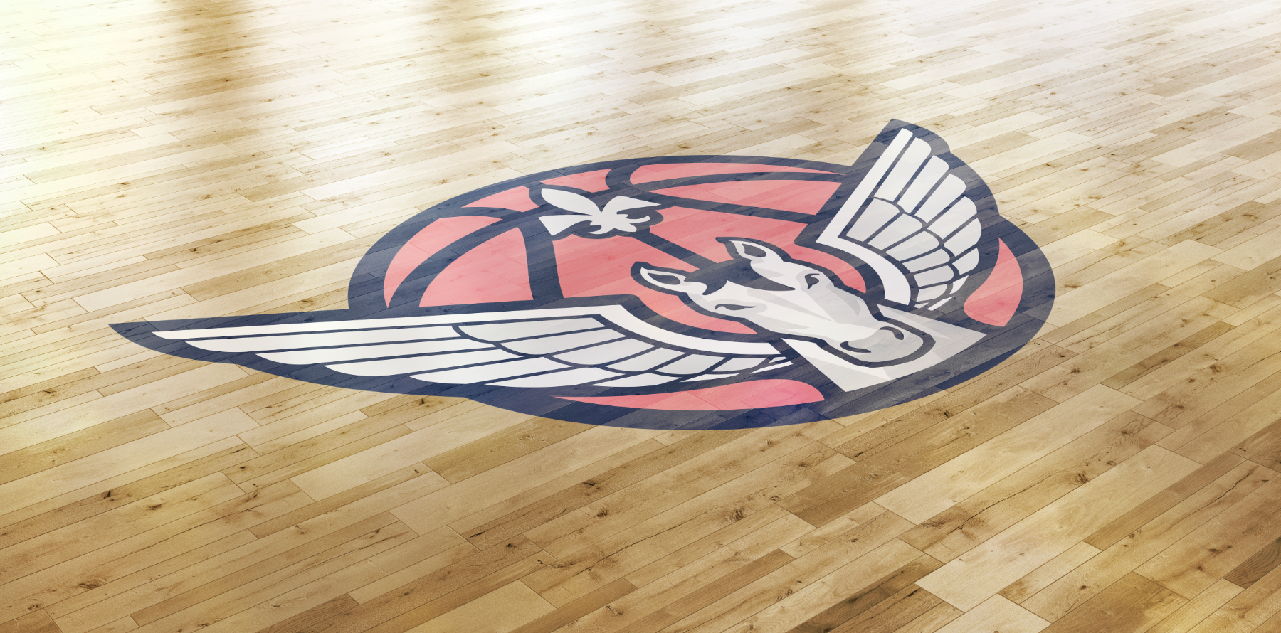
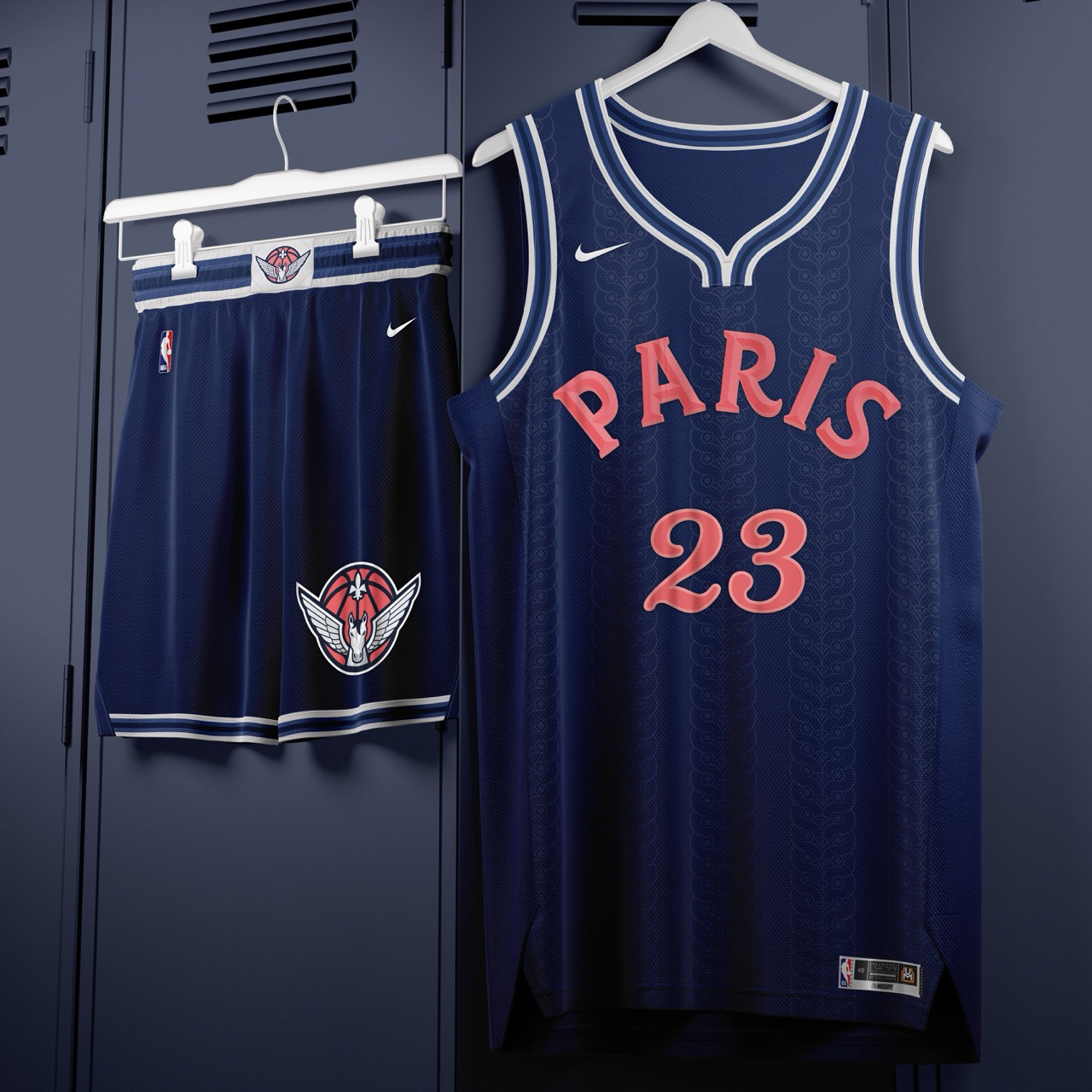
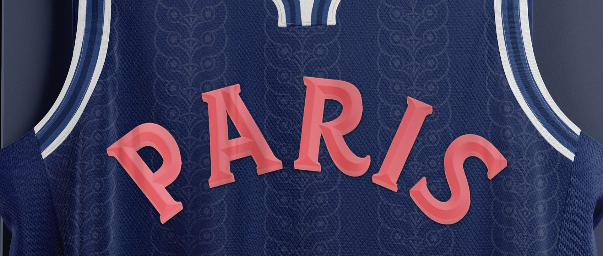
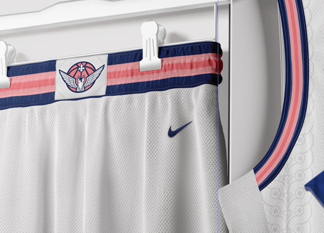
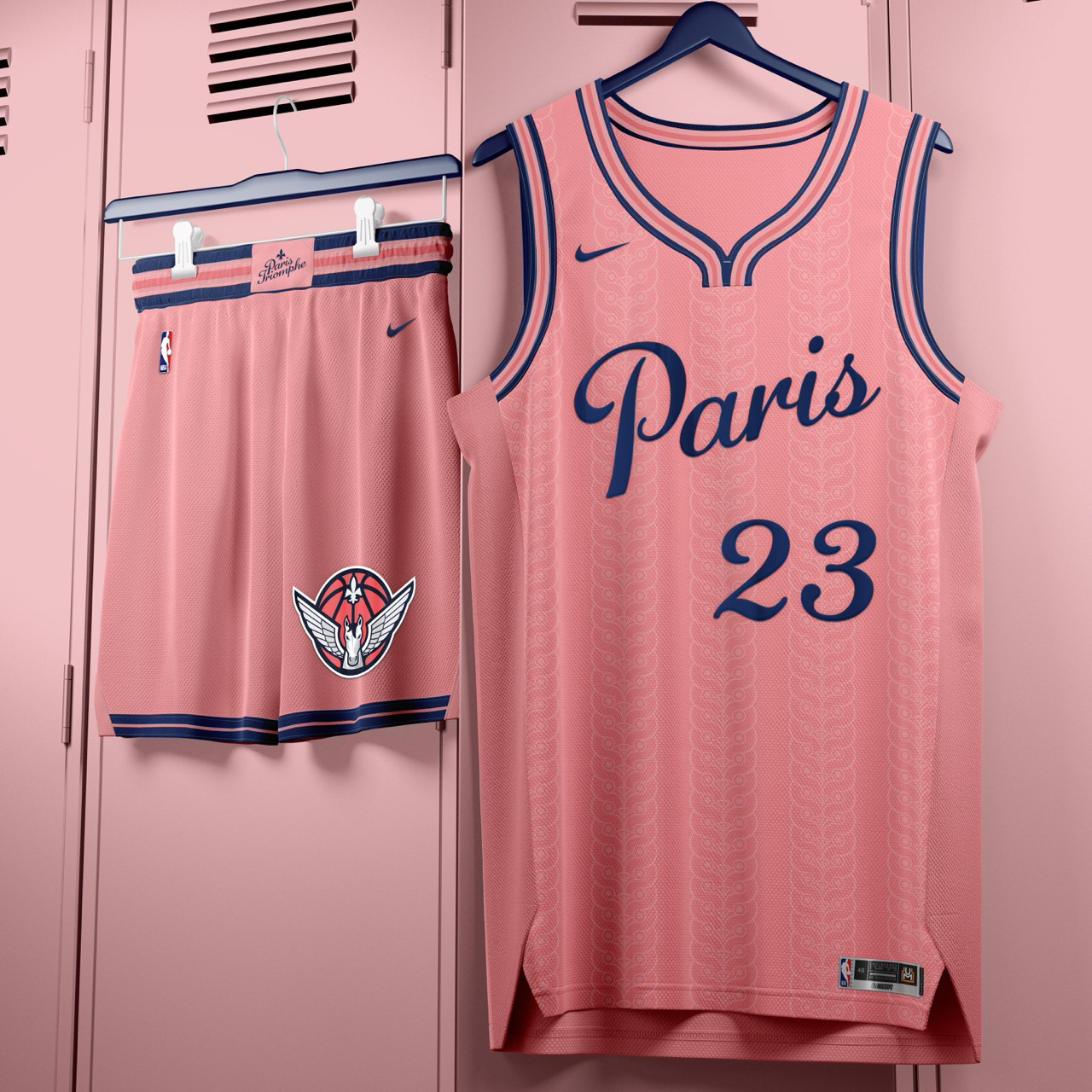
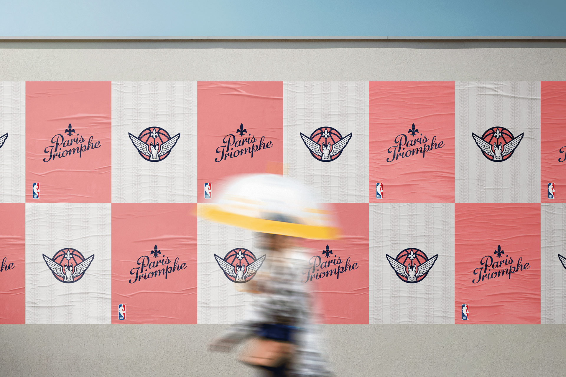
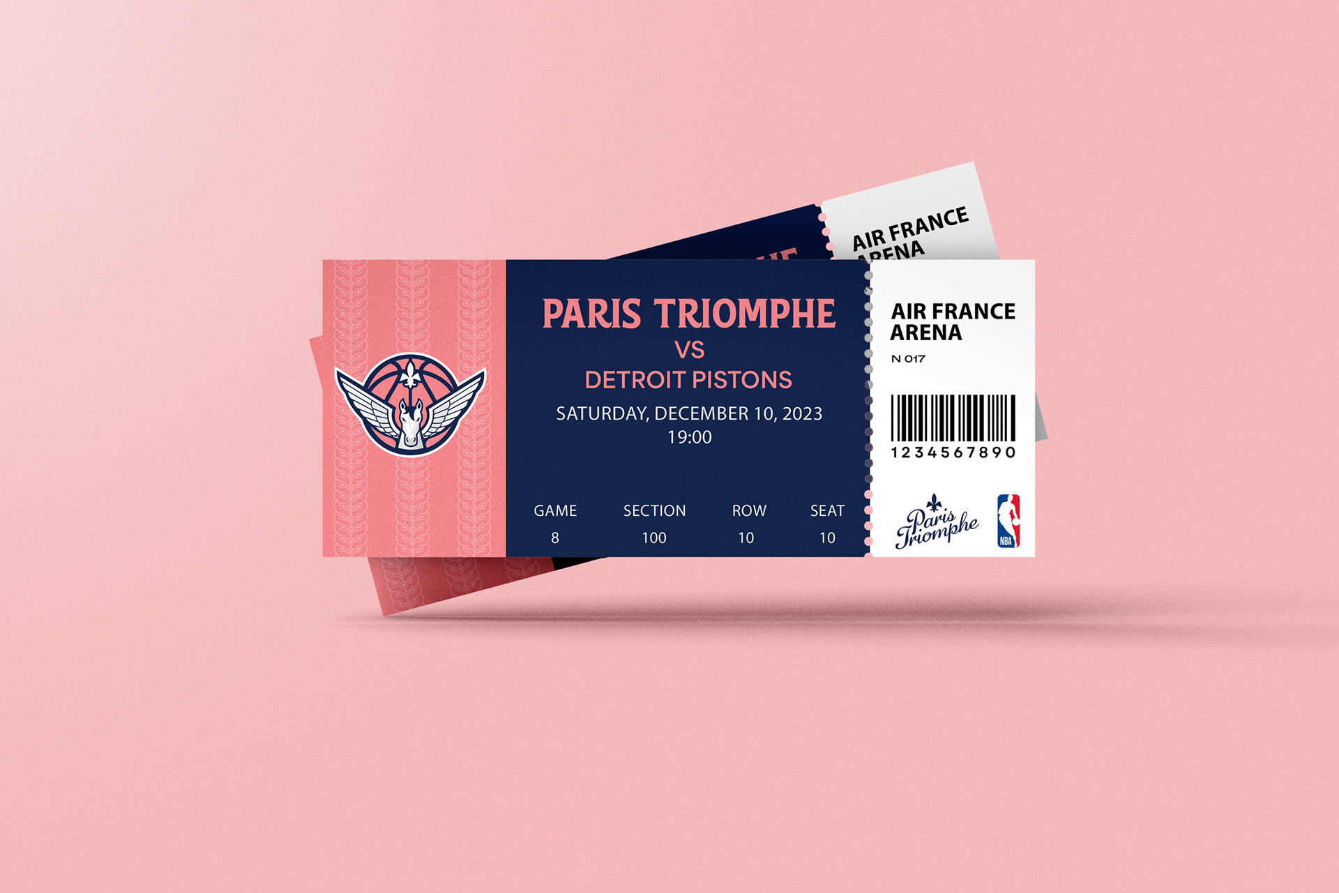
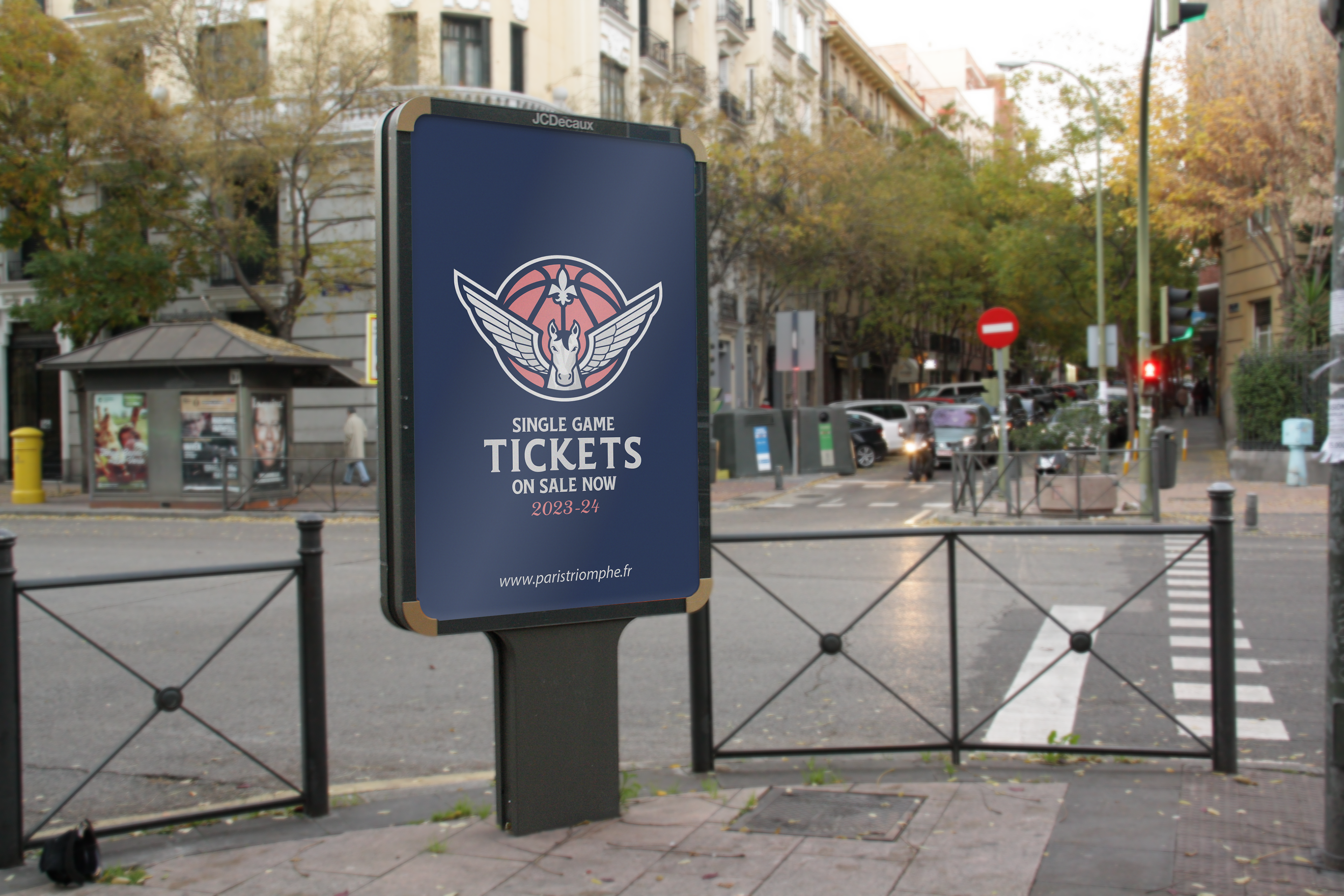
Vision: The objective for the Paris franchise was to engineer an identity that mirrors the city’s status as the global epicenter of luxury, high fashion, and curated French taste. The goal was to synthesize "noble high society" with iconic historical imagery. The moniker "Triomphe" serves as a direct reference to the Arc de Triomphe, while the visual identity centers on the Pegasus- a mythological symbol of divinity, achievement, and legacy that appears in monumental sculpture throughout the city.
Highlights and Logic:
• The Pegasus Insignia: The primary mark features a symmetrical, front-facing Pegasus integrated with a basketball. A Fleur-de-lis is set precisely within the seams of the ball, creating a balanced, heraldic emblem. This rigorous symmetry provides the sophisticated crest aesthetic necessary for a premium Parisian brand.
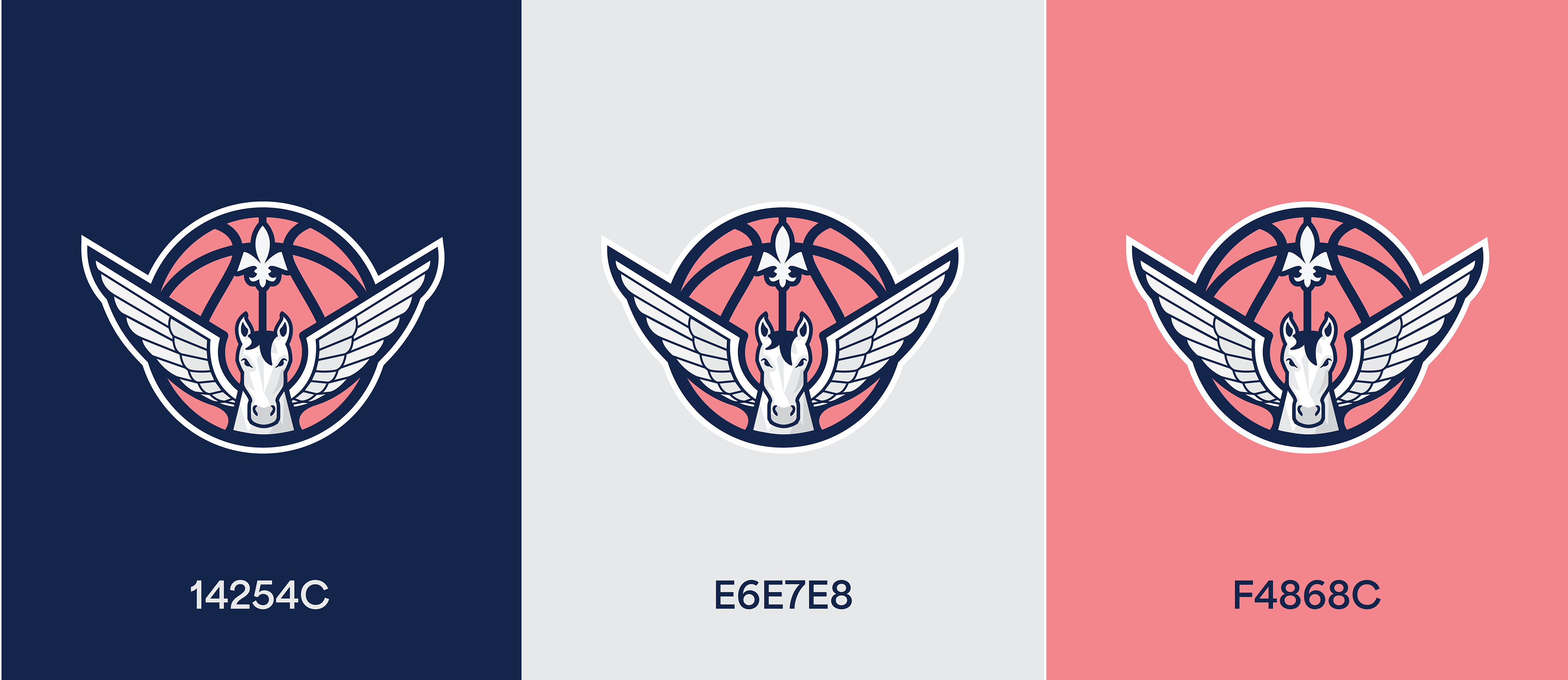
• Color Palette: I moved away from the literal colors of the French flag in favor of a soft salmon and deep navy palette. This high-contrast pairing offers an instantly recognizable, high-class feel that provides a sophisticated nod to the city’s most famous sports institution, Paris Saint-Germain, while establishing a unique lane within the NBA.
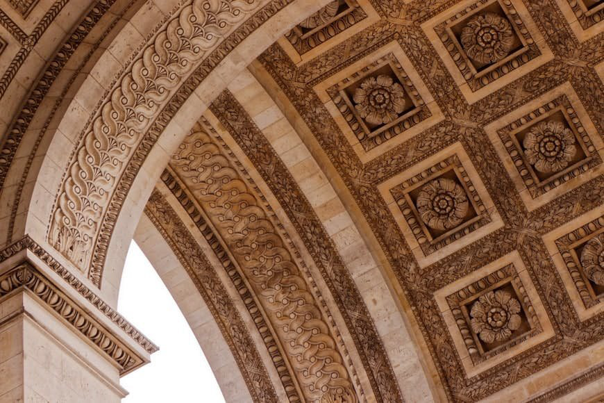
• Pattern work: The jerseys feature an intricate, tonal pattern derived from the ornate stone coffers of the Arc de Triomphe’s ceiling. This subtle detail reinforces the brand’s architectural roots and elevates the uniform from standard athletic gear to a fashion garment that fans and collectors will be dying to get their hands on.


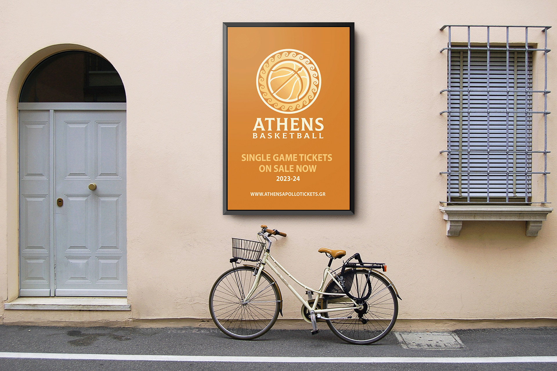
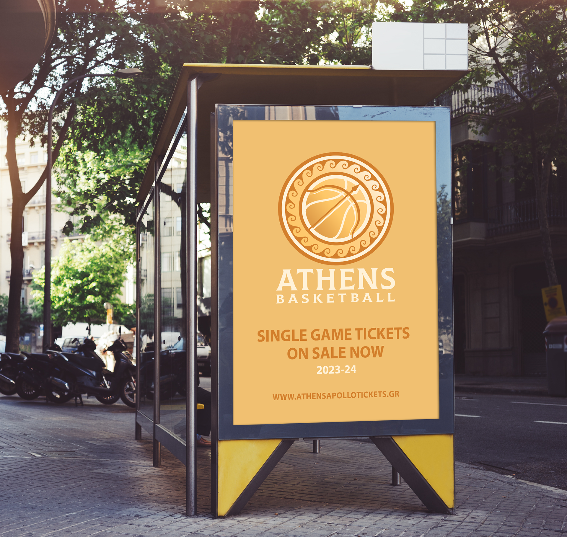
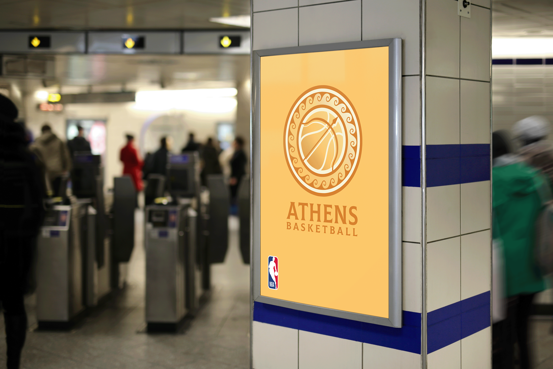
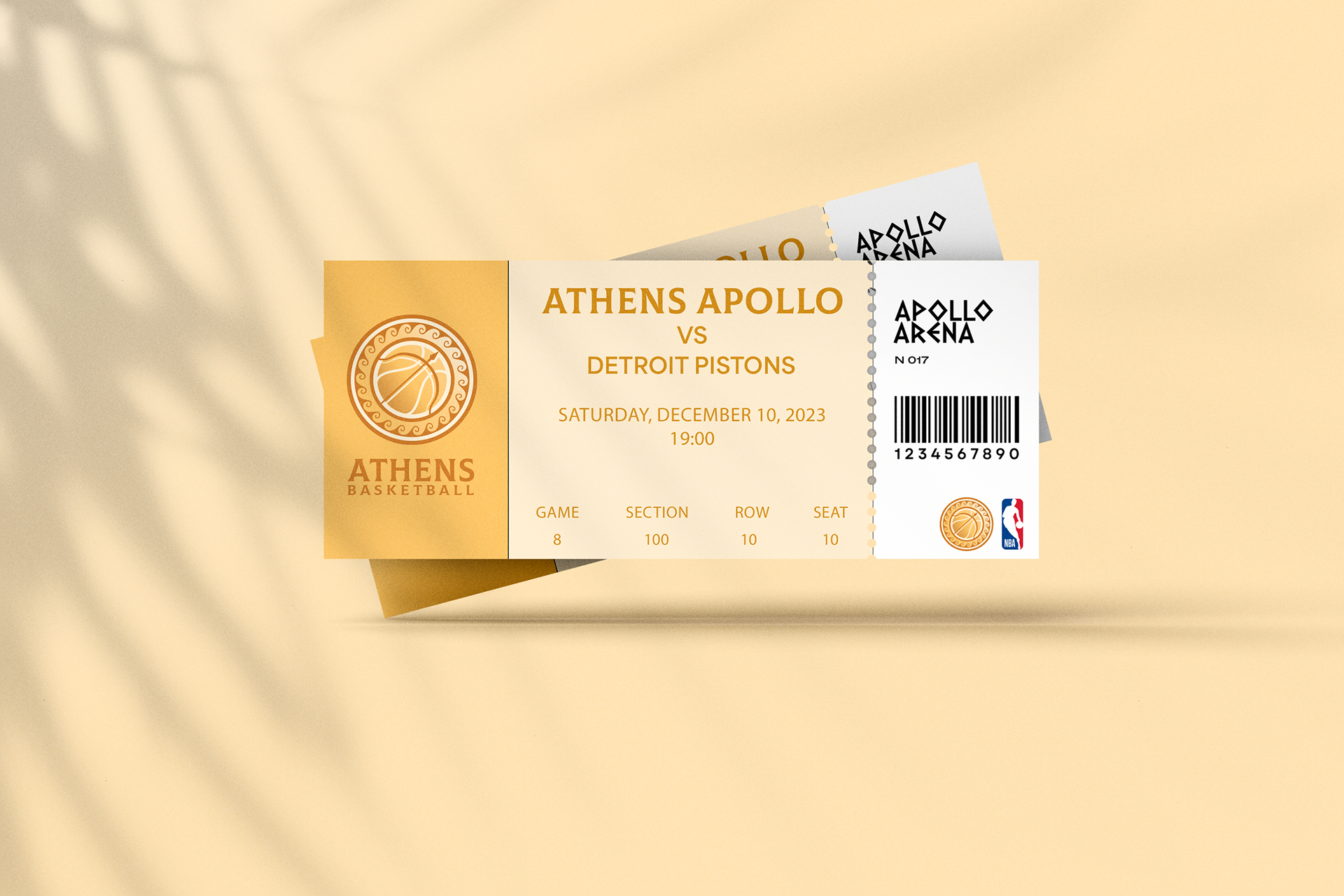
Athens Apollo
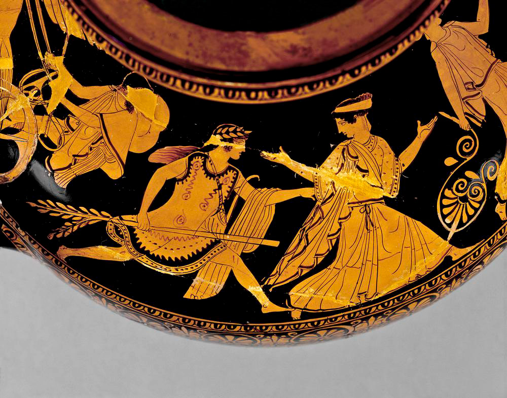
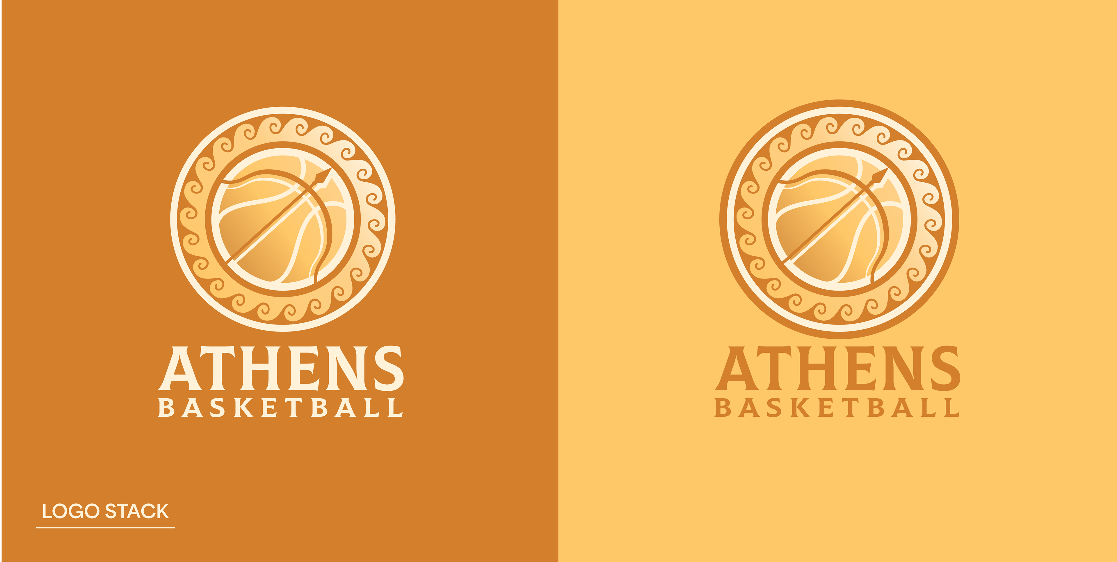
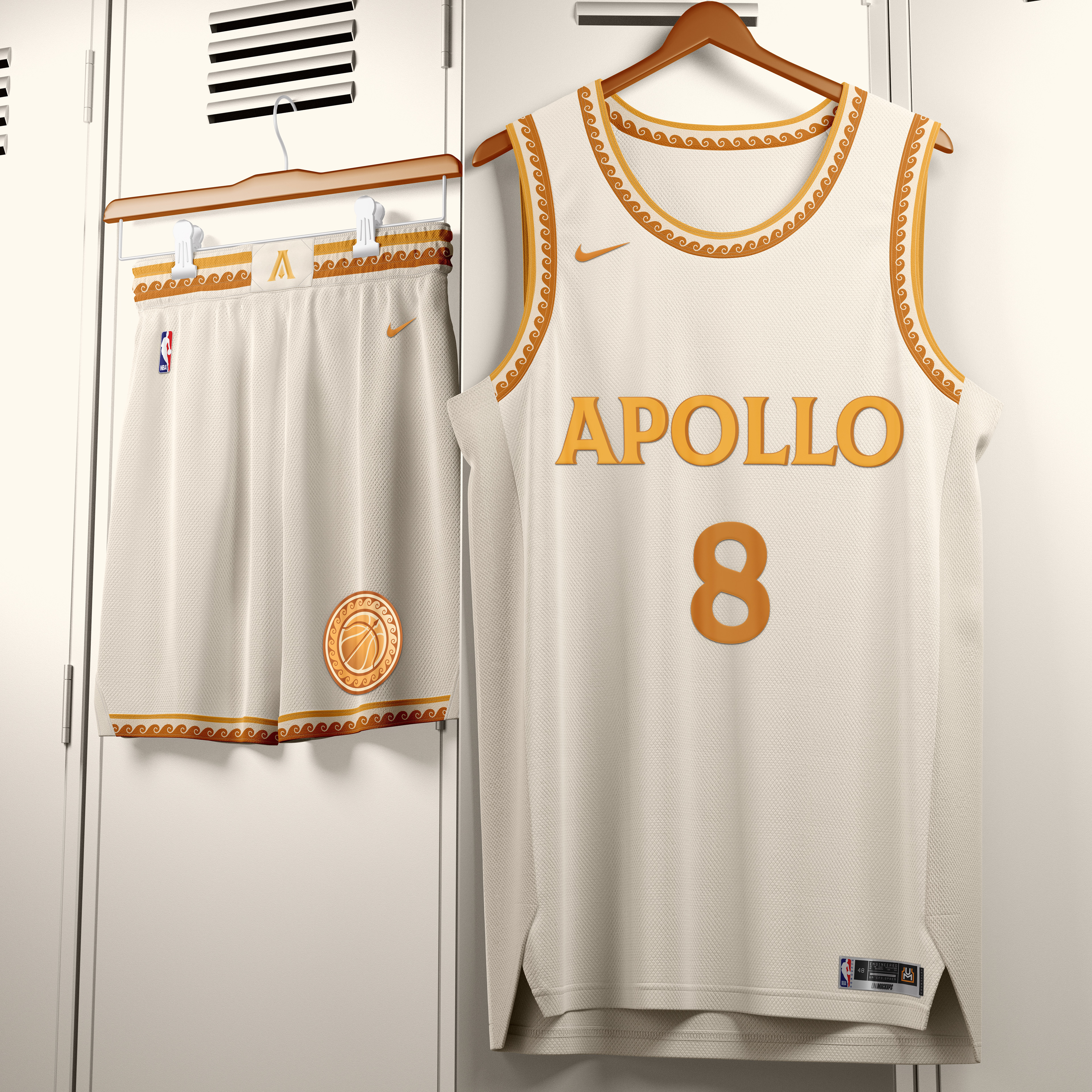
Vision: The goal for the Athens franchise was to create an identity that felt authentically Greek while avoiding overused athletic clichés. By selecting Apollo as the namesake, the brand was designed to feel drenched in gold, emitting a warmth that reflects both the Mediterranean sun and the persona of the Greek God of Archery. The visual language leans into the ornamental beauty of Greek pottery and architecture to create a prestigious, sun-soaked aesthetic.
Highlights and Logic:
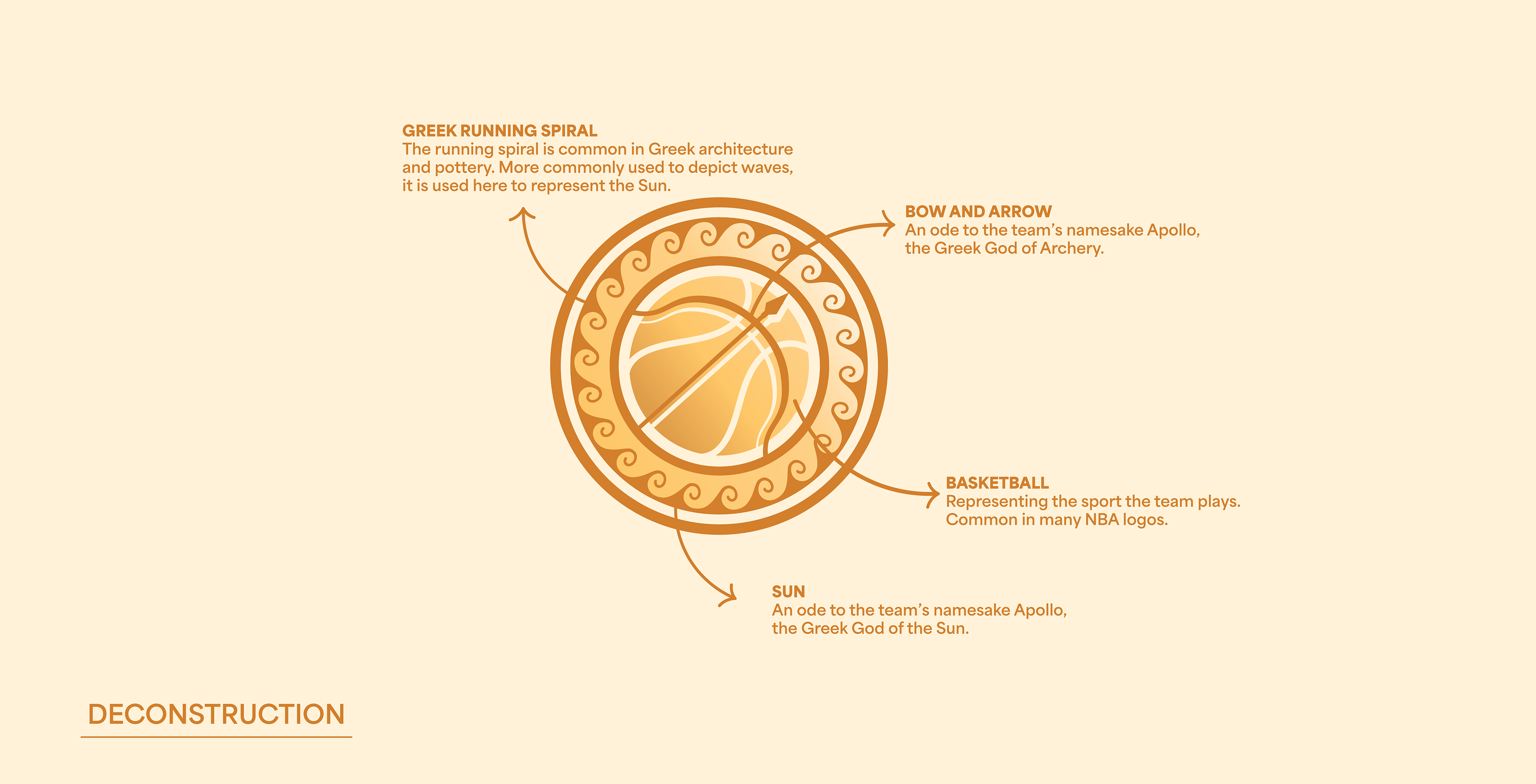
• Running Spiral: The primary logo is framed by a traditional Greek running spiral. This simple, iconic motif serves as a direct nod to ancient pottery and architecture, providing the mark with an unmistakable Hellenic character.
• Bow: Apollo’s bow is built directly into the seams of the basketball. This detail ties the team’s namesake to the sport itself through a seamless, structural integration.
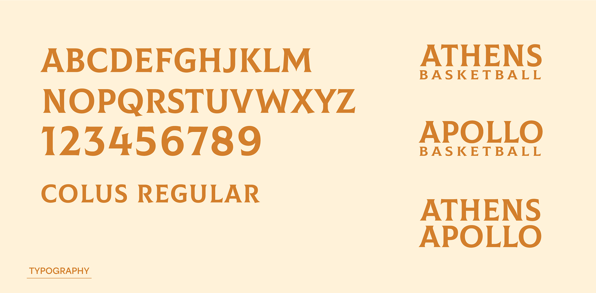
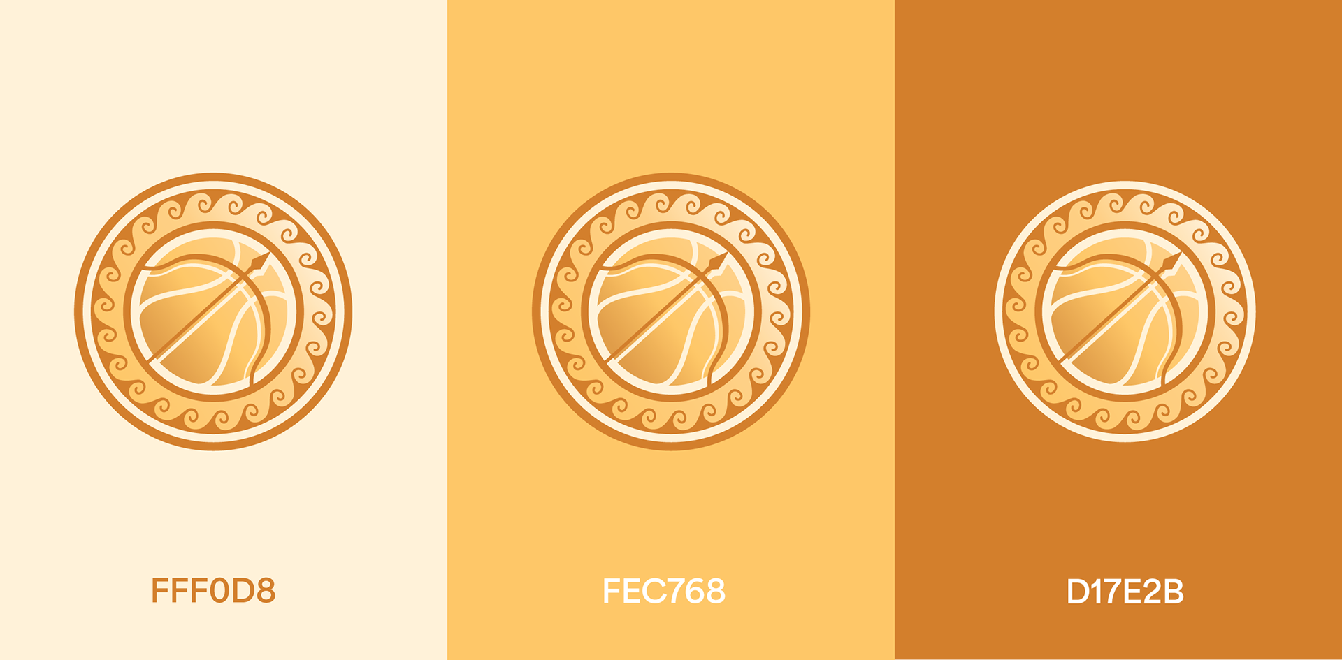
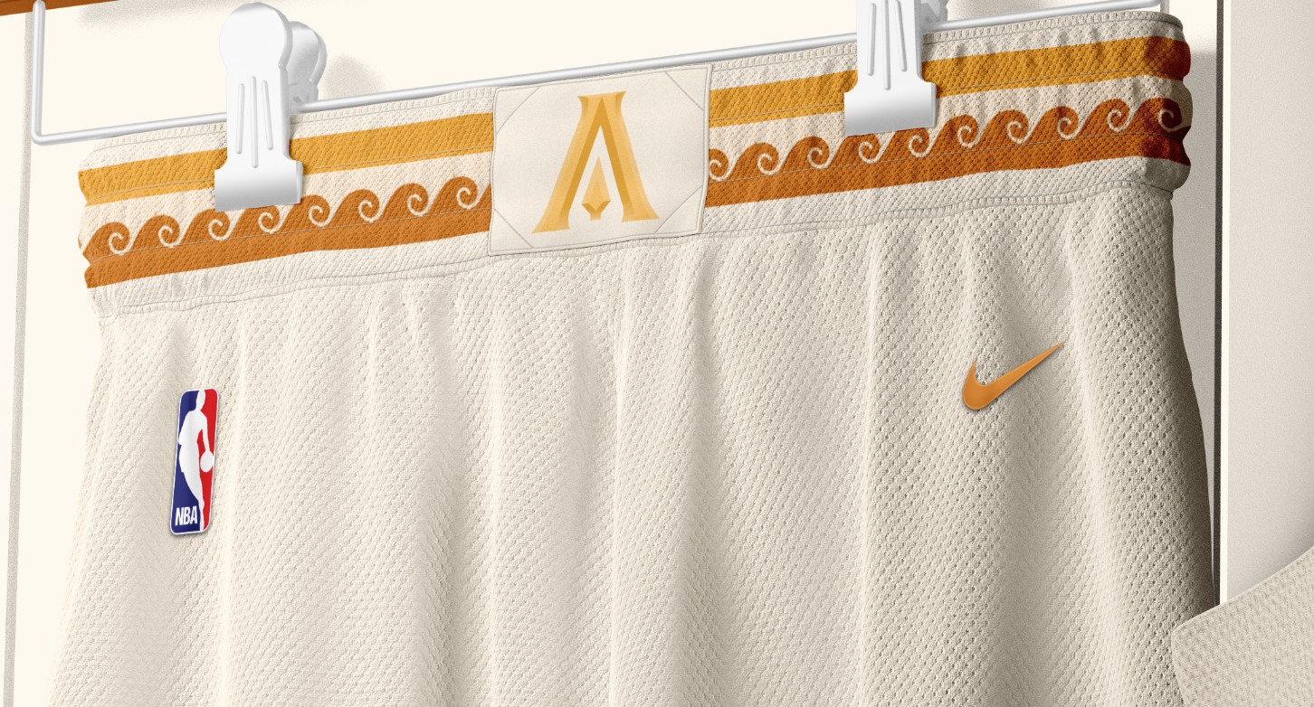
• Color Palette: To achieve the desired warmth, the palette utilizes soft yellows, ochre, and cream. This monochromatic approach captures the essence of bathing in the Mediterranean sun while distinguishing the franchise from every other team in the NBA.
• Secondary Logo: The secondary "A" logo features chiseled edges to mimic ancient stone carvings—an homage to Greece's monumental ruins. An arrowhead is tucked into the negative space of the letter as a final, cohesive tie to the archery theme.