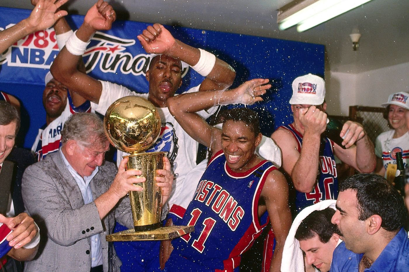
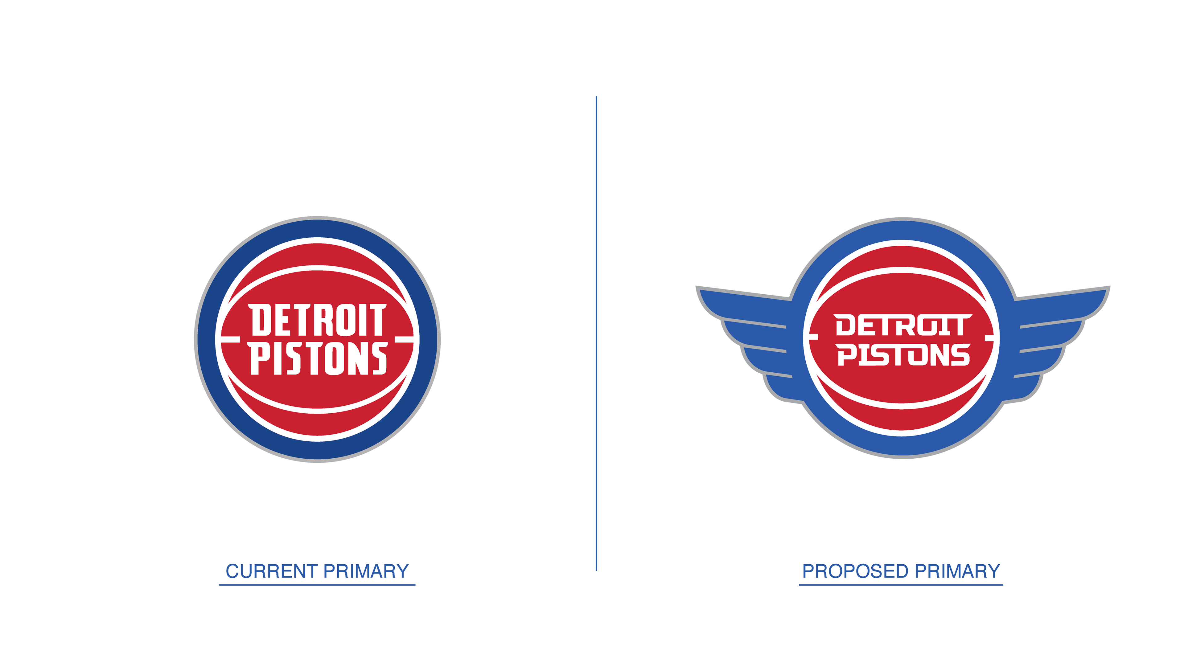
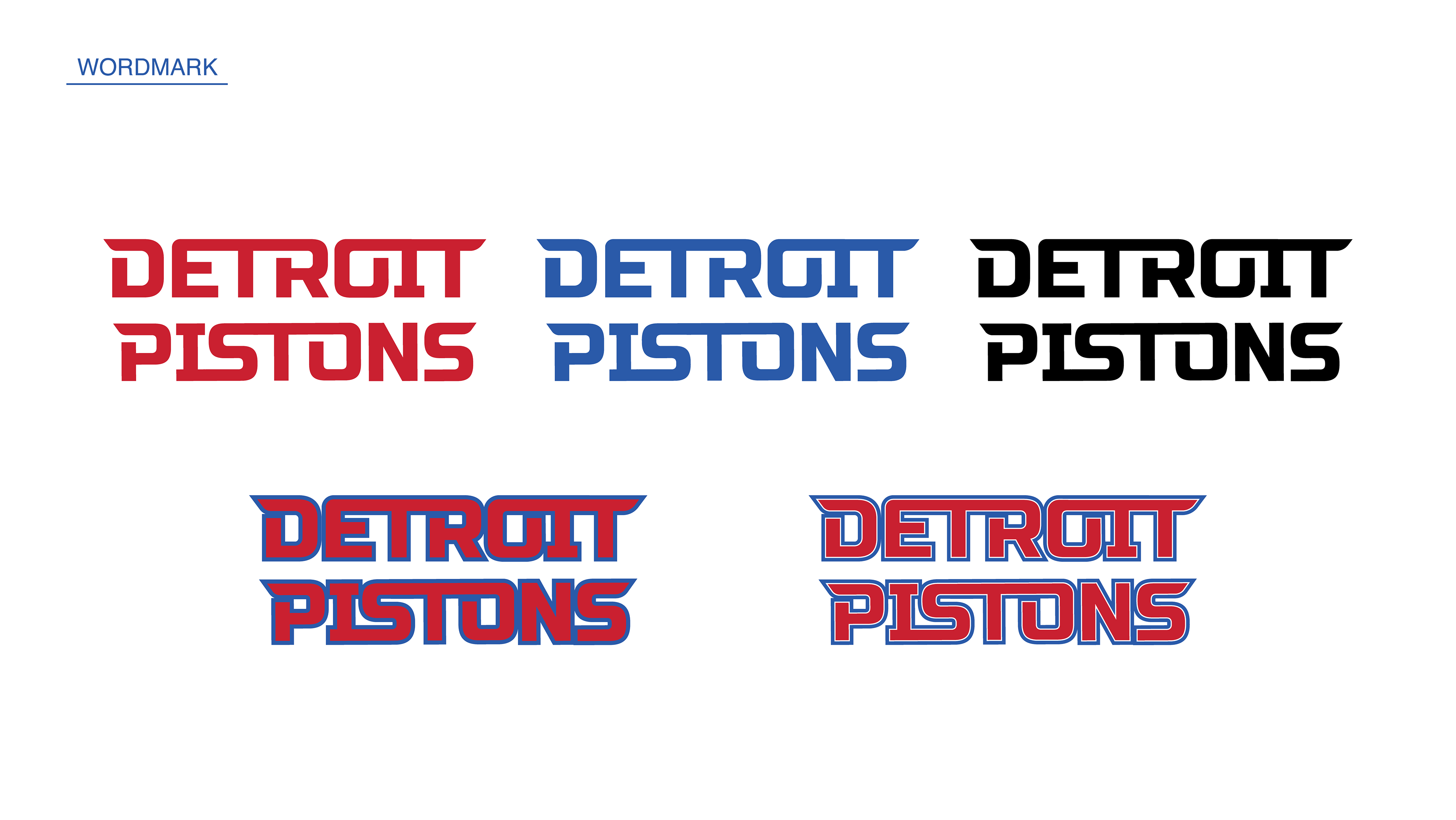
The Detroit Pistons are one of the most storied NBA franchises. They have won three NBA Championships, one of which is the only championship in NBA history where the team did not have a single player named to the NBA Top 75 All-Time list. The current visual identity feels safe. Yes, it looks like a basketball team, but it doesn't look like Detroit's basketball team. The current brand lacks an edge and an insignia that feels like it's uniquely theirs.
The Brief: Reimagine Detroit Pistons' brand elements to better represent the team's namesake and the city it represents. Create a visual identity system that feels unique to the Motor City and lean into automotive heritage that maintains a connection to the deep history of this storied franchise.
The Challenge: The main challenge when attempting a Detroit Pistons rebrand is to not fall back on the 1990's Horsepower/Teal era. These designs, logos, and jerseys are popular among fans and are great for nostalgia, but they are not going to move the brand forward in a sensible manner. It was evident that the current visual system needed to evolve, not simply revert to a previous time period.
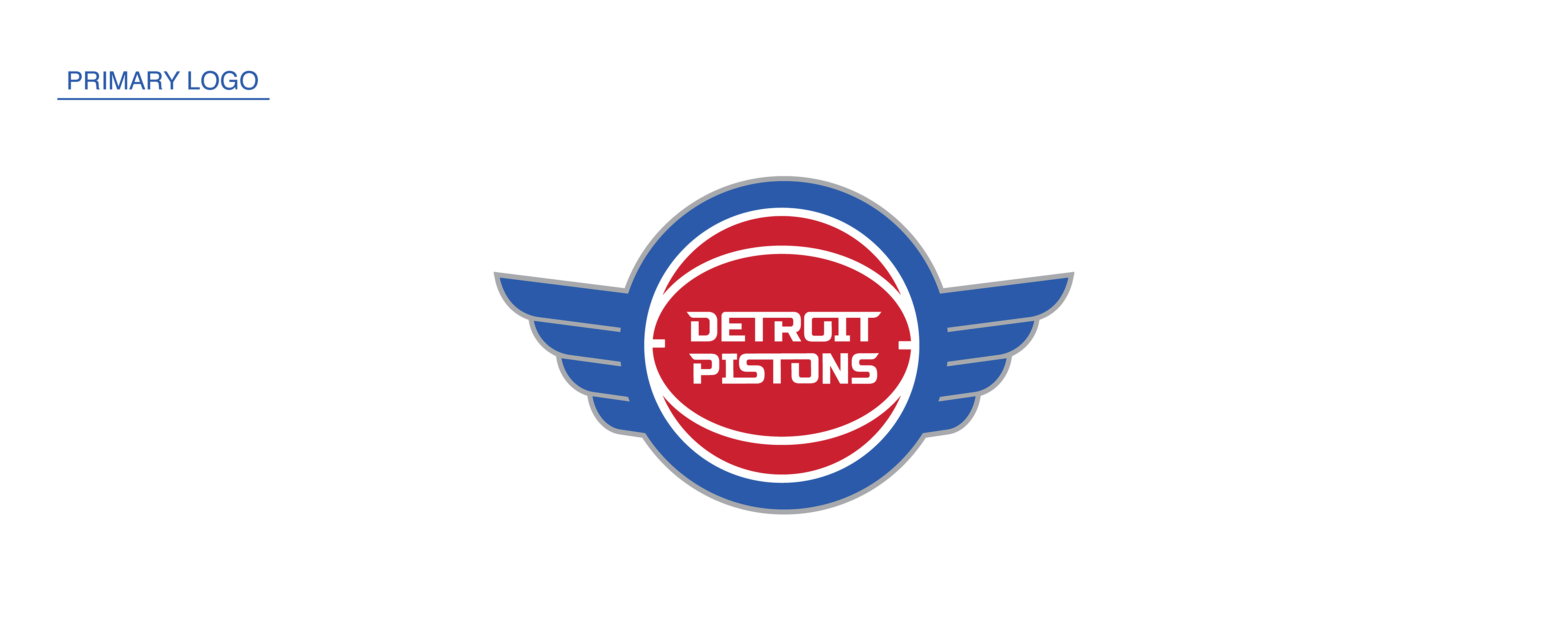
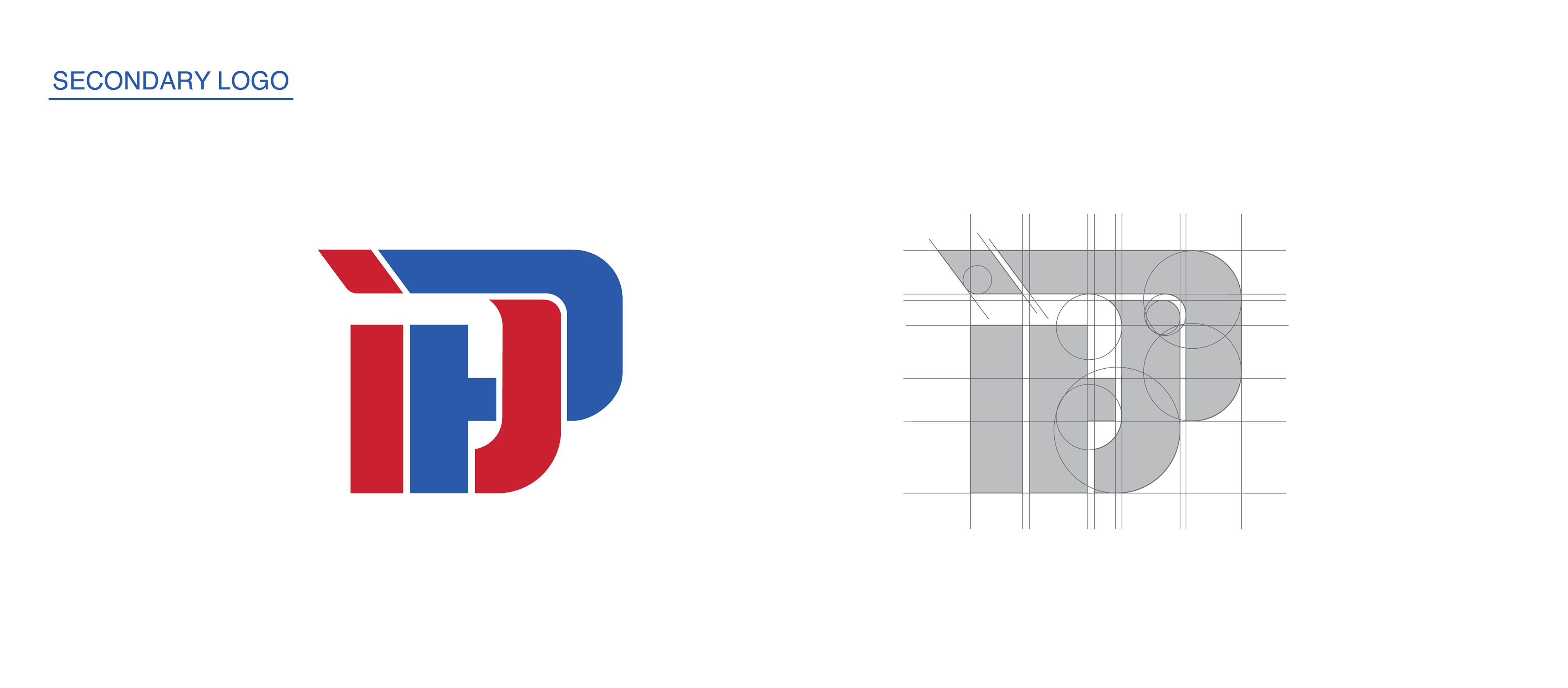
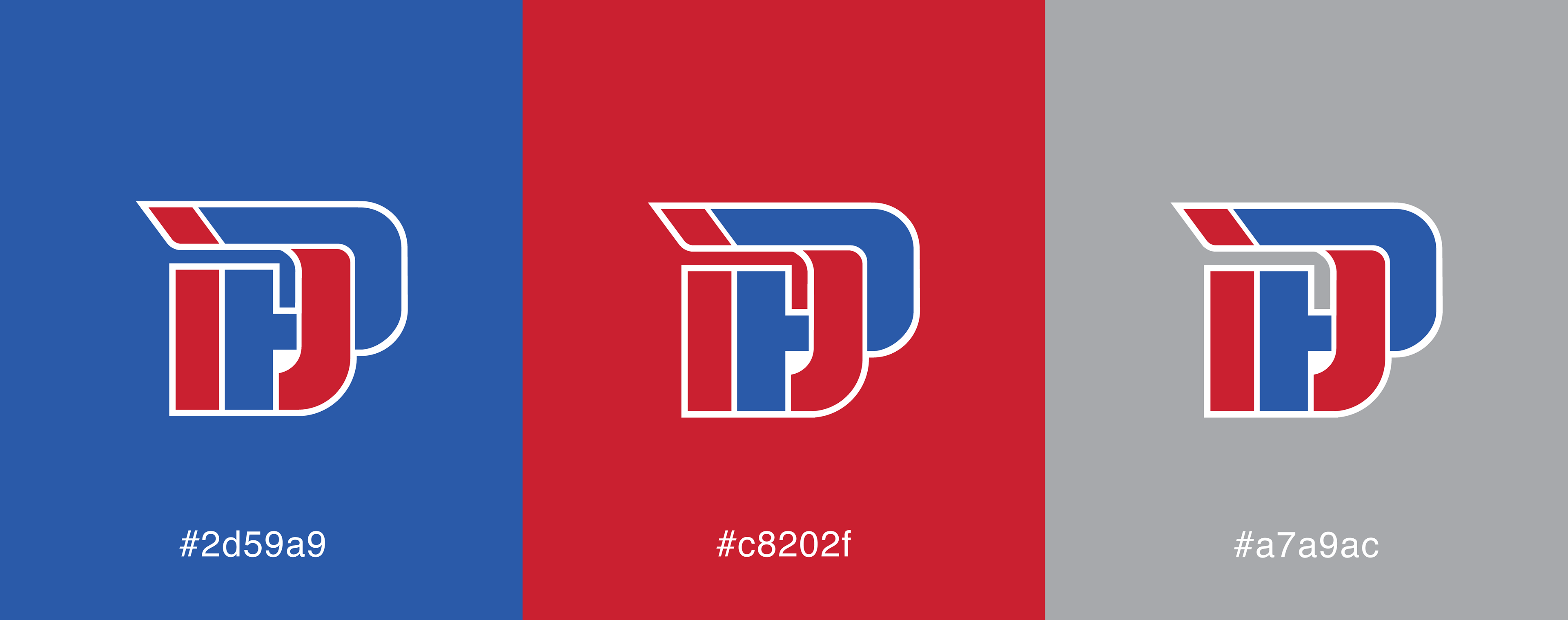
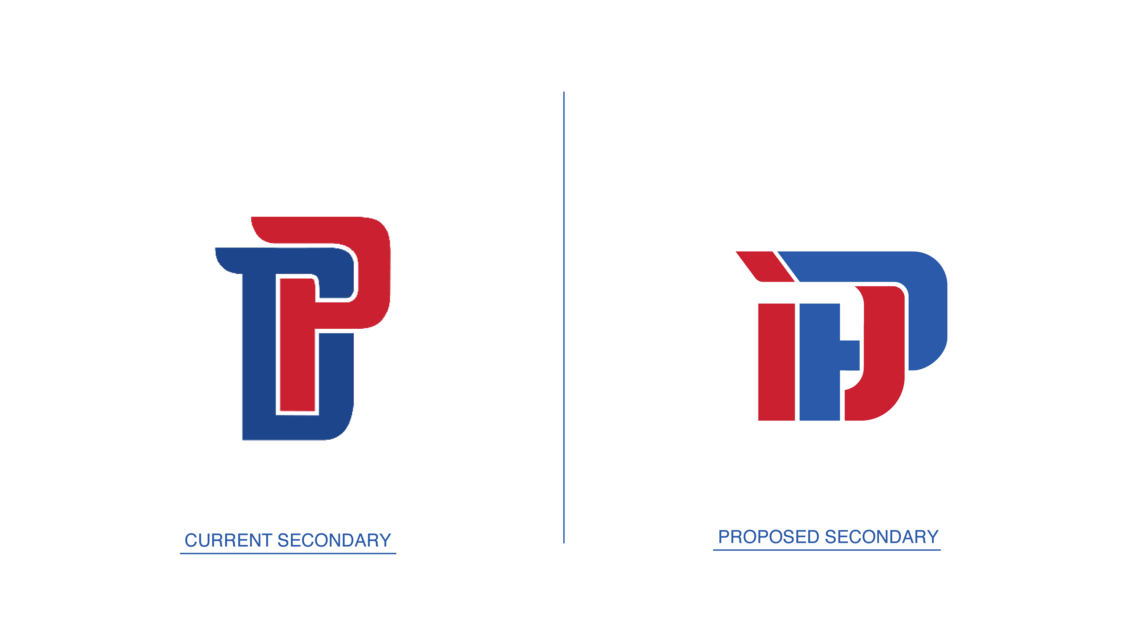
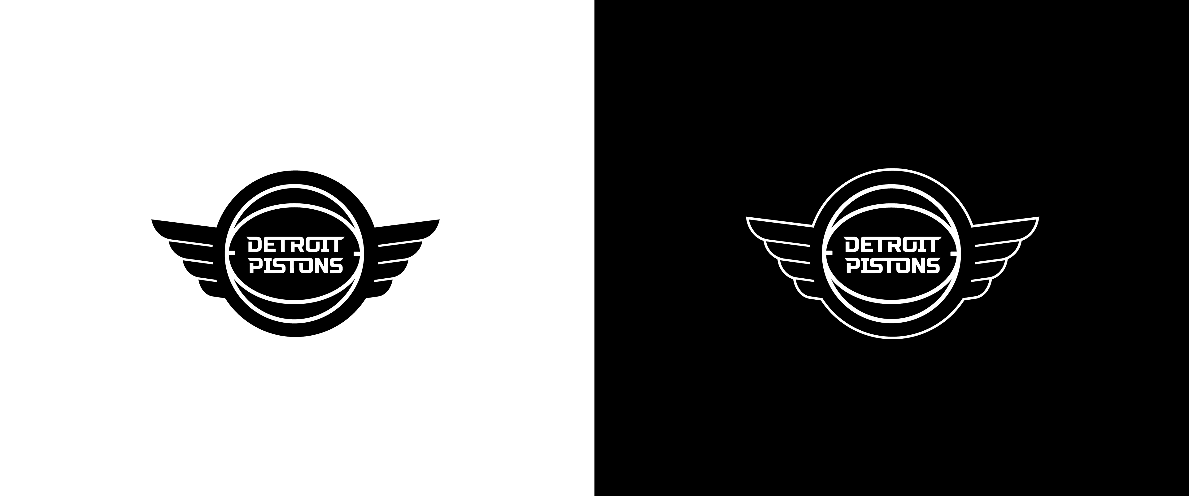
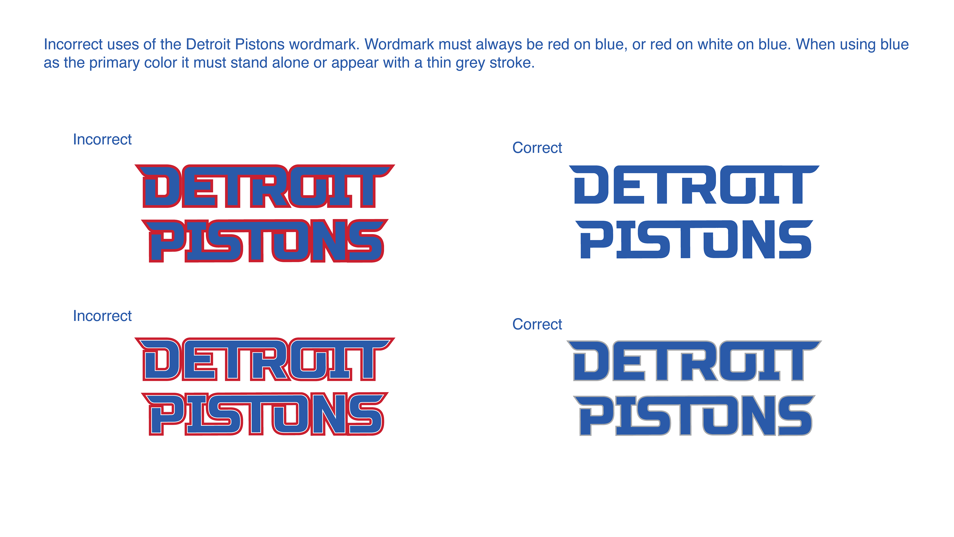
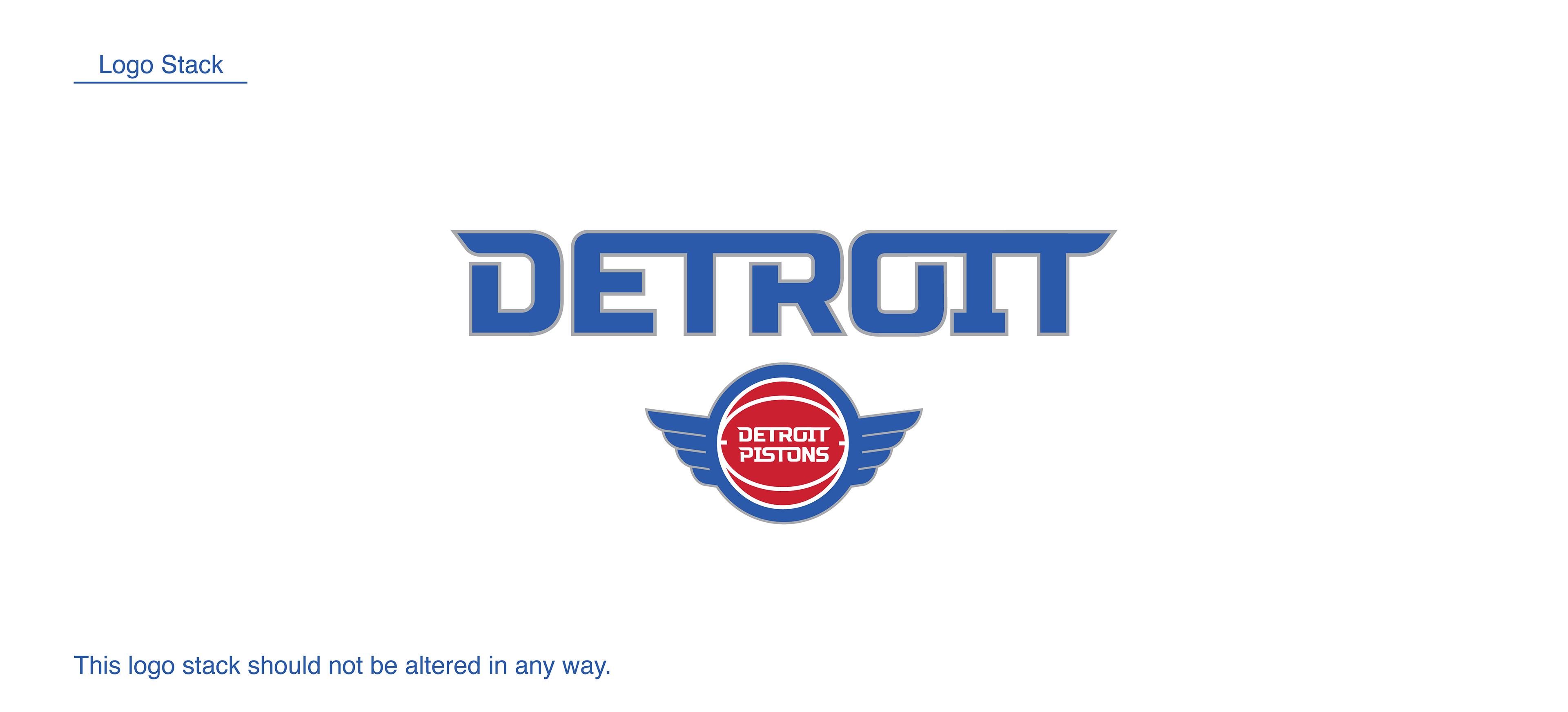
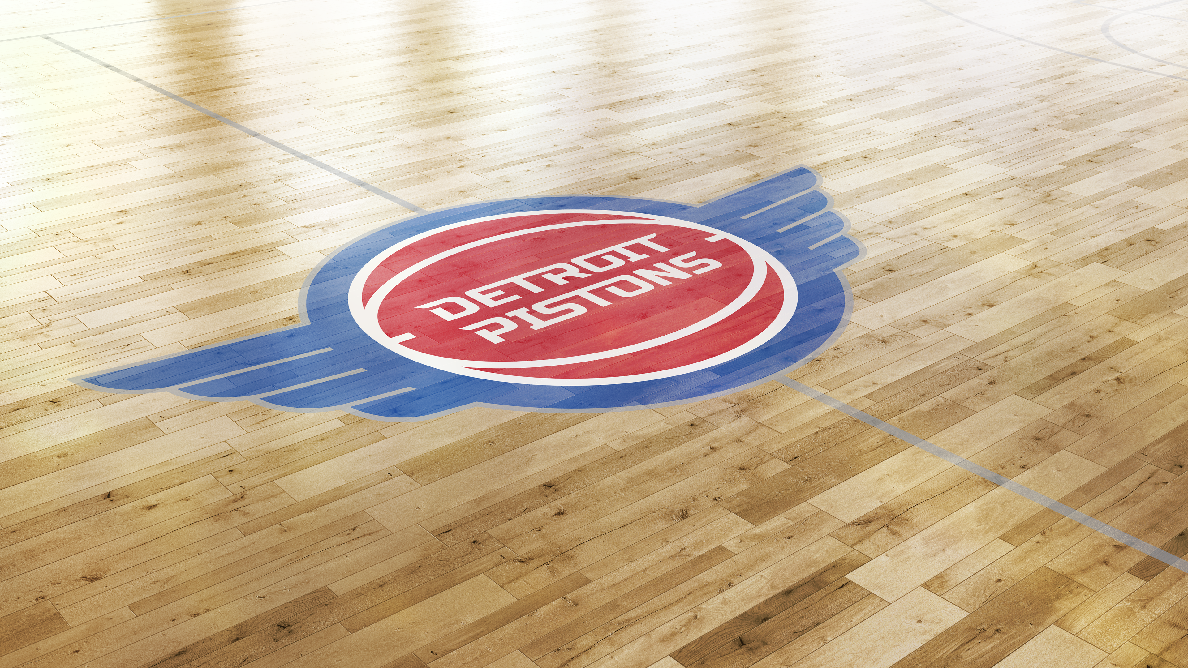
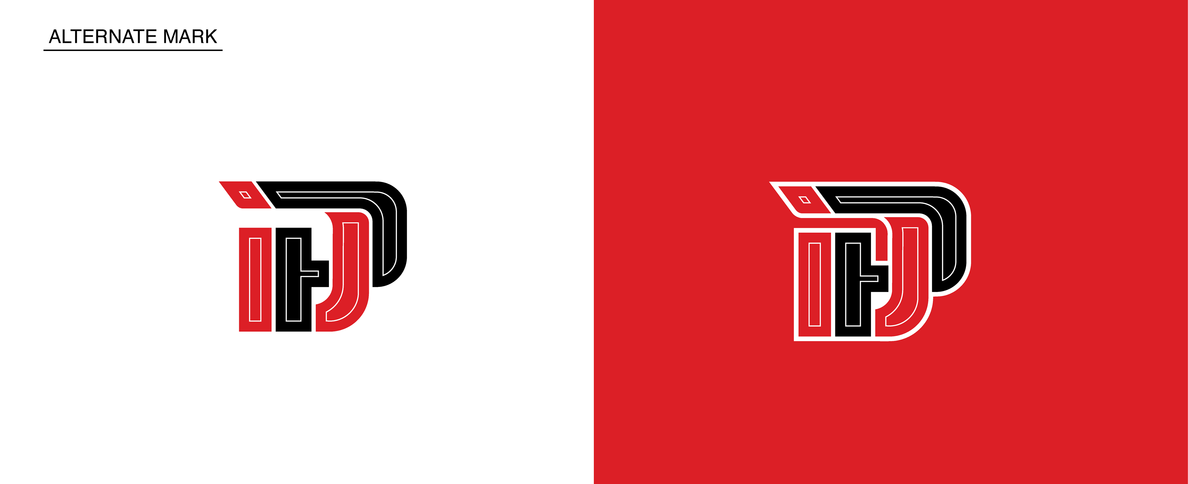
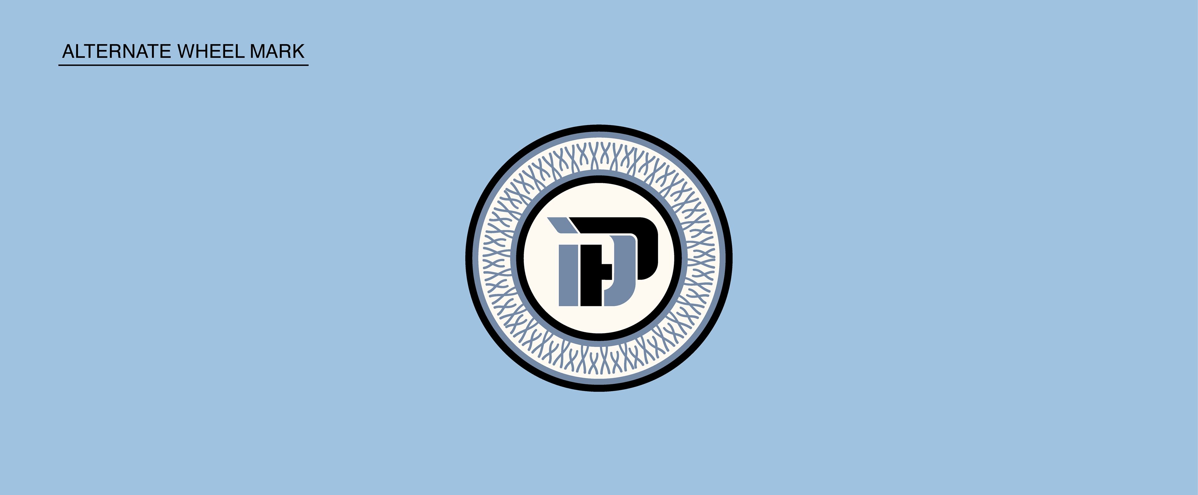
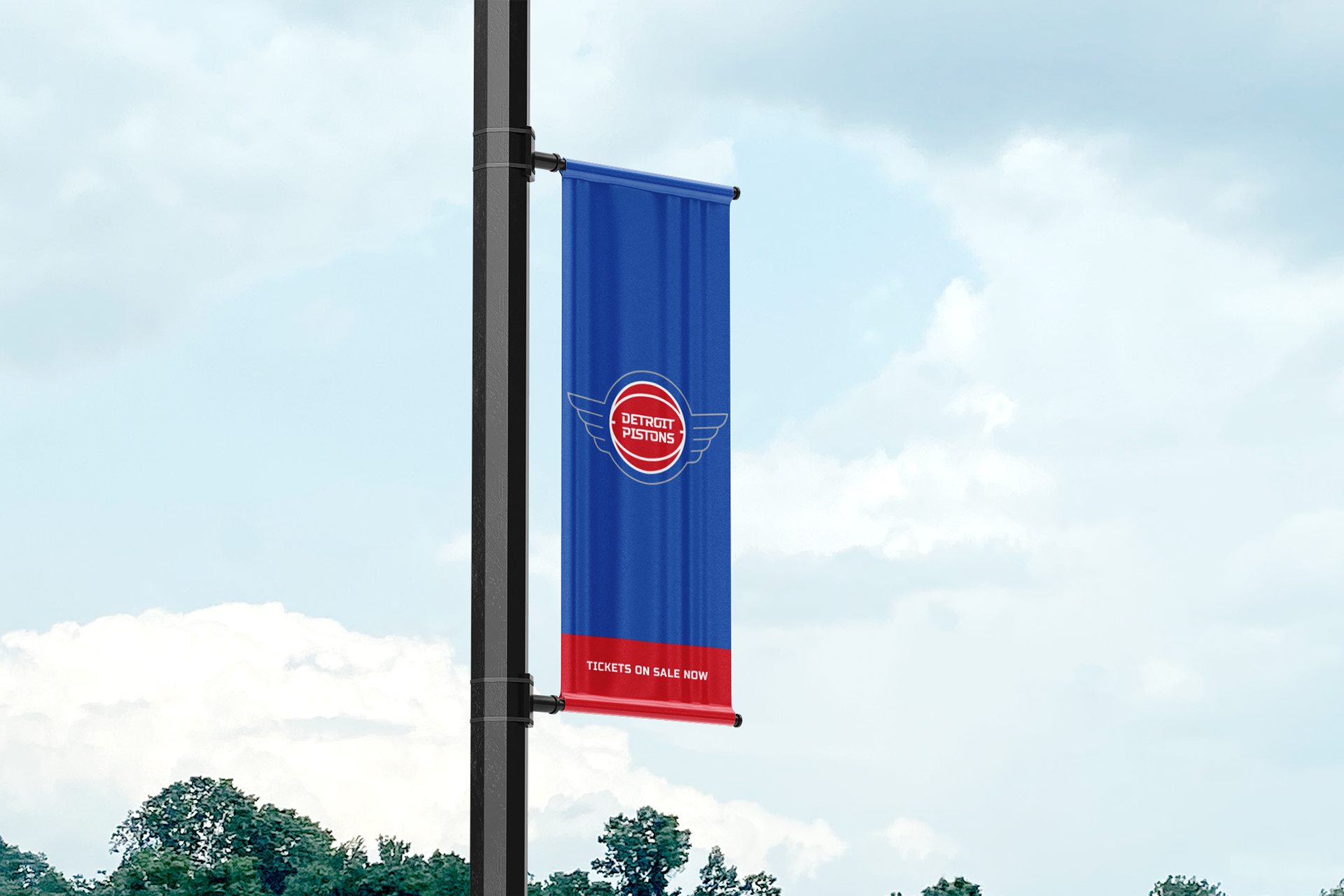
The Result: The final identity system evolves the Detroit Pistons from a static "basketball-in-a-circle" to an instantly recognizable industrial badge that adopts the speed wing architecture of some of the world’s most iconic automotive brands. This evolution grounds the team in the mechanical and industrial prowess of the Motor City, while the wings serve as a constant reminder of humanities greatest achievement - the engine’s ability to conquer the skies - and a signal to our hometown team that with grit and determination, anything is possible.
Furthermore, the winged insignia cements a kinship with Detroit’s broader athletic and industrial heritage; specifically, it provides visual cohesion with the Detroit Red Wings, aligning the city’s two most historic franchises. The resulting brand is anchored by team's classic roundel which preserves the franchise's DNA while shifting it into a more proprietary space.

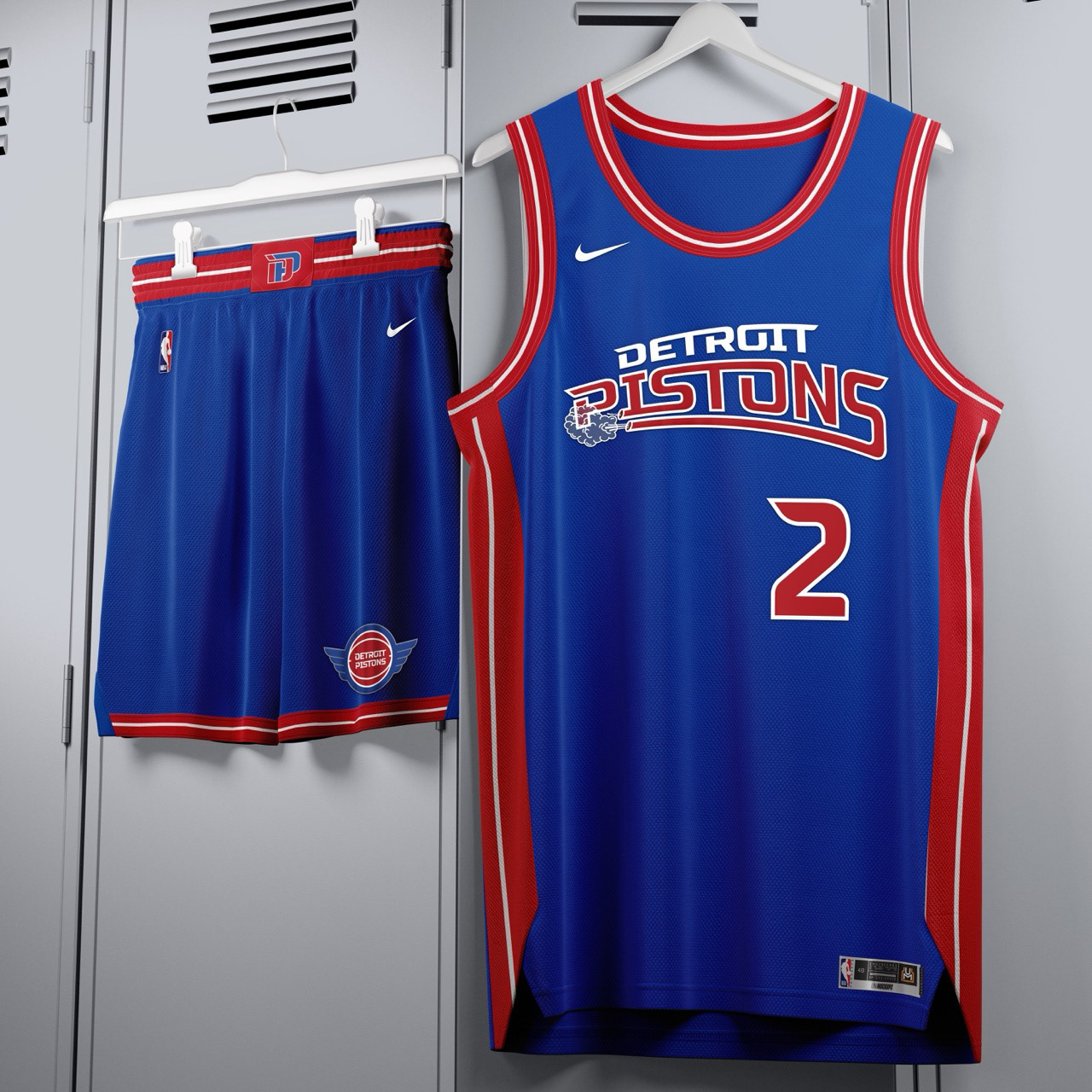

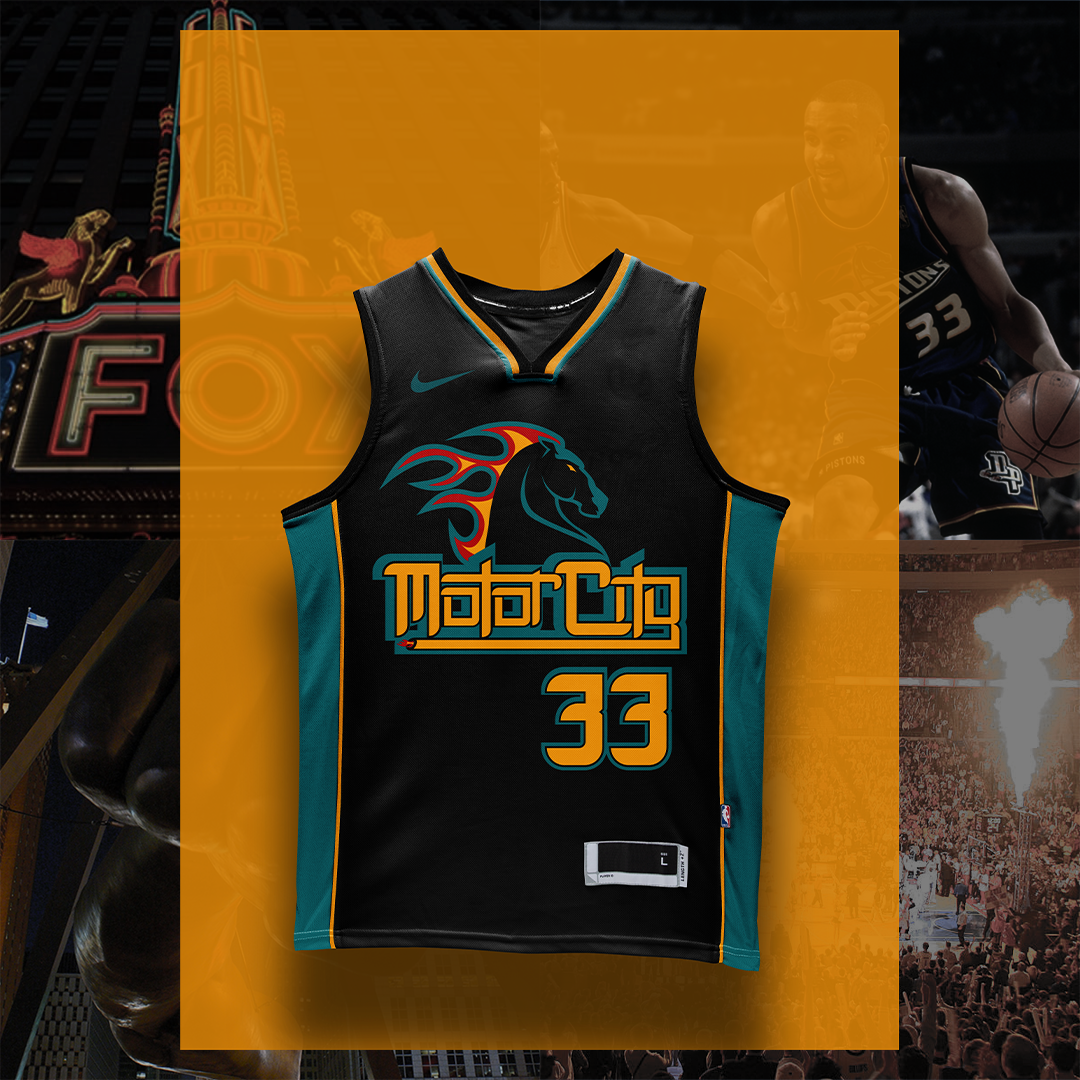
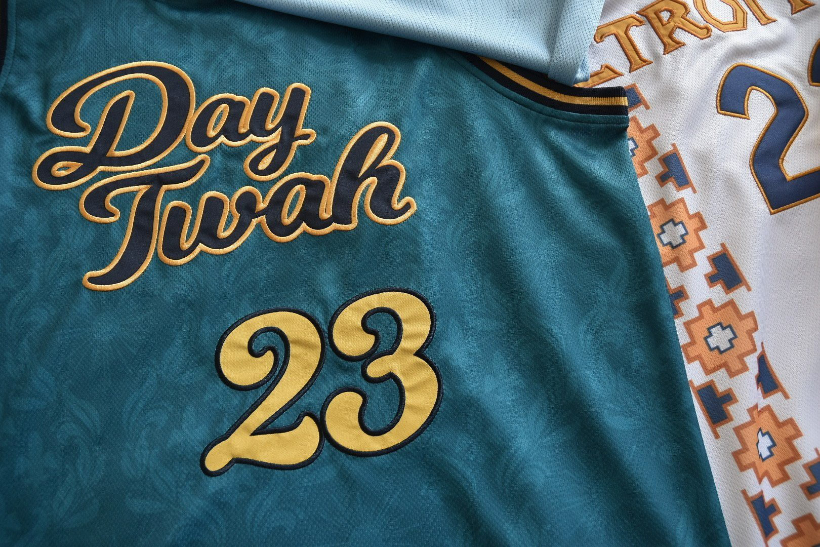
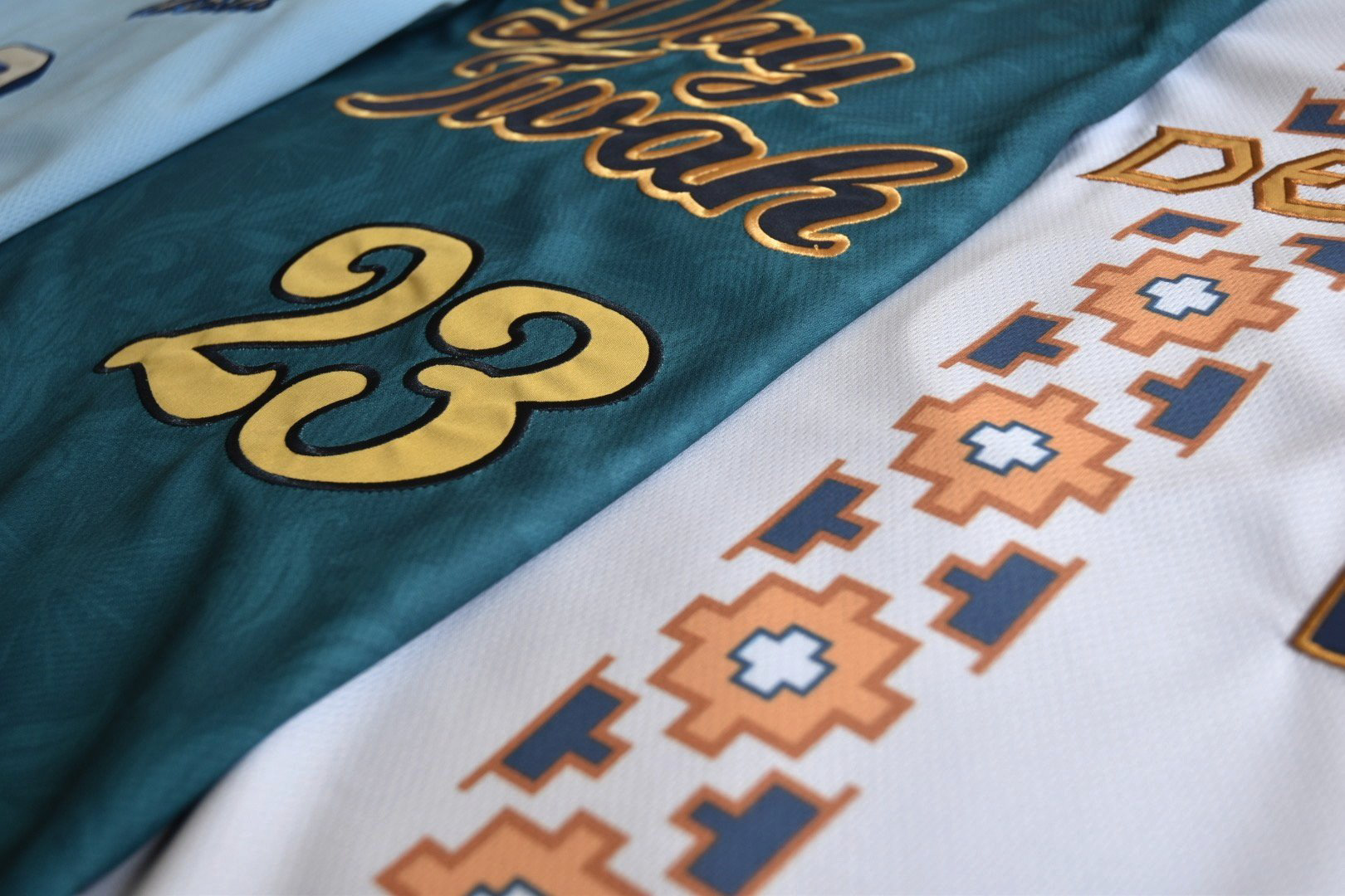
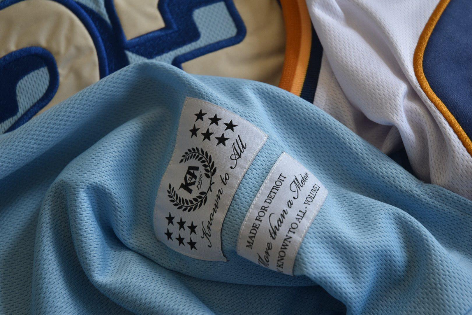
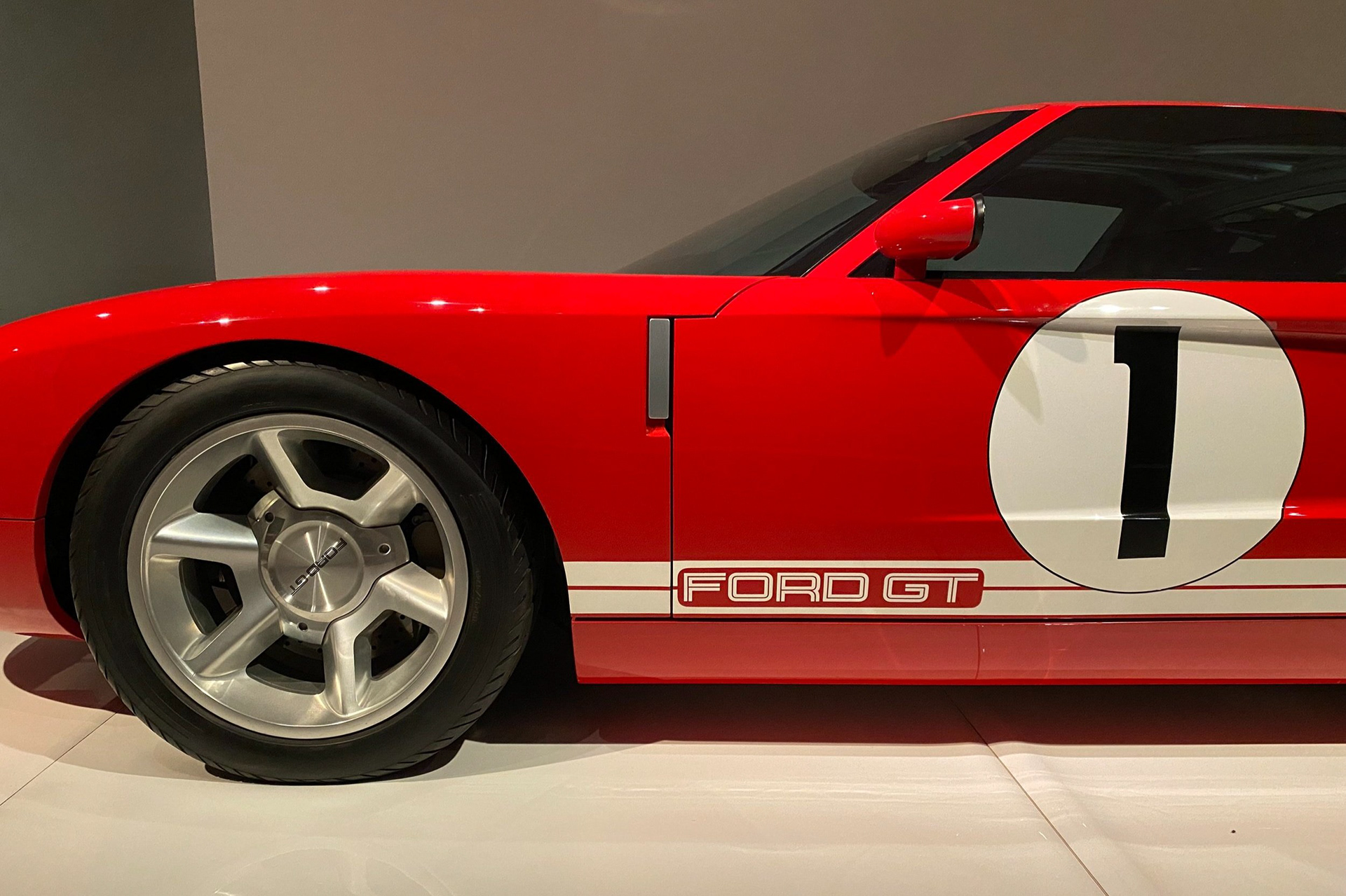
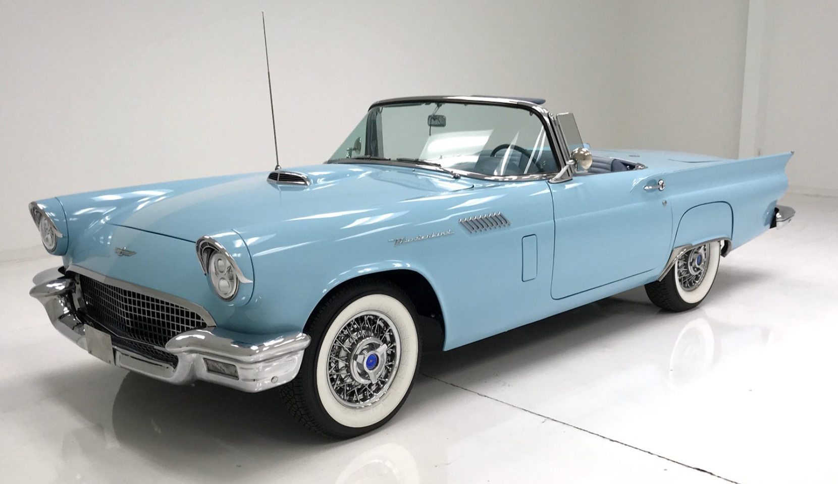
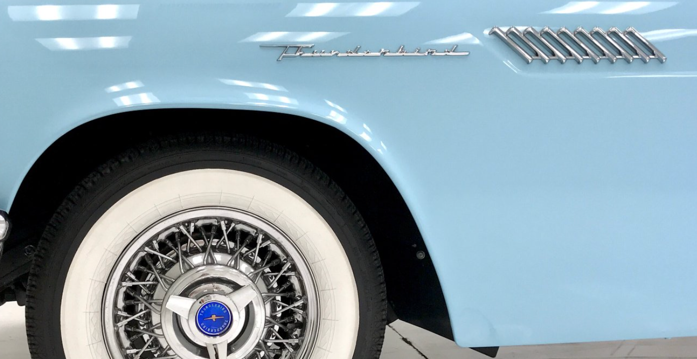
Below: Since Nike’s partnership with the NBA began, the league has prioritized a revolving cycle of unique "City" and "Statement" edition identities. Below are two concept alternates featuring bespoke wordmarks, jersey marks, and logos inspired by iconic vintage automobiles. These concepts serve as hypothetical special edition identities for upcoming seasons, showcasing some of the iconic automobiles the Motor City has brought to the world.
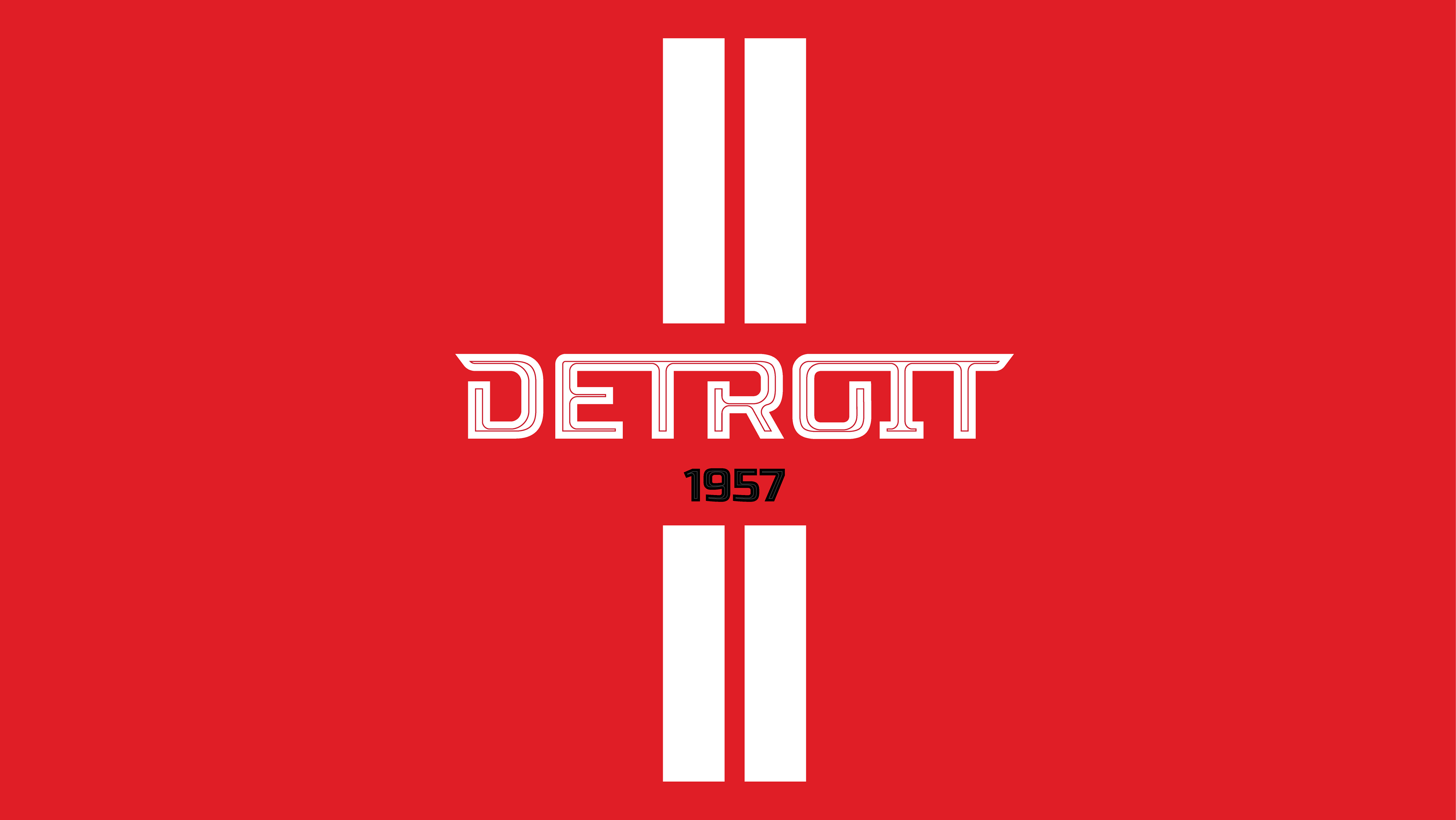


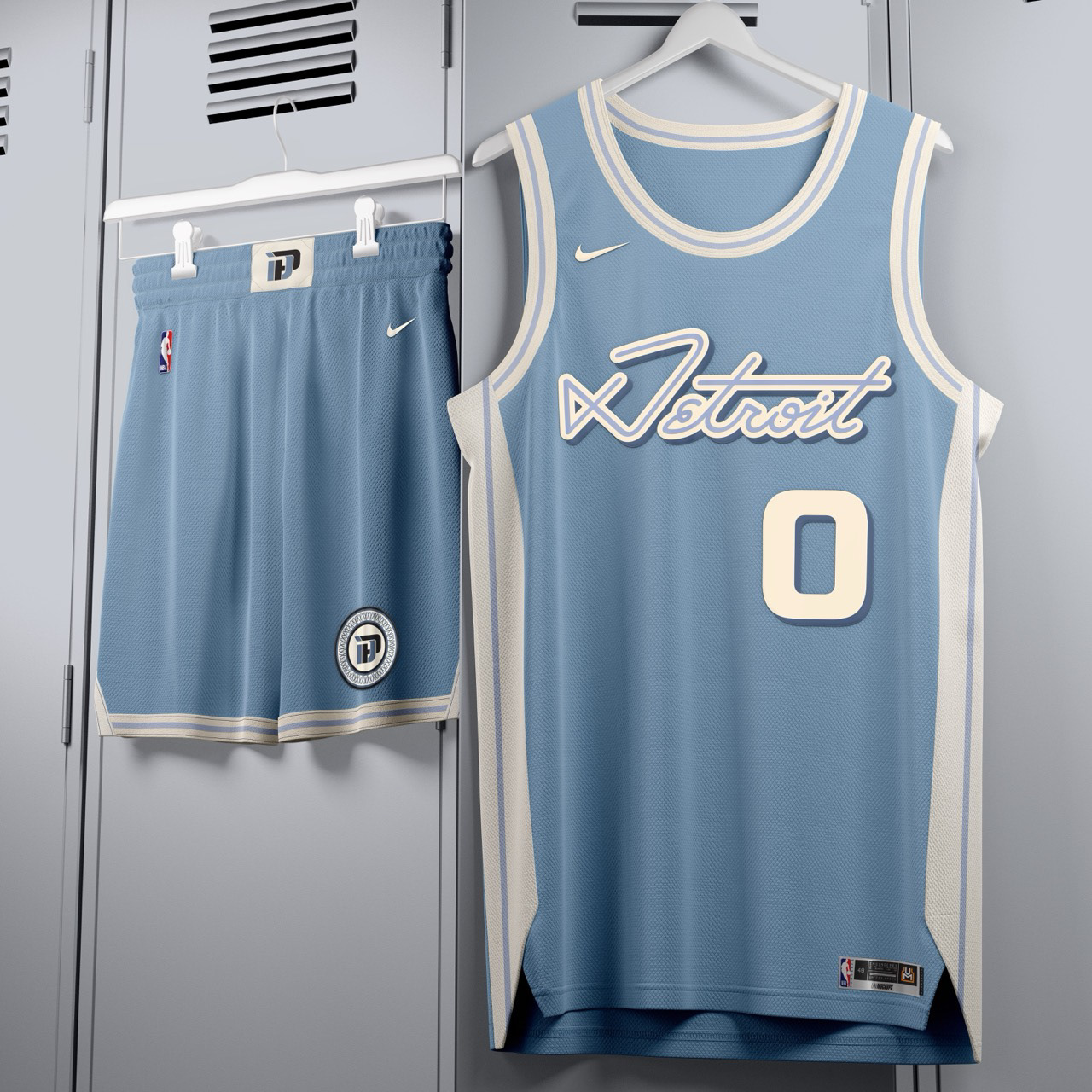
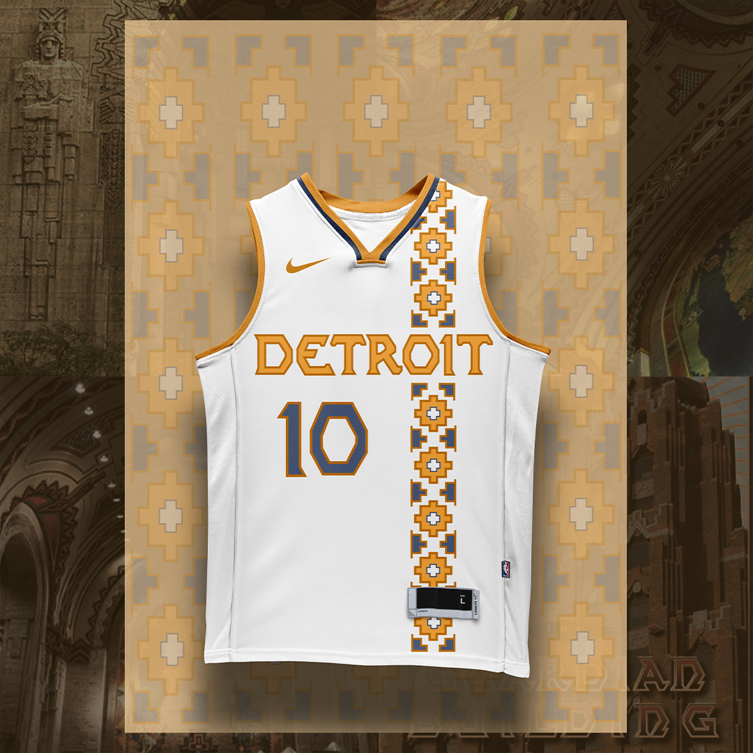
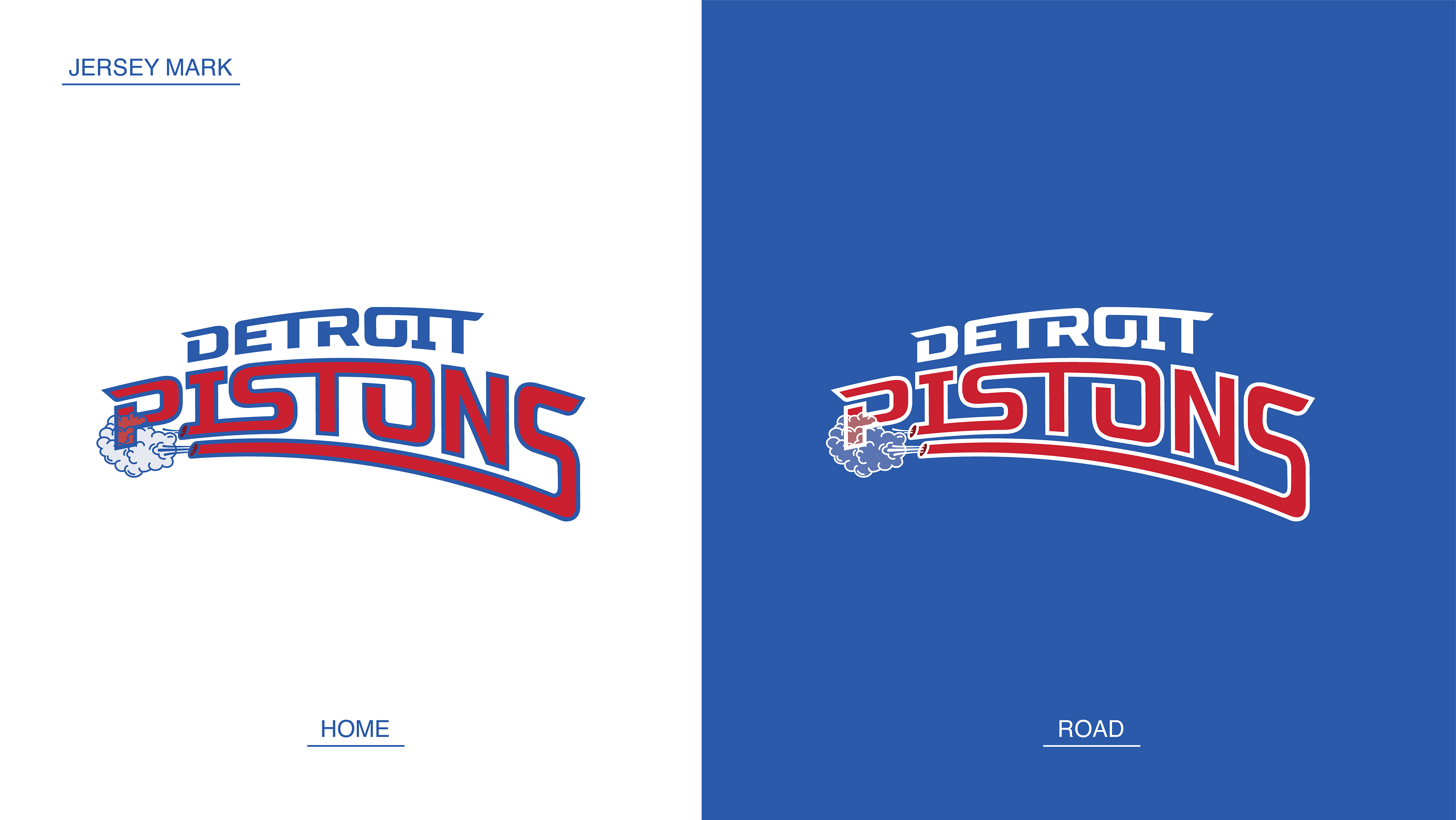
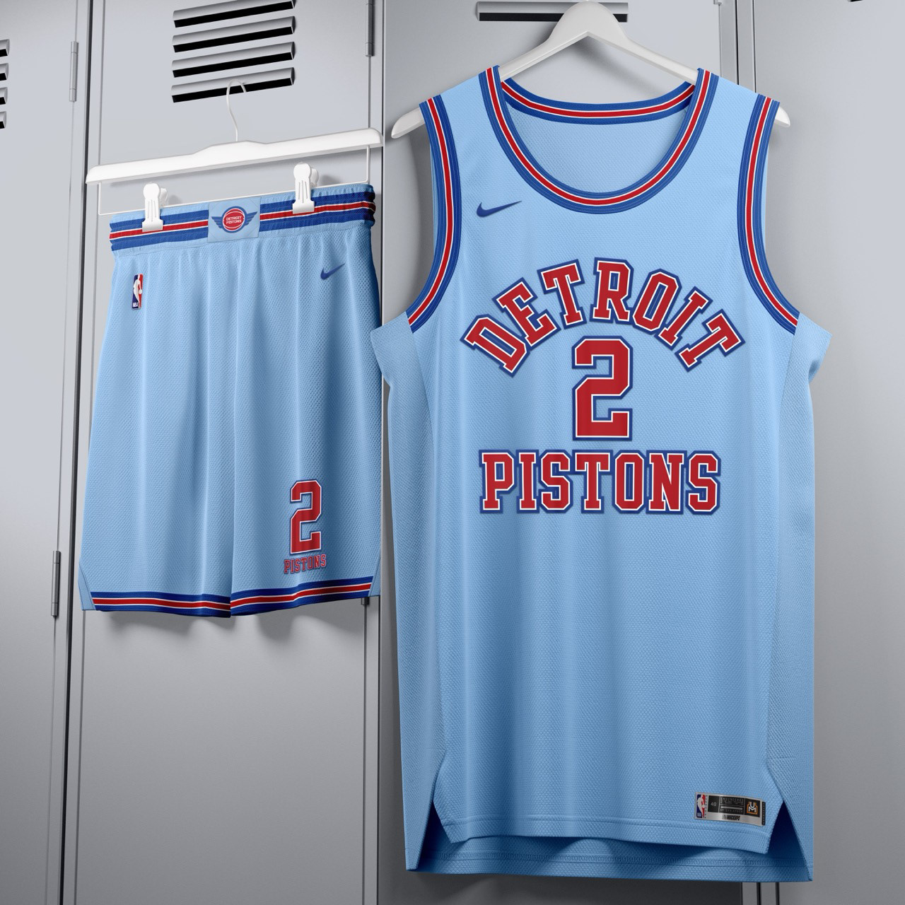
Below: Retro-inspired alternates that offer a clean on-court look and leverage the current vintage craze. Modeled after Pistons jerseys from the 1950's.

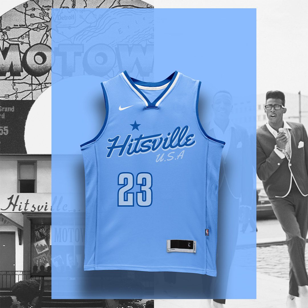
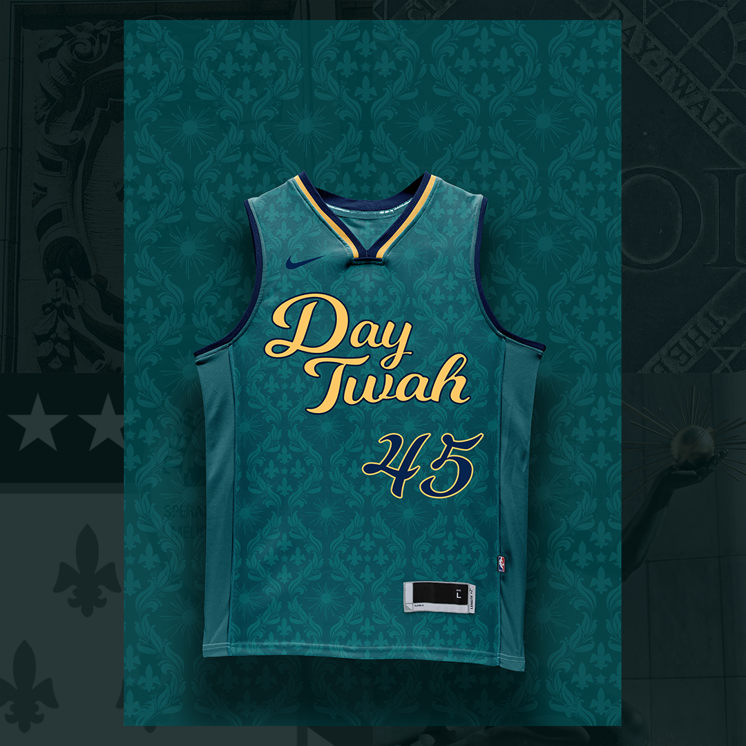
Below: Concept City Edition jerseys designed to address fan frustration for a more creative and intentional approach to our city edition jerseys. The designs resonated with fans and went viral on Twitter, generating 550K impressions and 60K engagements from my account with fewer than 600 followers.