Brief: Redesign the Michigan Memories trading card line. Michigan Memories turns legendary sports moments from Michigan Football history into premium physical memorabilia.
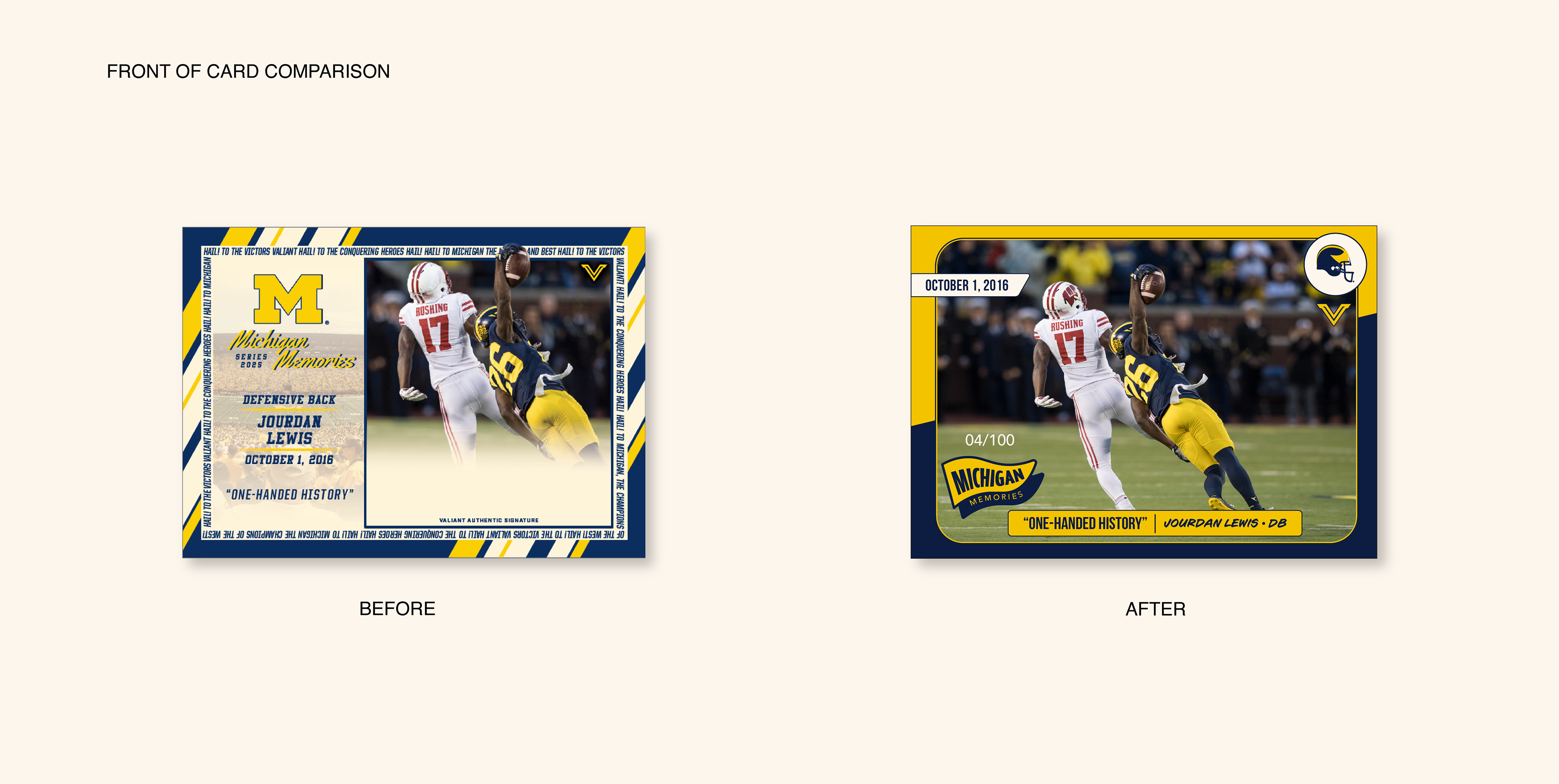
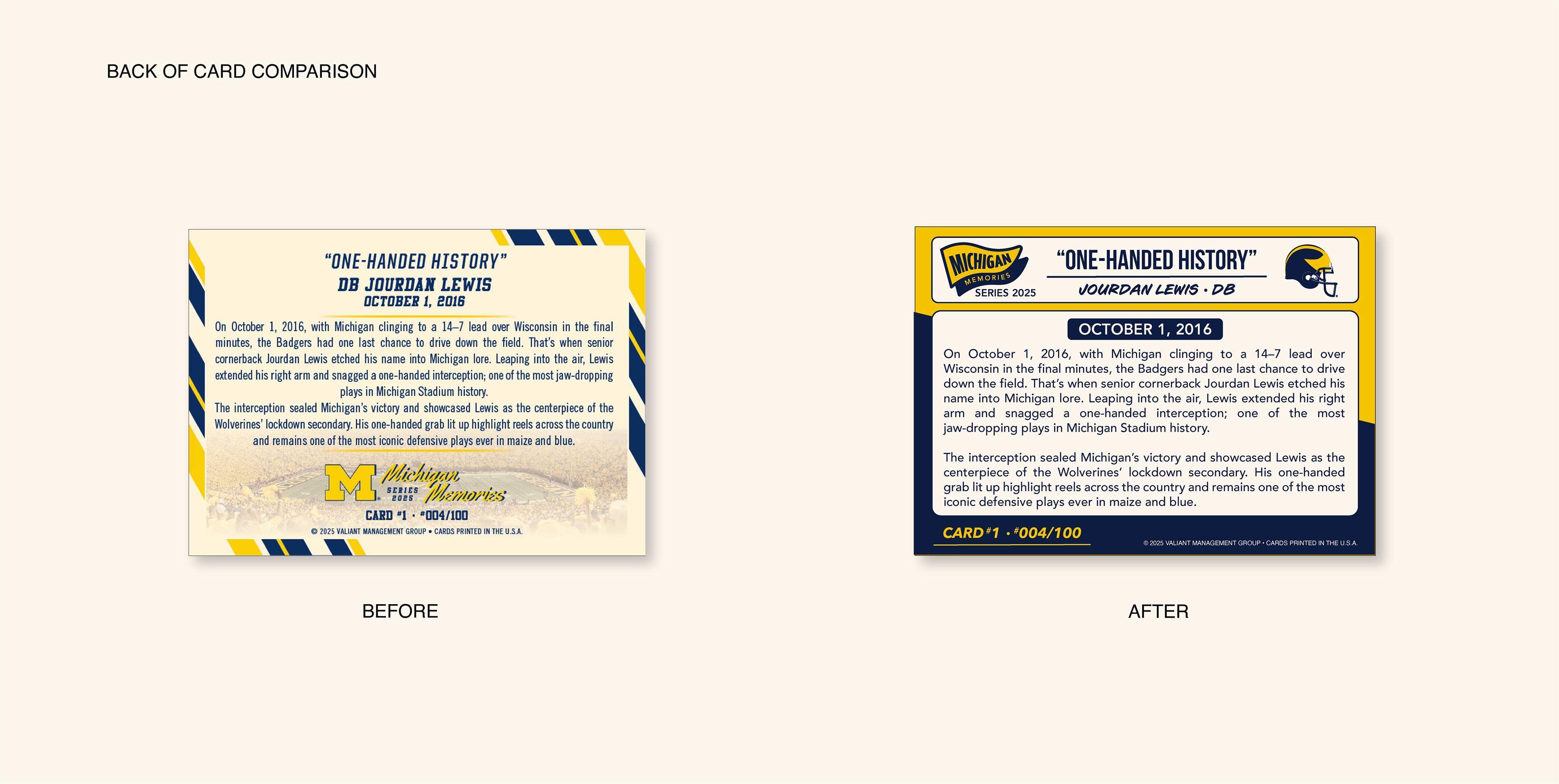
The Challenge: Overcoming and evolving the existing 'Michigan Moments' template. The existing layout was visually loud and featured competing fonts with no clear focal point, making it hard to disseminate the important information. In order to create a successful card I needed to evolve this cluttered card into a timeless design that could work in both vertical and horizontal orientation.
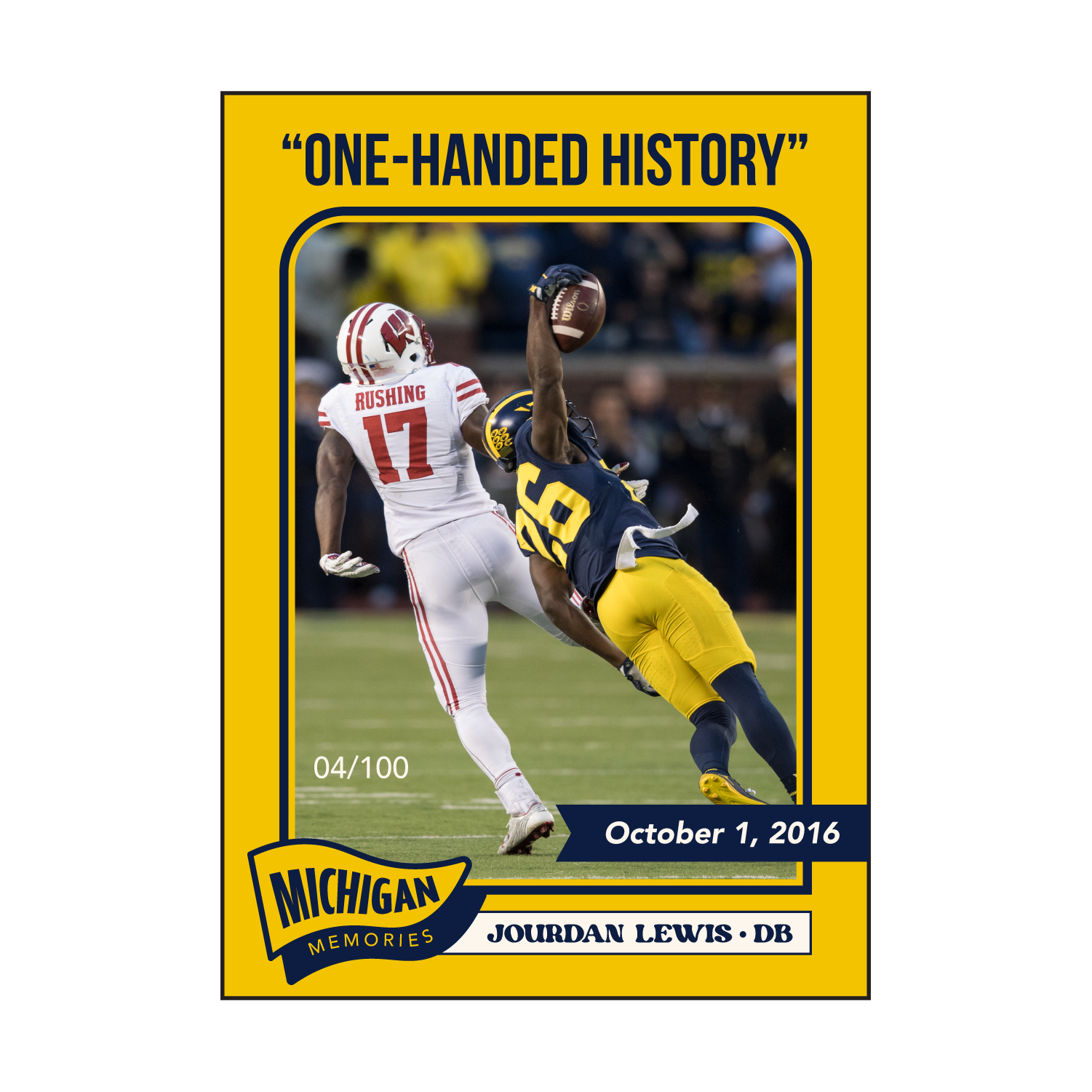
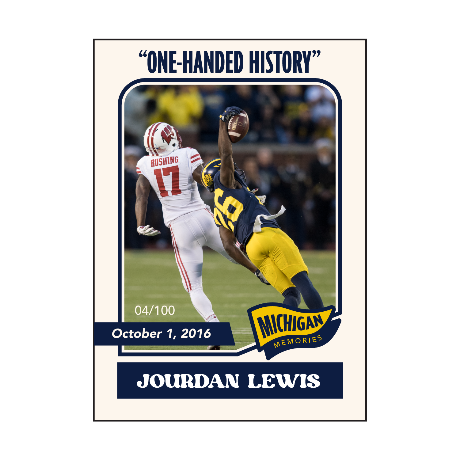
Strategy: Less is More. To create a premium card feel, I stripped the design back to its most essential elements and the let the moment itself do a bulk of the work. My strategy focused on the following:
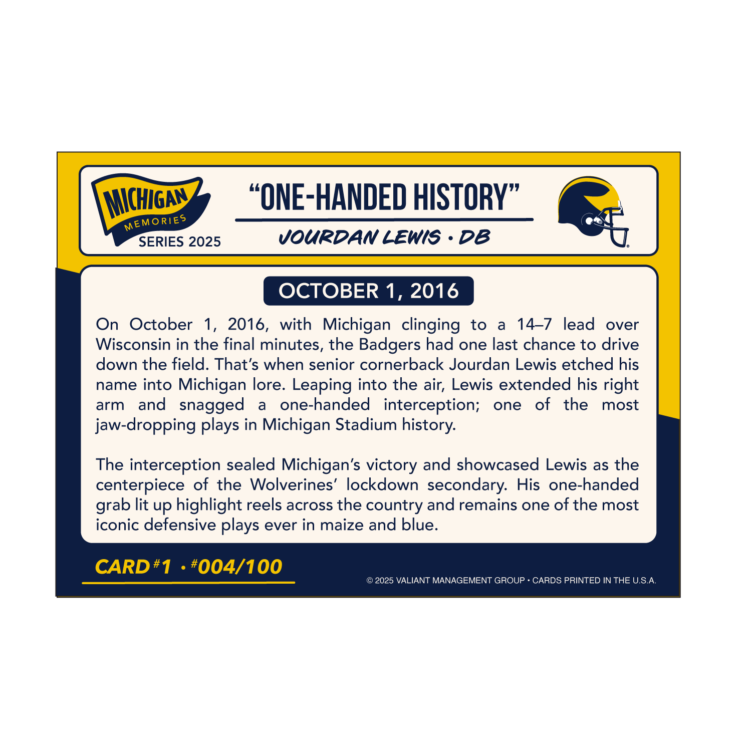
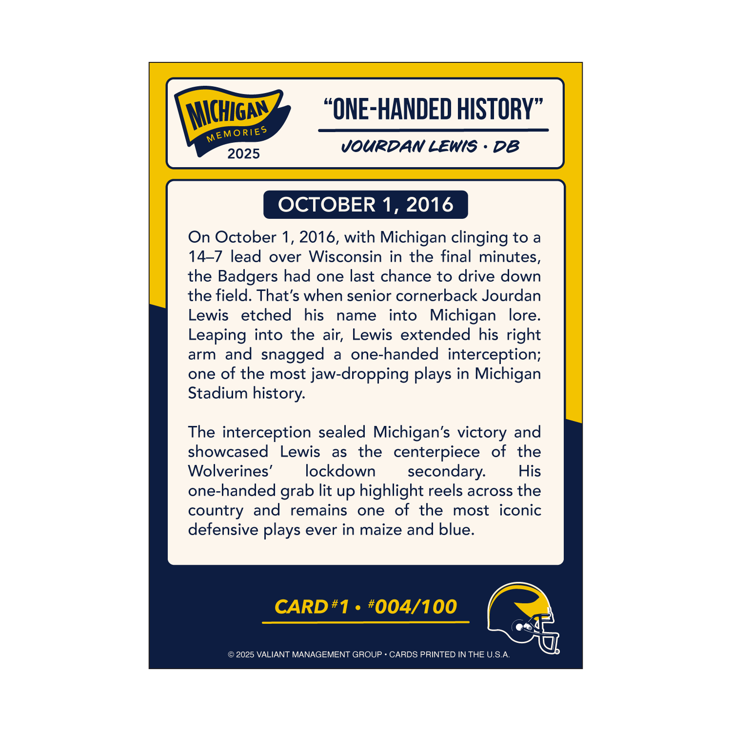
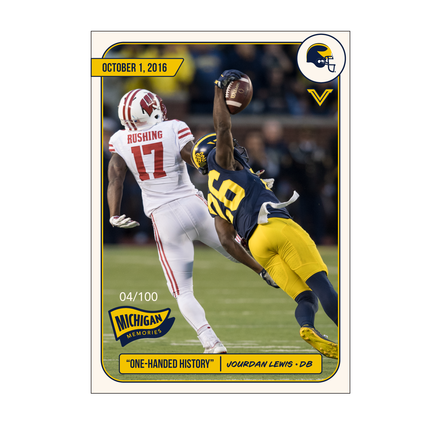
• Organizational Hierarchy: I reorganized the layout to prioritize these four elements: the Play, the Player, the Date, and the Series Title.
• Unified Branding: I developed a custom "Michigan Memories" mark to give the series its own identity. This made the collection feel like a cohesive set, one that could last for years to come.
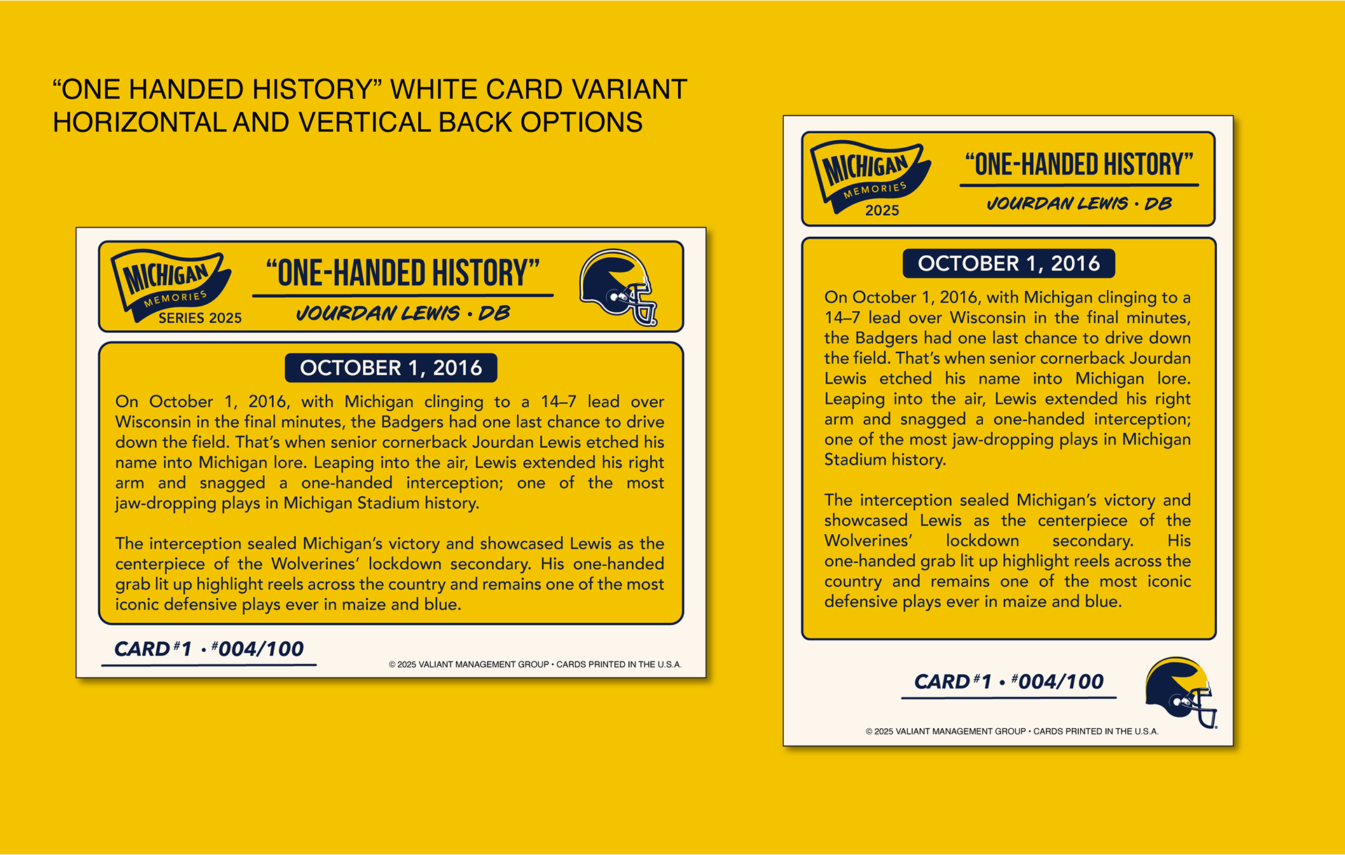
• Functionality: I created the a standard and white variant, both with a clean, high-contrast canvas that is equally functional in vertical and horizontal formats
• Vintage Aesthetics: I paired the vintage winged helmet mark with highly legible sans serif and handwritten typography to give the card a vintage aesthetic. This created a timeless feel that appeals to both older alumni and younger fans, making the cards feel like a curated piece of art rather than just a stat sheet.

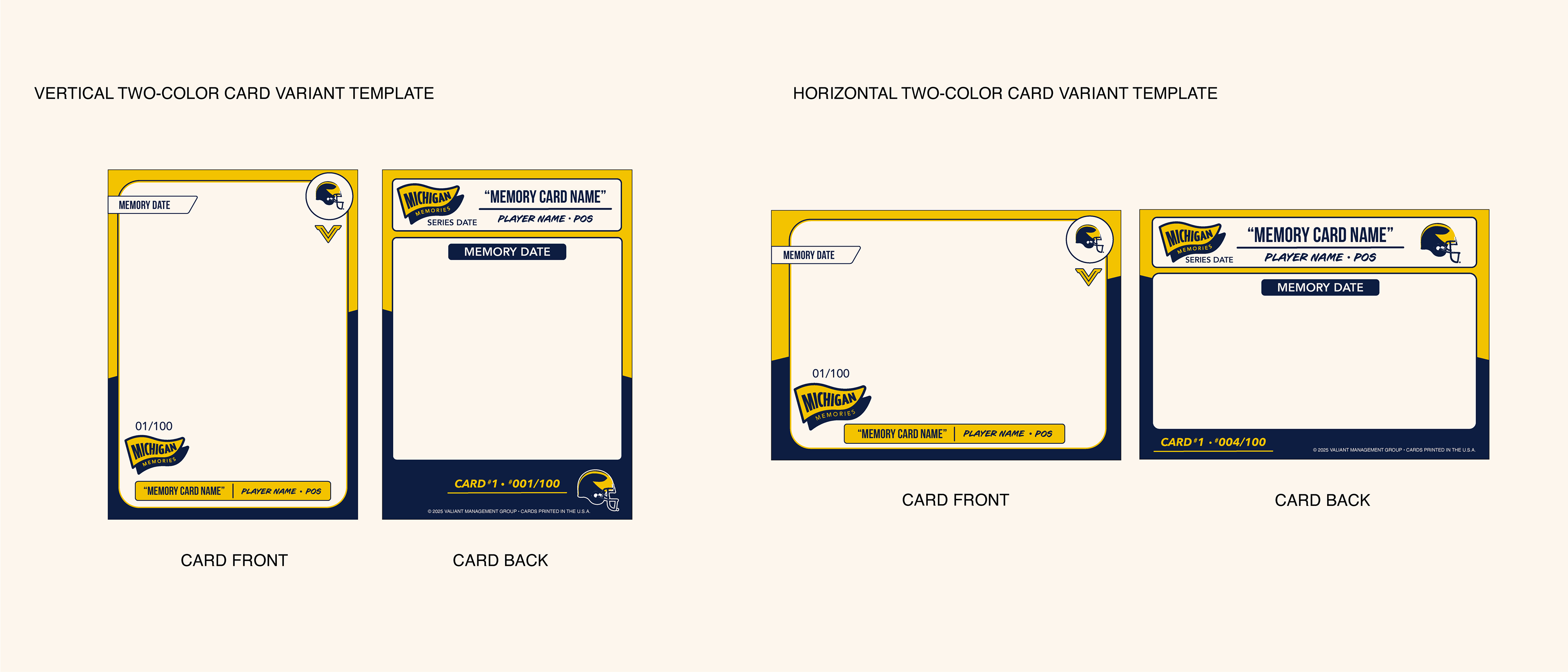
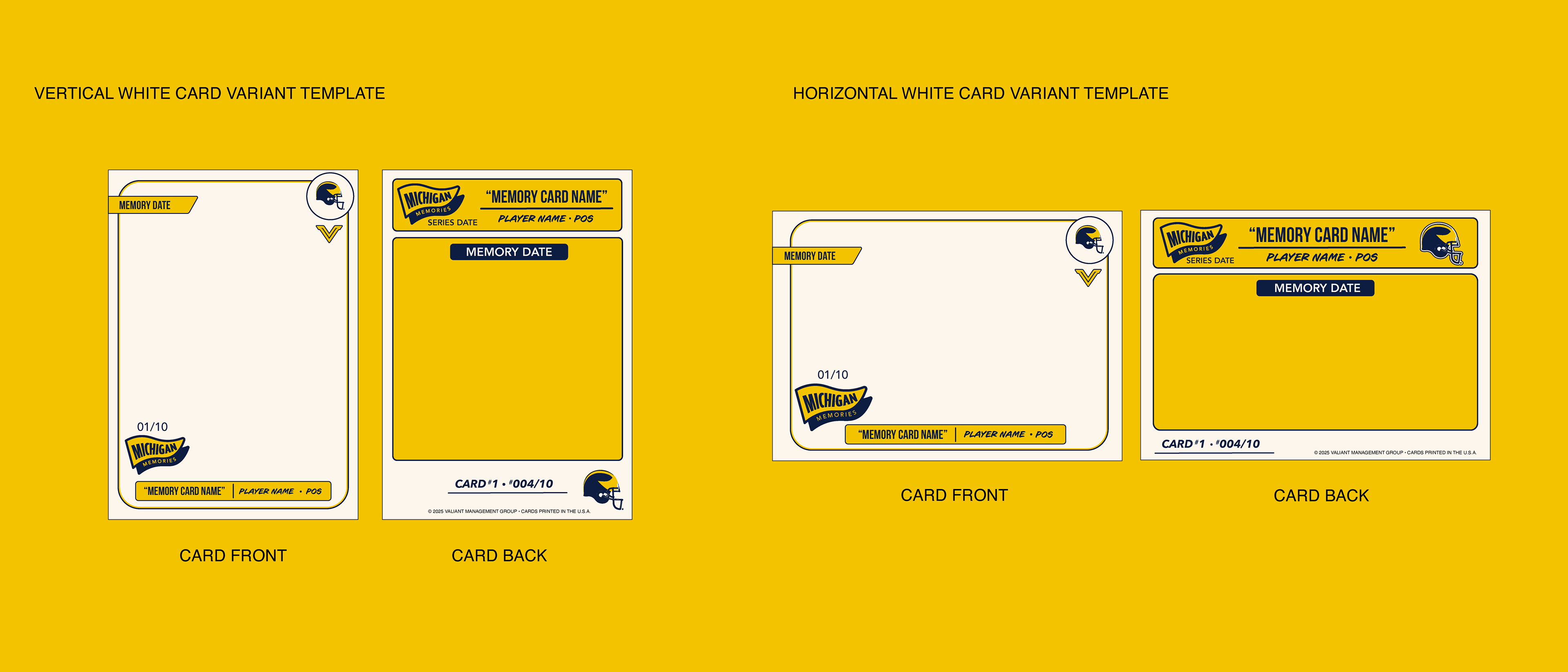
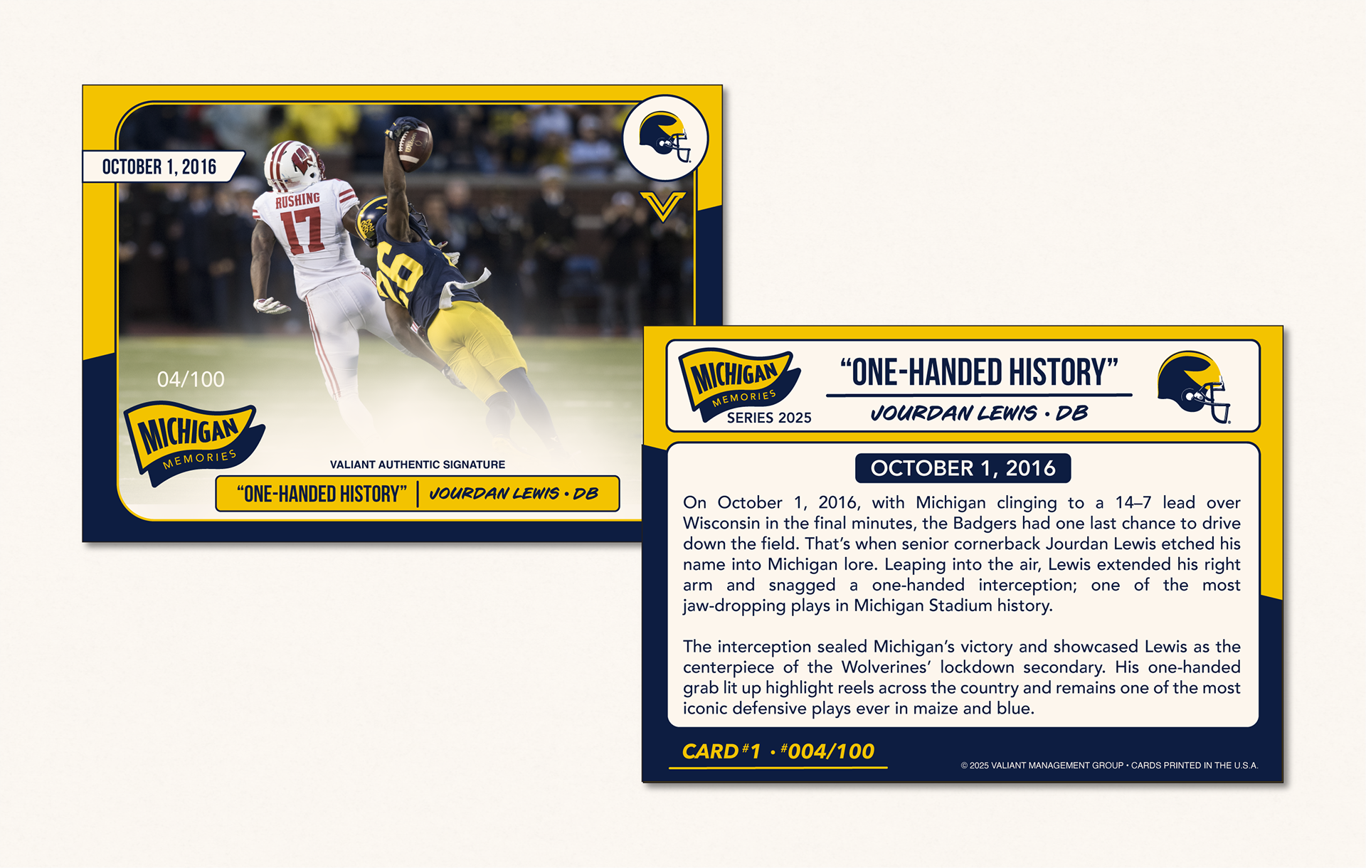
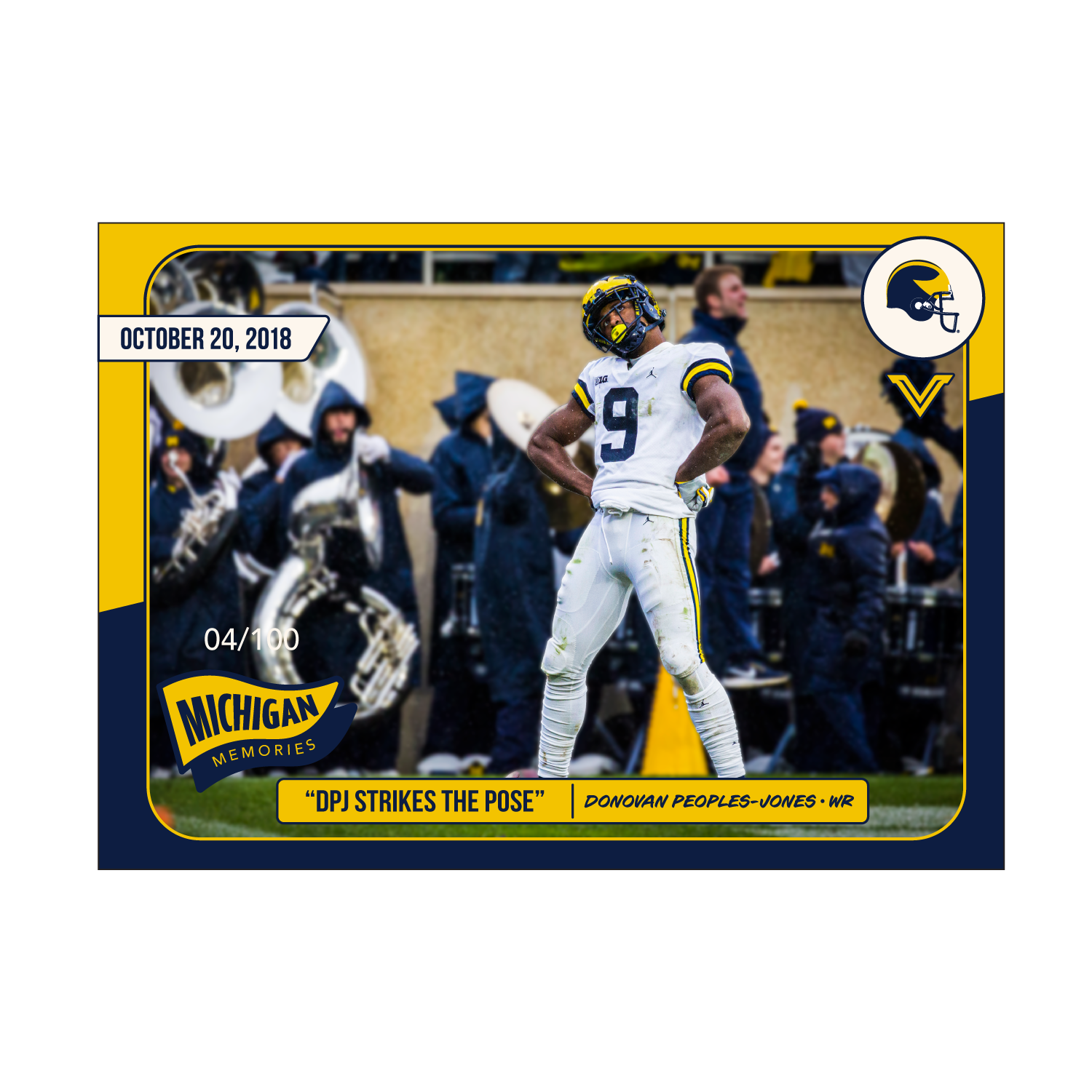
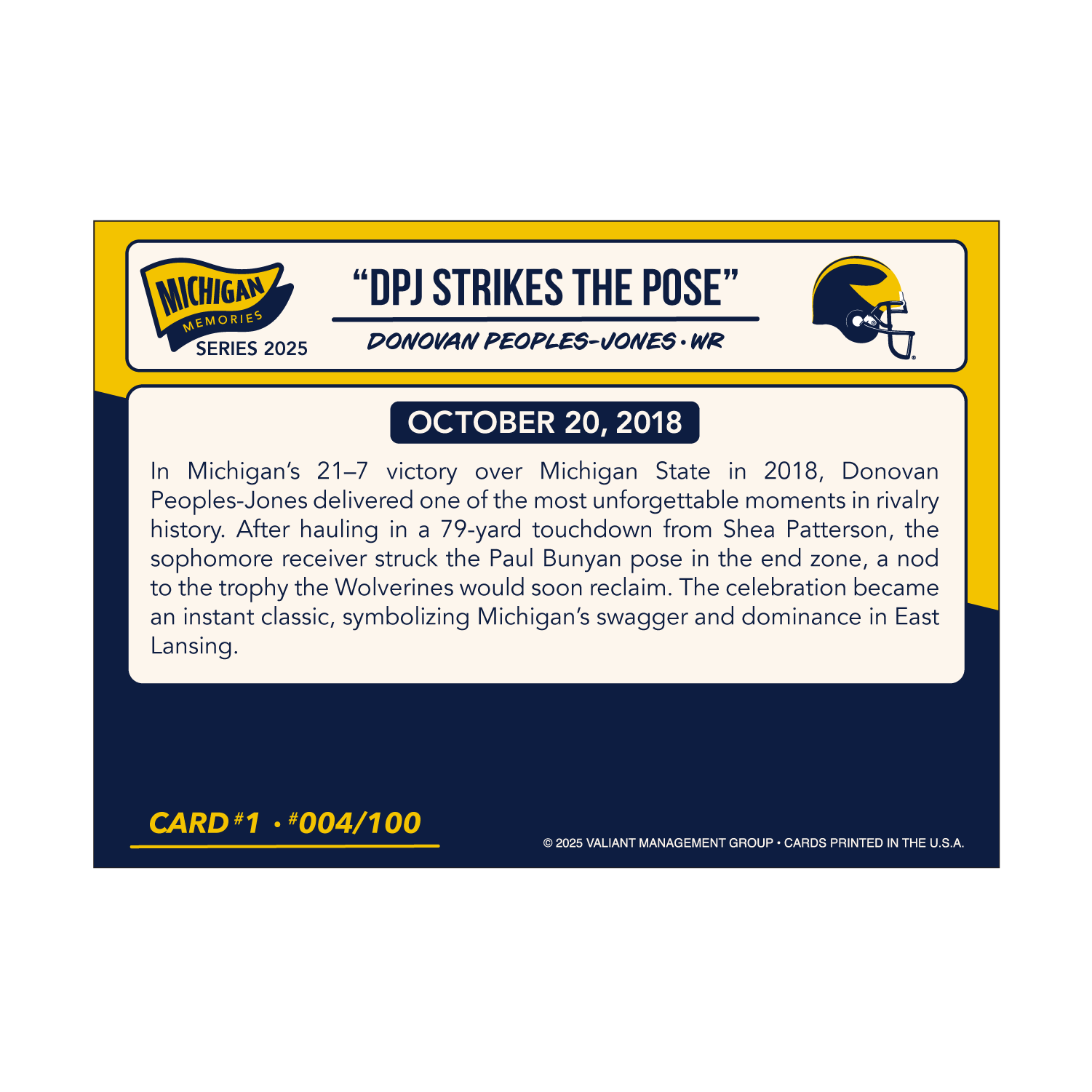
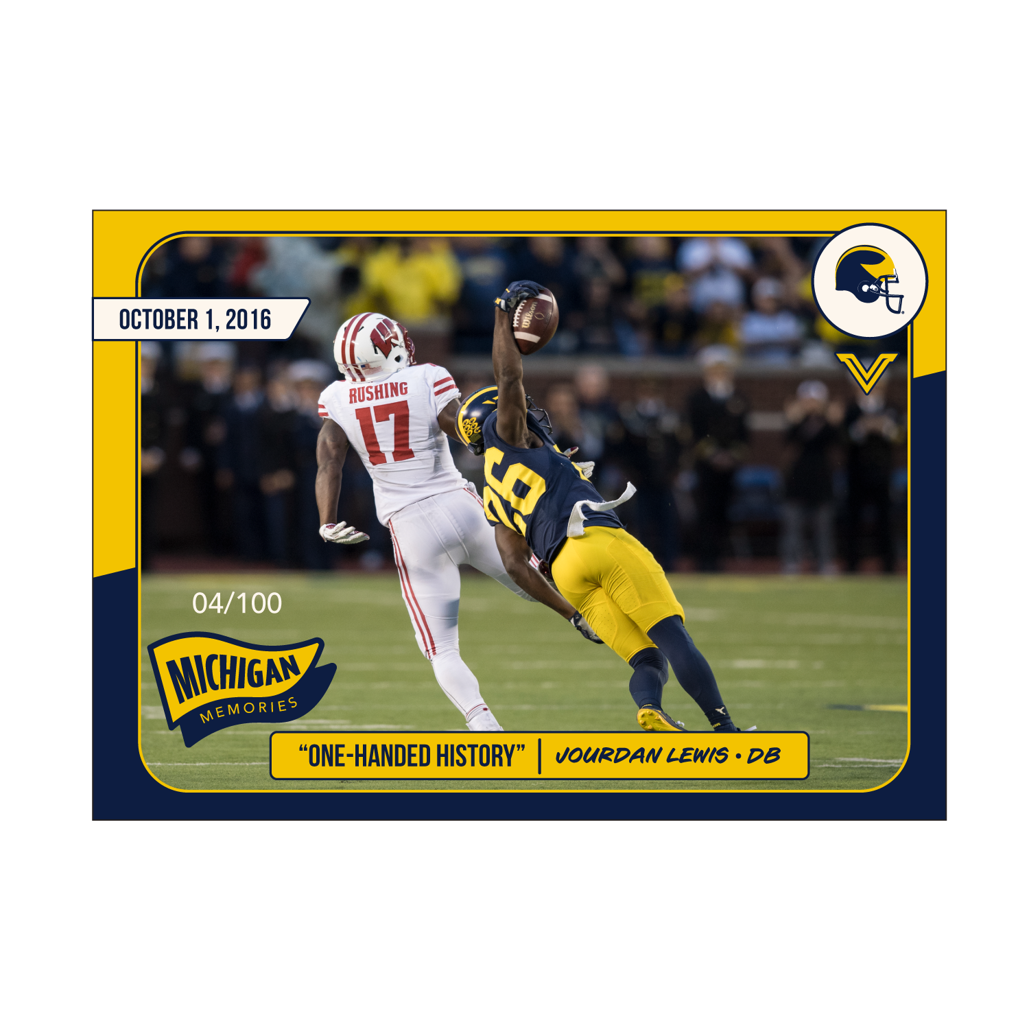
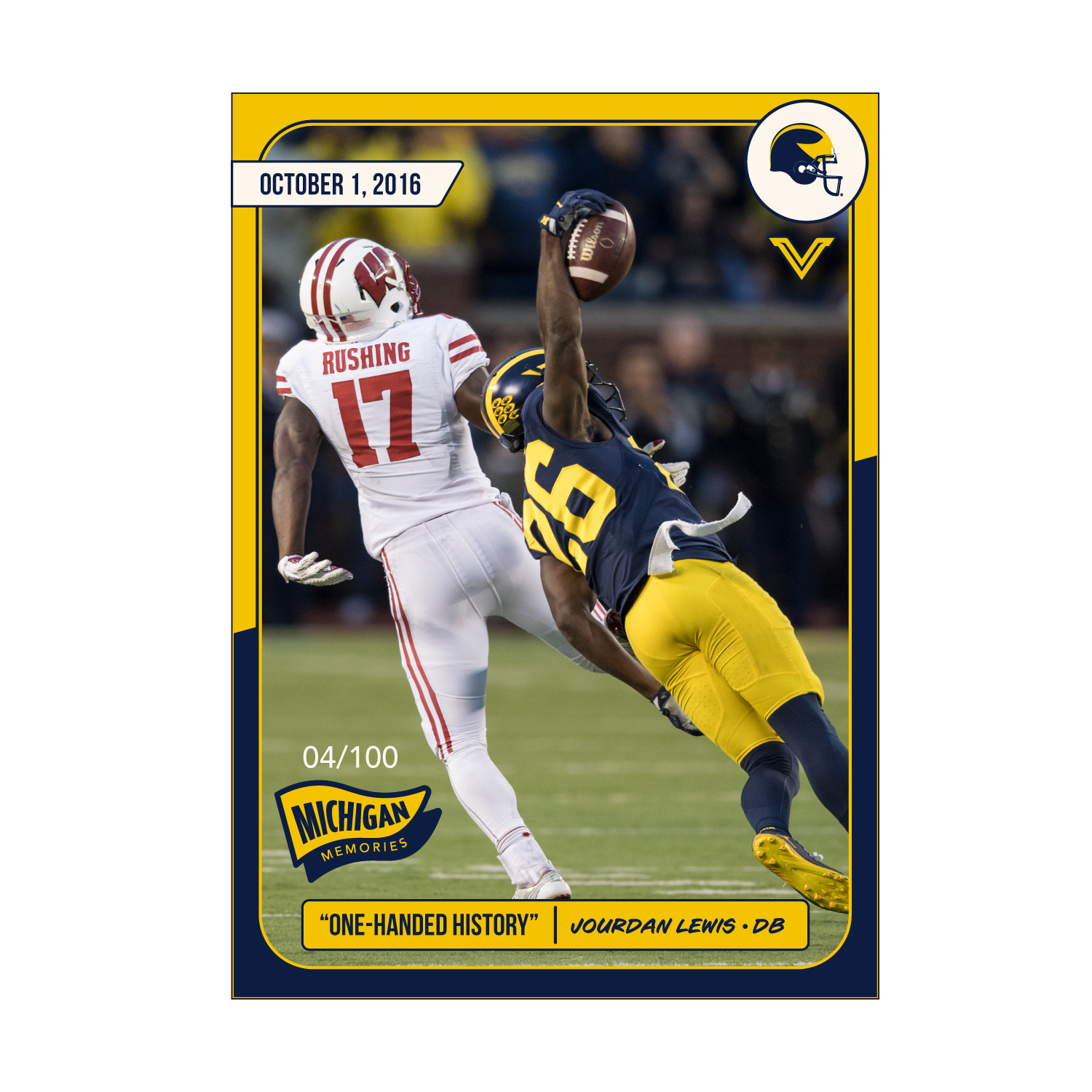
Below: The Michigan Memories template in use, highlighting the responsive layout across multiple orientations. The white variant was developed to provide a clean, high-contrast canvas for dynamic sports photography, allowing for the moment itself to be the focal point of the card.
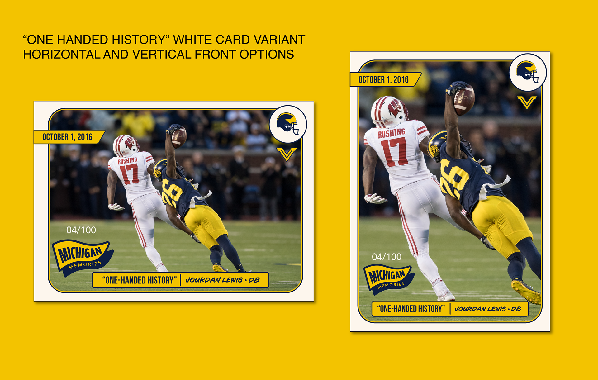
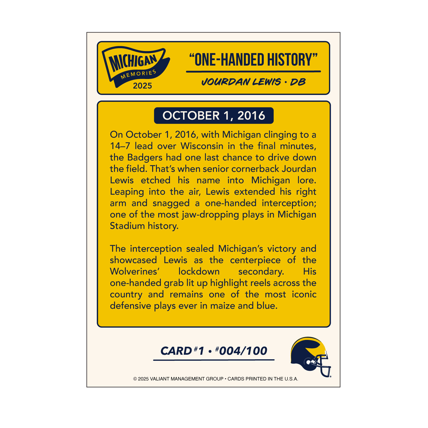
Below: The cards shown below demonstrate the templates versatility. The inclusion of signature-ready gradient fades and multiple layout orientations allows for the creation of limited-edition variants. This design framework not only future-proofs the collection to ensure that the next impact moment can be turned into a card, but also allows for Valiant to produce limited versions of the same play, creating a sense of rarity that card collectors covet.


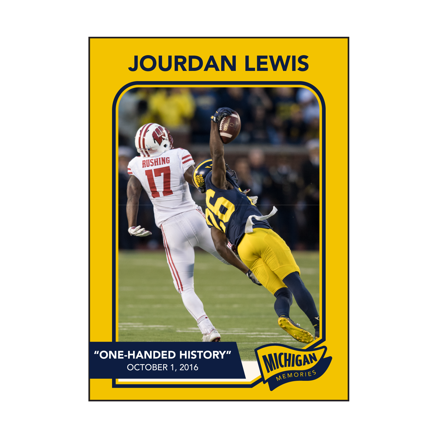
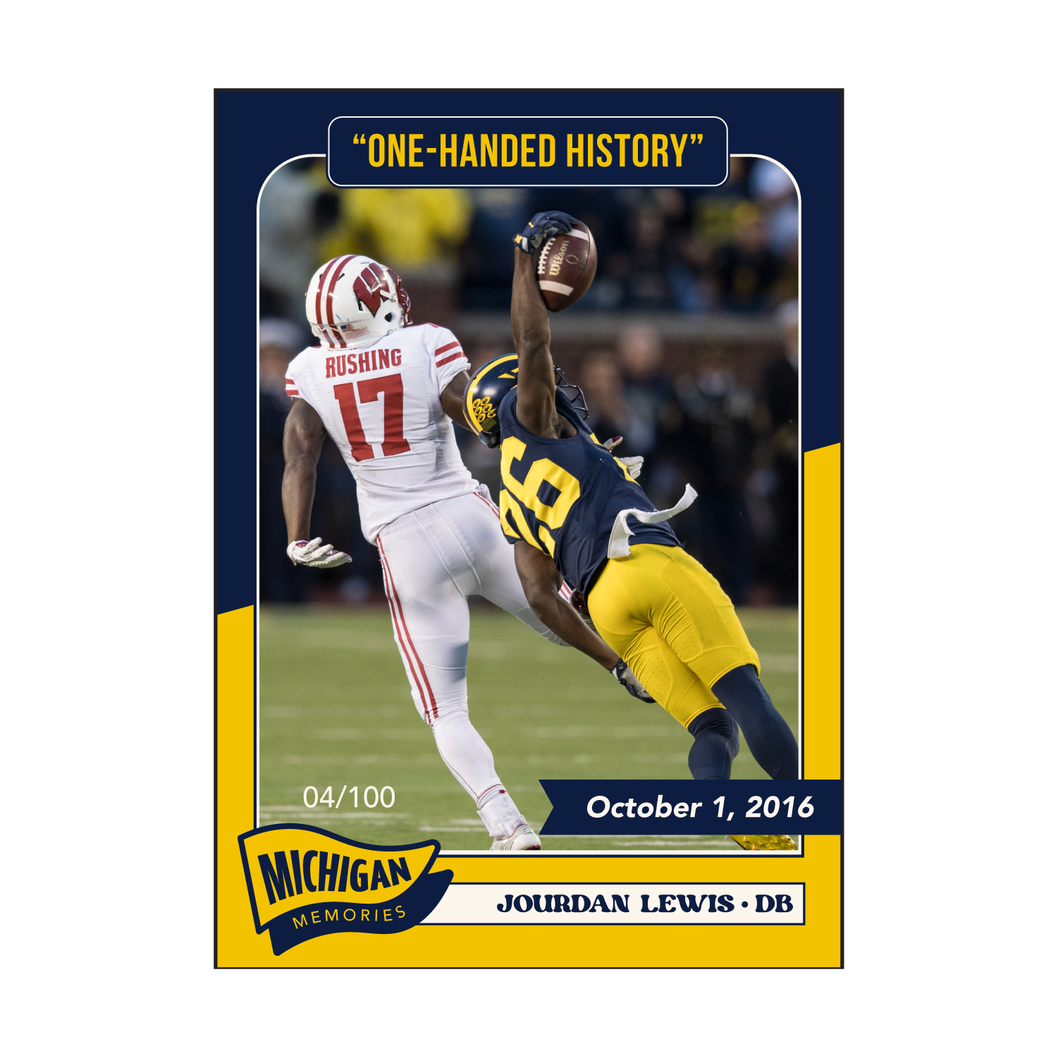
Below: A selection of preliminary concepts and explorations that informed the final design direction.
Additional: This was the original Michigan Memories card. The composition was visually busy, had poor contrast, and lacked a clear focal point. It felt disjointed, making it hard for the 'moment' itself to shine. I identified these layout deficiencies as the primary hurdle to creating a more premium card.
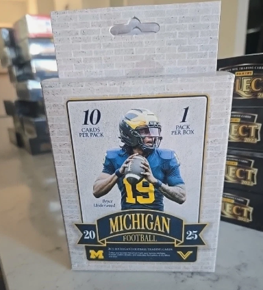
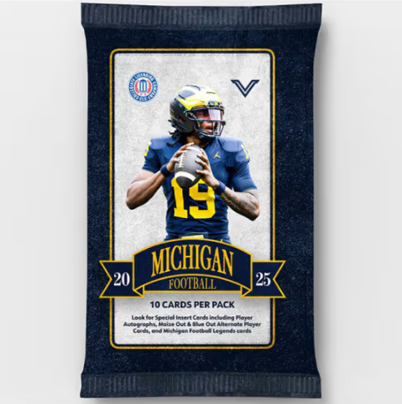
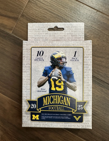
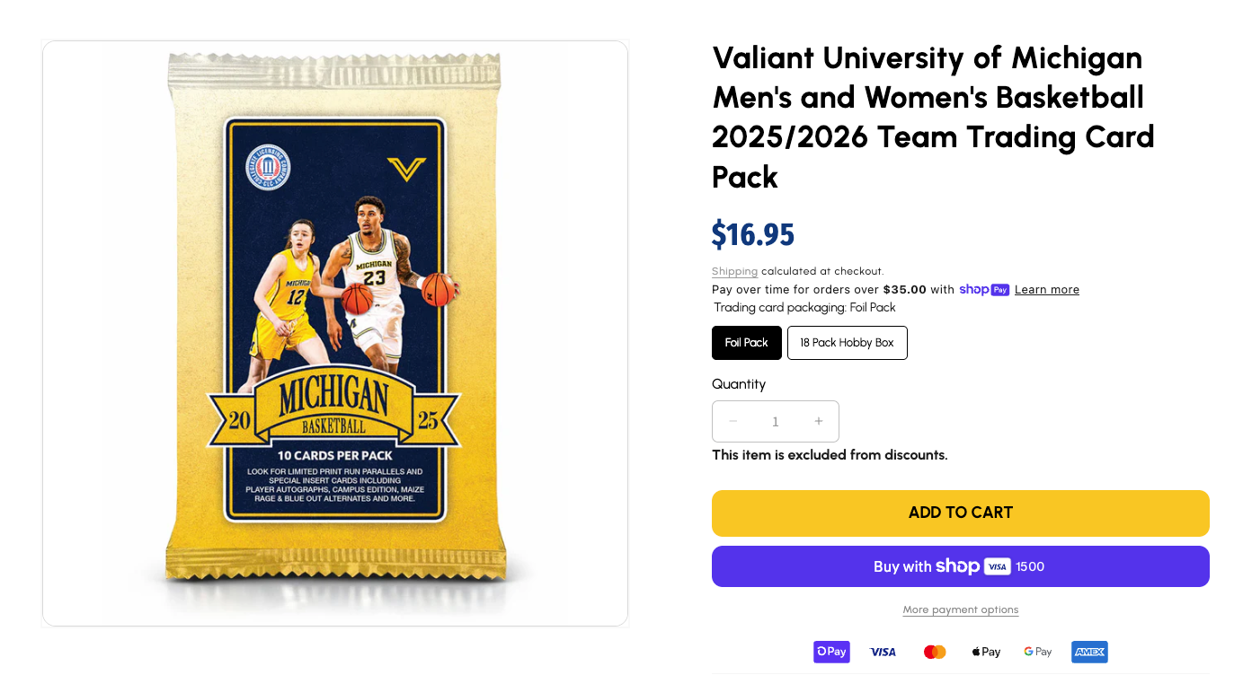
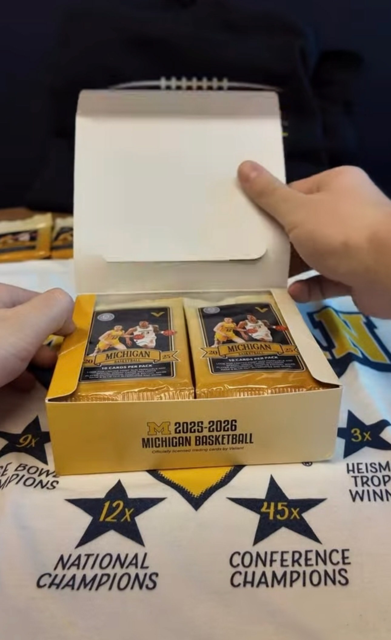
Bonus: A showcase of the packaging design I developed for Valiant’s full 2025 Football and 2025-26 Men’s and Women’s Basketball collections. These industry-competitive designs were developed for high-volume distribution in major big-box retailers statewide.